

Multi Columns component
The Multi Columns component is used to create two, three, four, or six additional columns of component drop zones within a section of a page. These columns are responsize within their design themes and will collapse and expand depending on device display width.
The Title and Options configuration dialog contains the following options:
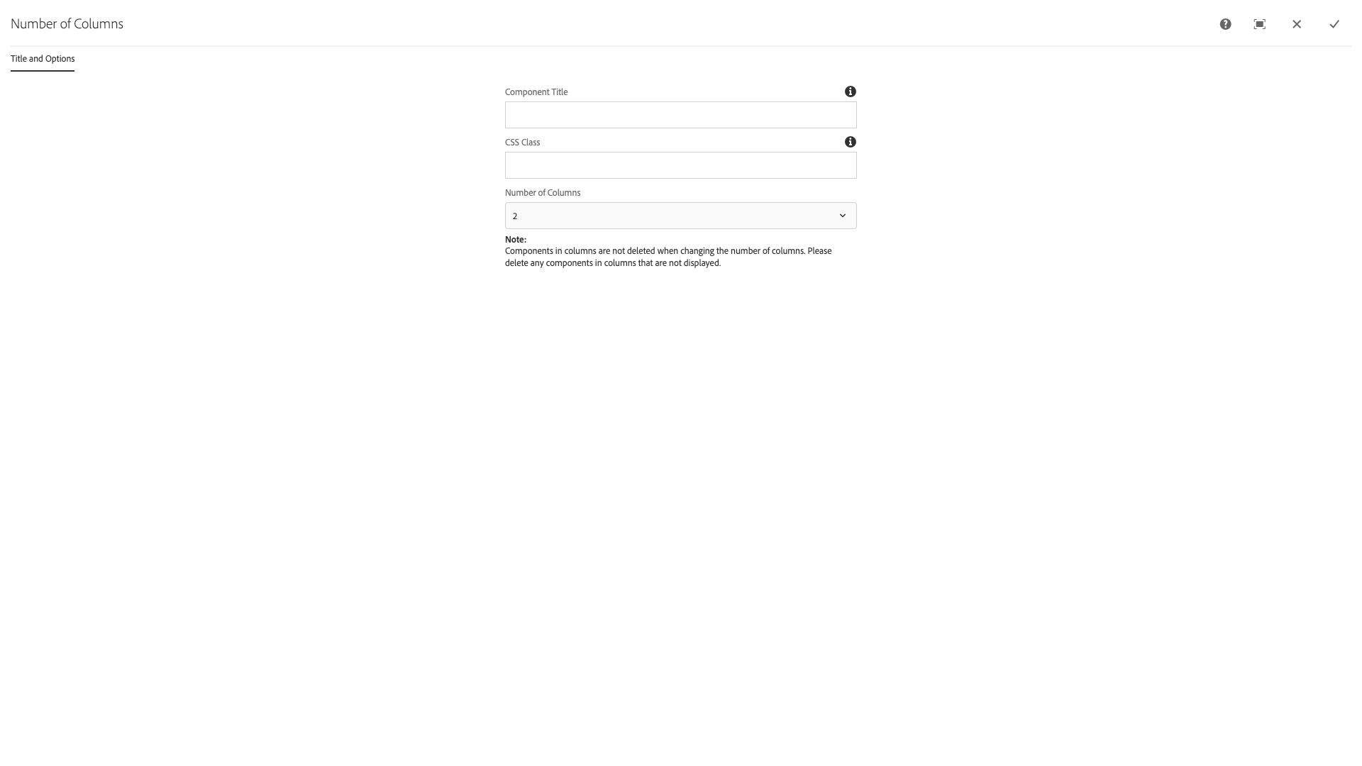
- Component Title - text input field that does not display for this component but useful for giving the component a title for keeping track of what it is used for on the page
- CSS Class - text input field for custom CSS and/or utility classes
- Number of Columns - select pulldown to choose 2, 3, 4, or 6 columns
NOTE: Use one of these per row of items you wish to display like this. Otherwise, variable item scaling will occur and vertical alignment will drift.
The multi-column component provides a way to display content across multiple columns on a page.
Features
- Affords a variable number of columns with content drop zones
- Note Components in columns are not deleted when the number of columns is changed. Be sure to delete these components before changing the number of columns
- The multi-column component can contain other multi-column components
Dialog Properties
Title and Options
Component Title- Title of ComponentCSS Class- CSS class to be applied to the componentNumber of columns2346
CSS Classes
- adaptiveimage
- caption
- col-md-2
- col-md-3
- col-md-4
- col-md-6
- col-sm-4
- col-sm-6
- image
- parbase
- row
- section
- vt-col
- vt-col-1
- vt-col-2
- vt-col-3
- vt-col-4
- vt-col-5
- vt-col-6
- vt-image
- vt-multicolumn
- vt_adaptive_img
- vt_large_img
- vtmulticolumn