

Reference component
The Reference component is used to have a single source for a piece of content and reference it within multiple pages. The single source allows for the content to be updated in one place and then changes display everywhere that content is referenced. The component can reference another component or set of components to display their content.
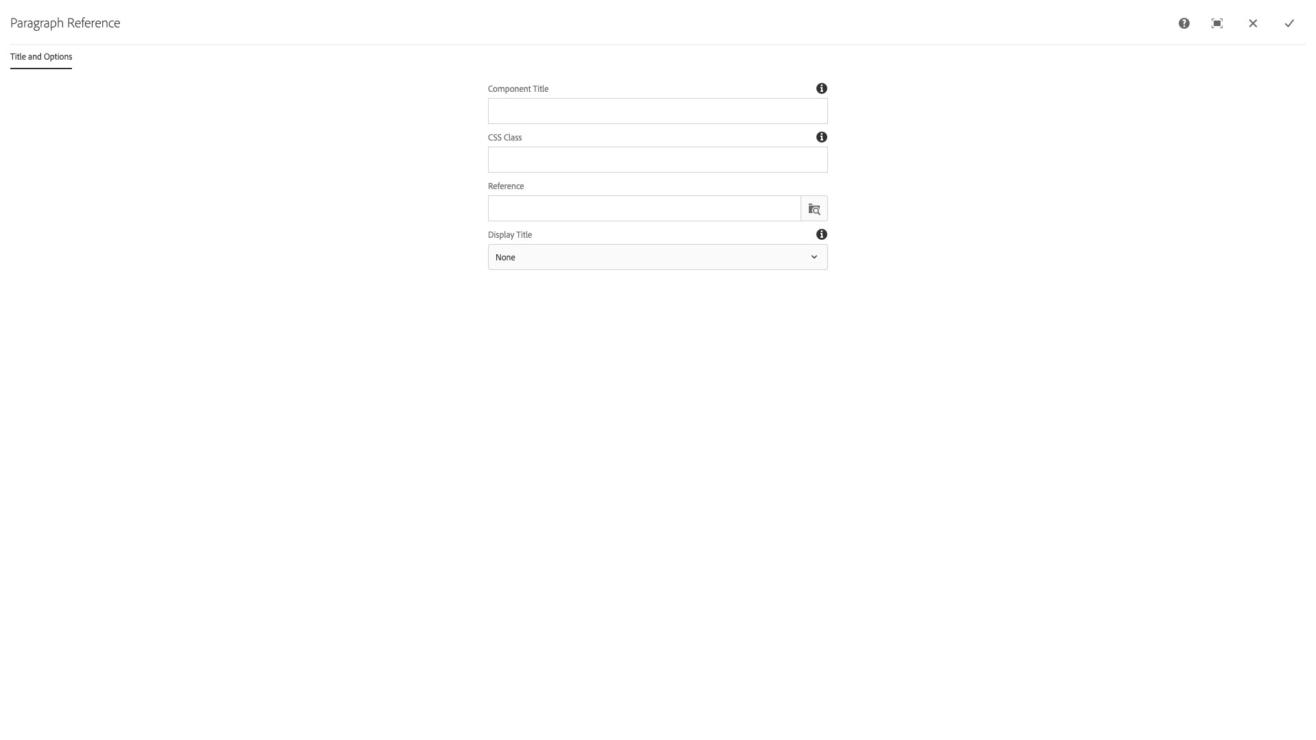
The Title and Options configuration dialog contains the following options:
- Component Title - text input field that does not display for this component but useful for giving the component a title for keeping track of what it is used for on the page
- CSS Class - text input field for custom CSS and/or utility classes
- Reference - text input and path selector for a /content/... path for content item
- Display Title - select pulldown used to choose None, Title, and Title with Link options for displaying the referenced component title
Note:
Once in place, you cannot edit the text within a referenced component. To make changes, go to the page where the original content appears and make updates. Those changes will appear wherever the reference component has been placed. However, you will need to republish any page on each site that uses the reference for that site to update referenced content.
The reference component is used to feature content from one page to another within your site. It can be used multiple times to display the same content on numerous pages. It supports a principle called Don't Repeat Yourself (DRY) which means that if the same content is created more than once, it is likely the mutliple copies will get out of sync.
Features
- Saves the author from copy/pasting content across multiple pages
- The user can browse Ensemble for the desired content
- Optional title for the source content with link
Dialog Properties
Title and Options
Component Title- Title of ComponentCSS Class- CSS class to be applied to the componentReference- Browse for the page or page contents to referenceDisplay Title- Choose whether to display the title, optionally with a link to the original pageNone- DefaultTitleTitle With Link
CSS Classes
- adaptiveimage
- caption
- cq-dd-paragraph
- image
- parbase
- reference
- section
- text
- vt-image
- vt-ref-title
- vt-ref-title-link
- vt-text
- vt-vtcontainer
- vt-vtcontainer-content
- vt_adaptive_img
- vt_large_img
- vtcontainer