Call To Action
Introduction
The Call To Action Component (CTA) is meant to bring the user’s focused attention to brief, but important, messages and entice the user to take actions. The primary use of this component is to be the first piece of content a user interacts with on a page.
Note: In the One theme, this component is included by default on all home page types at the top of the page. If left unconfigured, the component will vanish on published pages, but remain configurable in edit mode.
The CTA component embeds three additional subcomponents: the Call to Action Link component, the Adaptive Image component, and the Media External component. These components come pre-packaged with the CTA, but must be configured separately.
Note: HTML is now allowed in the title and description of the CTA component.
Note: Please keep in mind that while configuring the look and feel of the CTA, design and accessibility problems may occur. Certain color combinations between the background of the CTA and the color of the Call to Action Link component may be incompatible and must be changed. For example, using a maroon call to action link on a maroon background is inaccessible and does not meet our legal obligations.
Update: The embedded Call to Action Link component will now adjust itself to be an accessible color in situations where the color contrast between the CTA background and the CTA Link background is insufficient. This means that if you choose certain color combinations between the Call To Action and its embedded Call To Action Link, the Call To Action Link color will be overridden to be accessible. These combinations are:
- CTA: maroon, CTA Link: maroon (and outline version)
- CTA: maroon, CTA Link: orange (and outline version)
- CTA: maroon, CTA Link: outline, dark
- CTA: light, CTA Link: light (and outline version)
Configuration
Messages and Links
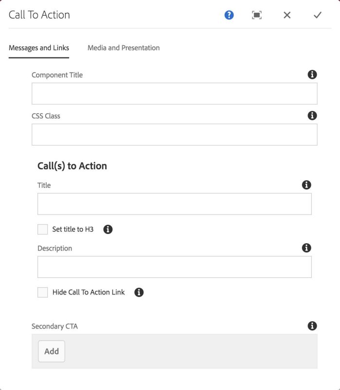
Call(s) to action
This section houses the primary message text, description, and link, and also the secondary calls to action. The user may have up to three calls to action: one primary, and two secondary.
Title: the primary message text, or title message.
Set title to H3: By default, the CTA uses an H2 html heading element for the title text. Sometimes the CTA may fall within the body column and under other page headings. In this case, for accessibility reasons, the title HTML must be adjusted for the document outline and assistive technologies.
Description: the optional descriptive text for the title message.
Hide Call To Action Link: Check this box to hide the Call To Action Link component that comes pre-packaged with the CTA.
Secondary CTA: any optional secondary calls to action. These have the same structure as the primary call to action but are visually distinct from it. Secondary CTAs provide a way for users to promote less important messages.
Call To Action component: Messages and Links tab

Media and Presentation
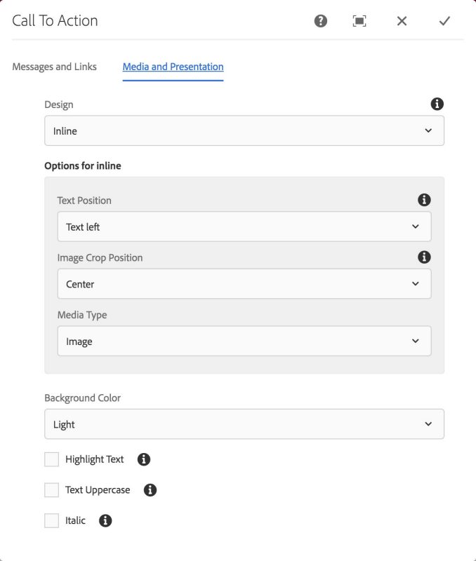
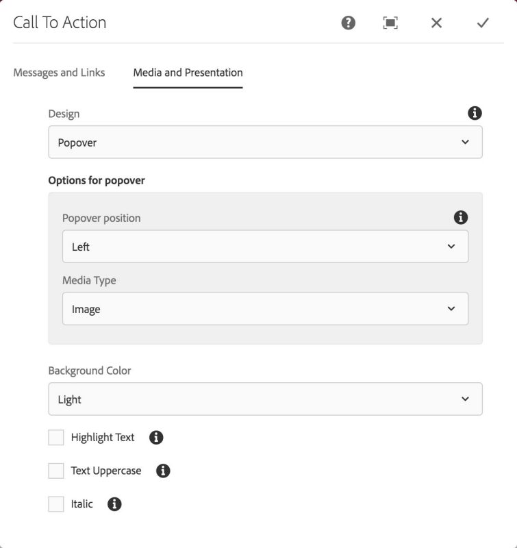
Design: choose between two different designs for the CTA.
- Inline (default) - 50/50 view of text and image
- Popover - Text is overlayed on top of the image
Inline Options
Text position: the user may swap the position of the text and the media.
Image crop position: Images are cropped and may be positioned in the center, right, or left, depending on the specific image subject matter.
Media type: the user may choose between an Adaptive Image component, an External Media component, or no media at all.
Popover Options
Popover position: controls the alignment of the text overlay area. Left, center, or right.
Media type: the user may choose between an Adaptive Image component, or no media at all. (External media component currently not supported in this design).
Miscellaneous Presentation Options
Background color: The user may choose between different color combinations.
Highlight text: the primary text may have a highlighted effect behind the text.
Text uppercase: force text to display in all capital letters.
Italic: force text to display in oblique or italic.
Call To Action component: Media and Presentation tab, inline design options

Call To Action component: Media and Presentation tab, popover design options

The Call To Action Component (CTA) is meant to bring the user’s focused attention to brief, but important, messages and entice the user to take actions. The primary use of this component is to be the first piece of content a user interacts with on a page.
Features
- Embeds the Call to Action - Link component and the Image component
- Customizable primary and description texts
- Optional, customizable secondary calls to action for a total of three calls to action
- Various design options including style, positioning, and theme
Dialog Properties
Messages and Links
Component Title- Title of ComponentCSS Class- CSS class to be applied to the componentTitle- The primary text for the CTASet title to h3- When checked, the title will use a Headling level 3 instead of a Heading level 2. For use when the CTA is mixed in with the body content and not the first content on the pageHide Call To Action Link- Removes the embedded CTA Link component
Secondary CTA
Up to two secondary CTAs may be added.
Title- The title of the secondary CTADescription- A description sentenceLink Text- The text for the linkAccessible Link Text- Text that will only be available to a screen reader. Useful if link text needs to be something like "Learn more"Link URL- the url for the link
Media and Presentation
Design- There are currently two design optionsInlinePopover
Background Color- The color of the background behind the textLightMaroon
Highlight Text- Creates a highlighted text effect behind the primary textText Uppercase- Changes the primary text to be all uppercaseItalic- Changes the primary text to be italicized
Options for Inline
Text Position- the order of the text and imageText left- Text is on the left, image is on the rightText right- Text is on the right, image is on the left
Image Crop Position- The alignment of the image under the cropCenter- cropped in the center of the imageRight- cropped to the right of the imageLeft- cropped to the left of the image
Media Type- What sort of media will be displayed in the CTAImage- uses an image component as the form of mediaVideo- uses an media external component as the form of mediaNone- removes the media from the CTA entirely
Options for popover
Popover Position- the alignment of the popover textLeft- Text is aligned to the leftCenter- Text is aligned in the centerRight- Text is aligned to the right
Media Type- two optionsImage- uses an image component as the form of mediaNone- removes the media from the CTA entirely
CSS Classes
- caption
- col-12
- col-lg-6
- col-sm-6
- d-flex
- embed-responsive
- embed-responsive-16by9
- fa-arrow-right
- far
- font-italic
- image-center
- light
- link-text
- maroon
- parbase
- row
- section
- text-uppercase
- vt-callToAction
- vt-callToAction-message
- vt-callToAction-message-description
- vt-callToAction-message-heading
- vt-callToAction-message-secondary
- vt-callToAction-message-secondary-container
- vt-callToAction-message-secondary-link
- vt-callToAction-message-secondary-link-description
- vt-callToAction-noMedia
- vt-callToAction-primary
- vt-callToAction-supplement
- vt-callToAction-supplement-fig
- vt-callToAction-supplement-fig-container
- vt-callToAction-textHighlight
- vt-callToAction-textLeft
- vt-callToAction-textRight
- vt-ctaLink
- vt-image
- vt-video
- vt-video-kaltura-player
- vt-vtcontainer
- vt_adaptive_img
- vt_large_img
- vtcta
- vtctalink


