

Media component
The Media component is used to provide an embedded player for small, My Assets hosted audio and video files. These files can be no larger than 300 MB or they will be deleted automatically by the system upon upload.
Video and audio content should be hosted externally via YouTube or via the Kaltura hosted media solution available at video.vt.edu and displayed using a Media - External component.
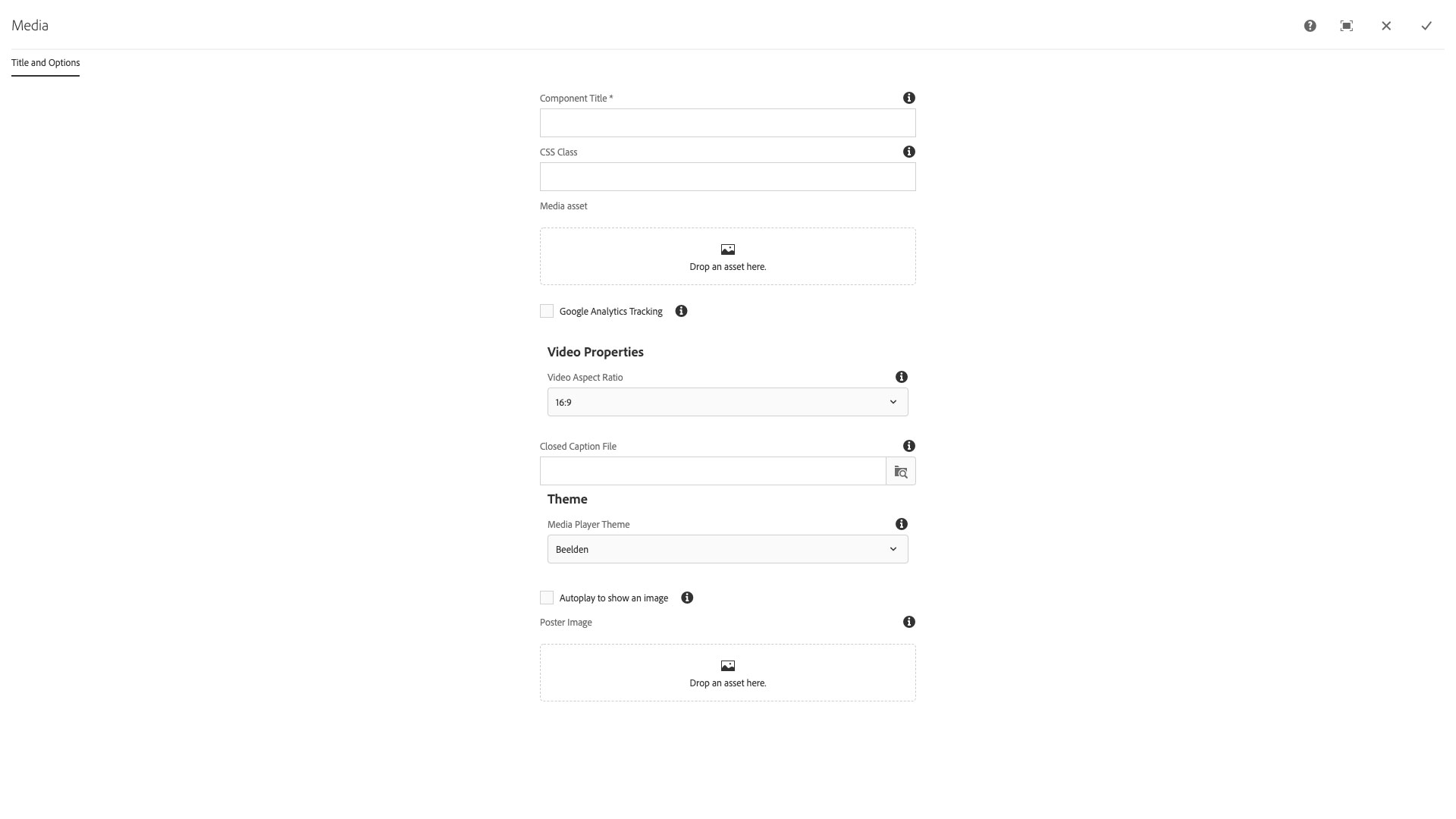
The Title and Options configuration dialog contains the following options:
- Component Title - text input field that does not display for this component but useful for giving the component a title for keeping track of what it is used for on the page
- CSS Class - text input field for custom CSS and/or utility classes
- Media asset - drop zone for digital media file from Assets sidebar
- Google Analytics tracking: checkbox used to toggle the tracking of video events using the Google Analytics
- Video Properties
- Video Aspect Ratio - select pulldown used to choose the aspect ratio for the video. Options include 16:9 (standard for web video); 4:3, 5:3, 1:1, 21:9, or 24:10
- Closed Caption file - text input and browse button used to add a /content/dam/... path to a closed caption file. These are normally formatted with a vtt extension.
- Theme
- Media Player Theme - select pulldown used to choose a theme for the video player.
- Autoplay to show images - checkbox to toggle use of javascript to play the video for a moment to load a poster image for the video once it is ready to play on the page.
- Poster image - drop zone for an image file from the Assets sidebar to be used as a Poster image when the video is ready to play on the page.
The Media component displays videos on a web page. It is intended to be used for videos that have been uploaded to the Asset library.
Features
- Aspect ratio selection
- Choose video from asset library
- Theme options
- Closed caption file upload
Dialog Properties
Title and Options
Component Title- Title of ComponentCSS Class- CSS class to be applied to the componentMedia asset- The video to play, provided by the asset libraryGoogle Analytics Tracking- Whether or not to include Google AnalyticsVideo Aspect Ratio16:94:33:25:31:121:924:10
Closed Caption File- Browse for the closed caption fileMedia Player Theme- The look and feel of the playerBeeldenBekleFiveGlow (default)RoundsterSevenSixStormtrooperVapor
Autoplay to show an image- Generate a poster image for the videoPoster Image- Create and apply custom poster image
CSS Classes
- embed-responsive
- embed-responsive-16by9
- embed-responsive-1by1
- embed-responsive-21by9
- embed-responsive-4by3
- media
- parbase
- section
- vt-video
- vt-video-player