

Text component
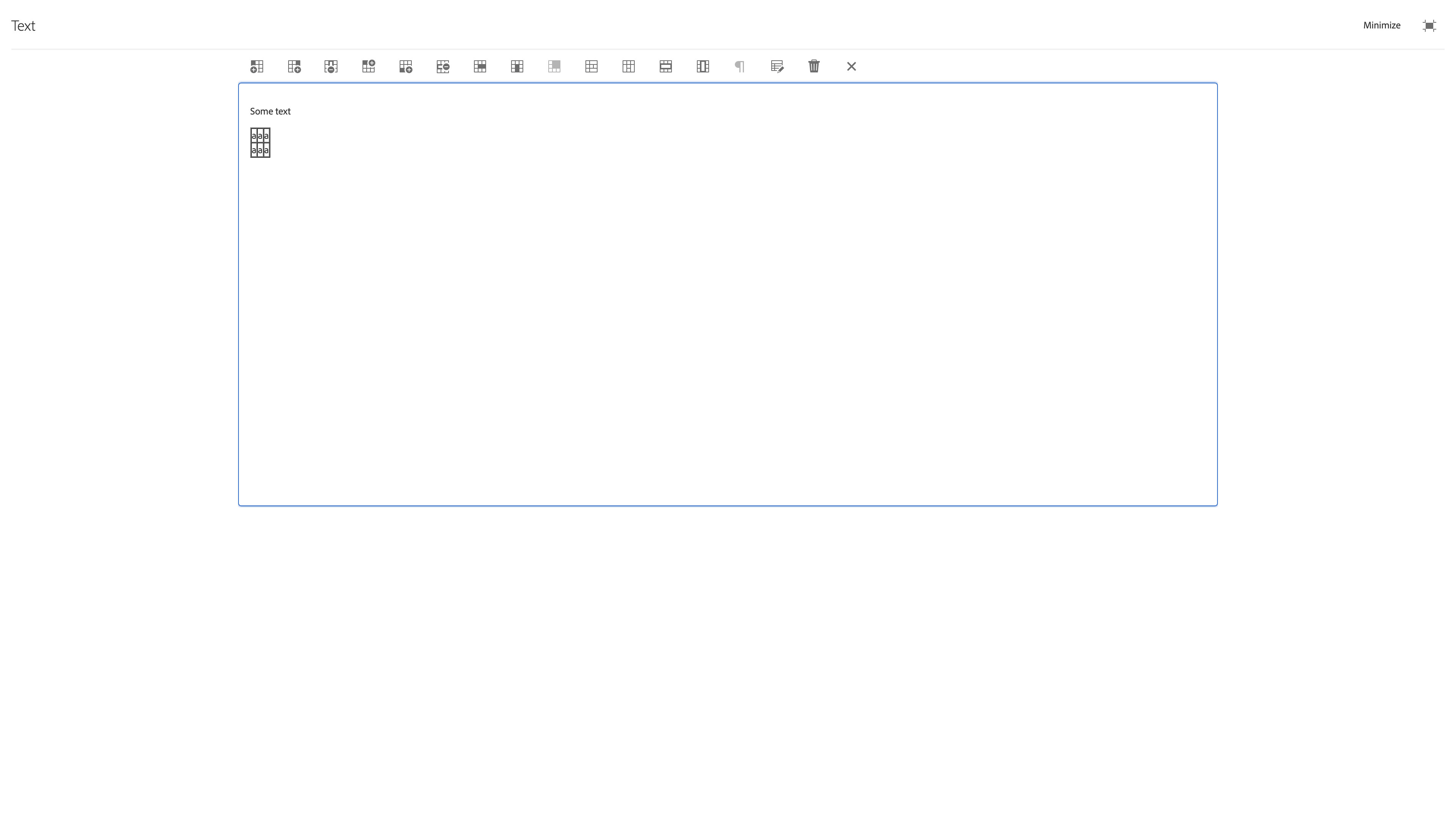
The Text component is used to place formatted text into any page. It has limited rich text features so text formatting relies heavily on the design template and any custom CSS in local assets.
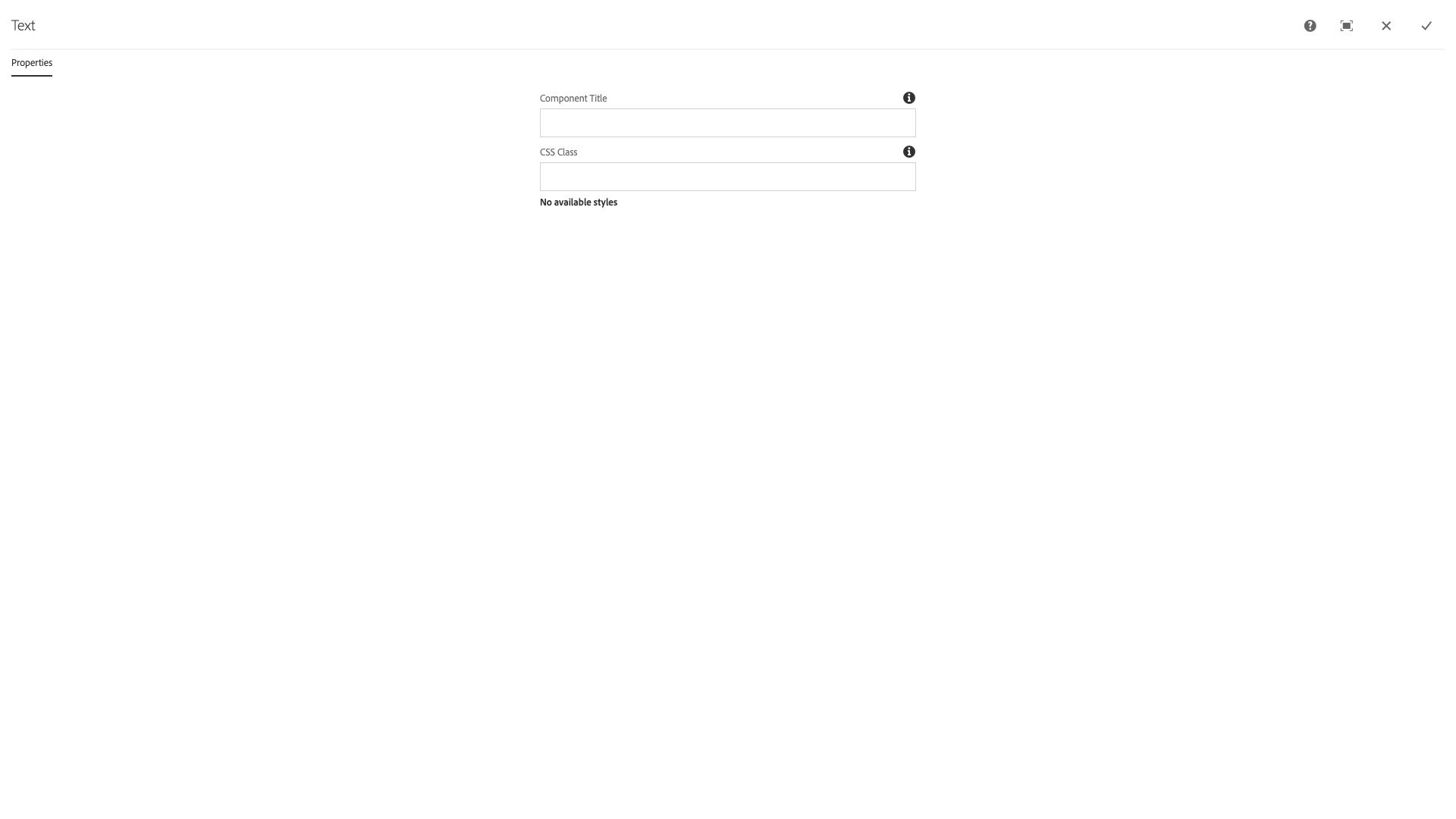
Title and Options
The Title and Options configuration dialog contains the following options:
- Component Title - text input field that does not display for this component but useful for giving the component a title for keeping track of what it is used for on the page
- CSS Class - text input field for custom CSS and/or utility classes
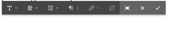
Inline Editor
The Inline Editor toolbar for the Text component contains the following tools and options:
- Text formatting menu - select Bold, Italic, Underline, Subscript, or Superscript text formatting options
- Text justification menu - select Left, Center, or Right text justification options
- Text list menu - select bulleted or ordered list options and indent and outdent list item options
- Text paragraph menu - select Paragraph and Headings 2 though 6 text formats
- NOTE: Do not use headings for text styling. They are for document context and must not be used for styling to avoid violating WCAG requirements.
- Hyperlink - button that opens hyperlink dialog
- Path - text input field for /content/... or https:// links to pages or assets
- Alt text - text input field for accessible alternative text for links if more context is needed for their destination to be understood
- Target - browser window target for the link behavior
- Unlink - unlink the selected text
- Expand - button that opens the expanded text editor
- Cancel and close - button that cancels all edits and closes the edit toolbar
- Save and close - button that saves all edits and closes the edit toolbar
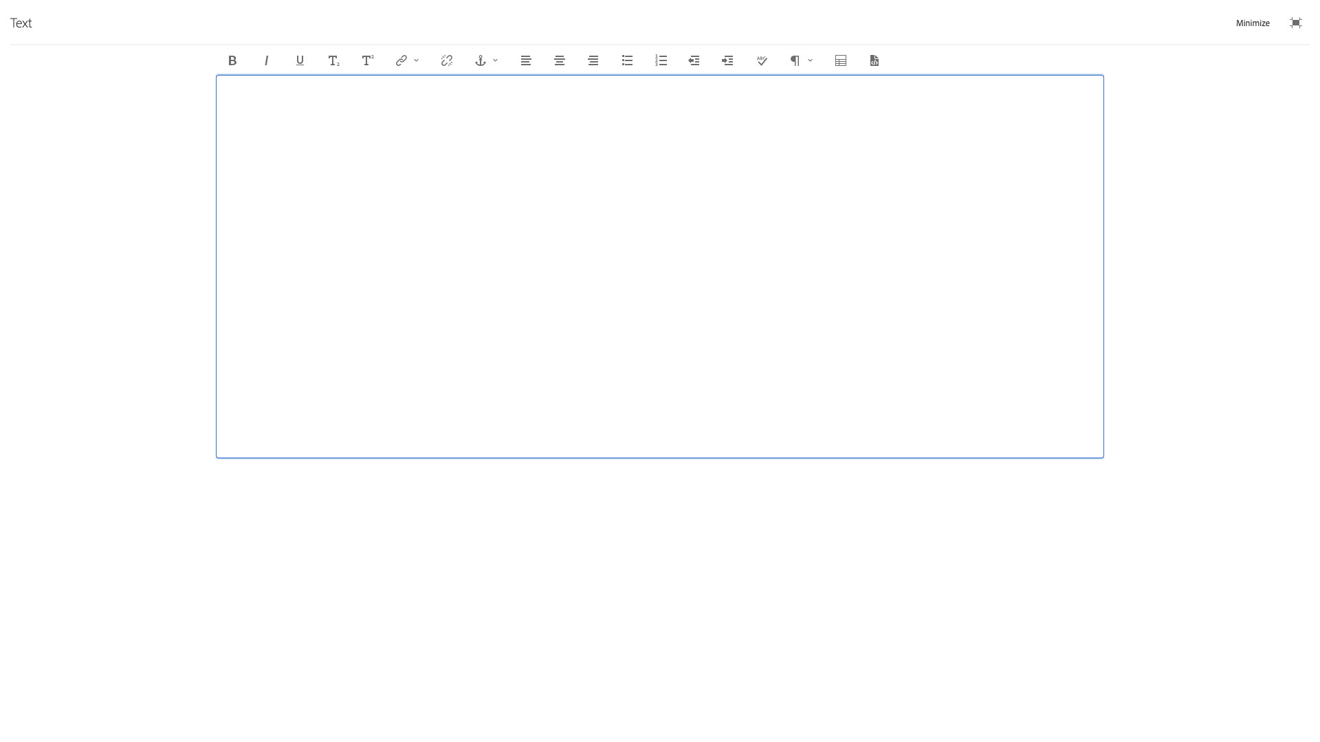
Expanded Editor
The Expanded Editor for the Text component contains the following tools and options:
- Bold - button to bold the selected text
- Italic - button to italicize the selected text
- Underline - button to underline the selected text
- Subscript - button to subscript the selected text
- Superscript - button to superscript the selected text
- Hyperlink - button that opens hyperlink dialog
- Path - text input field for /content/... or https:// links to pages or assets
- Alt text - text input field for accessible alternative text for links if more context is needed for their destination to be understood
- Target - browser window target for the link behavior
- Unlink - button to unlink the selected text
- Text anchor - button to open the text anchor naming dialog to insert text anchor at active cursor location
- Left - button to left justify selected text
- Center - button to cetner justify selected text
- Right - button to right justify selected text
- Bulleted list - button to convert selected text lines into a bulleted list
- Ordered list - button to convert selected text lines into an ordered list
- Outdent - button to outdent the current element
- Indent - button to indent the current element
- Spell check - button to check spelling of text contents
- Paragraph style - select pulldown for choosing paragraph and heading text styles
- Insert Table - button to open table insert dialog
- HTML view - button to view the HTML source of the text component.
- NOTE: not all HTML is supported by the component. Need to save changes in this view before exiting expanded editor.
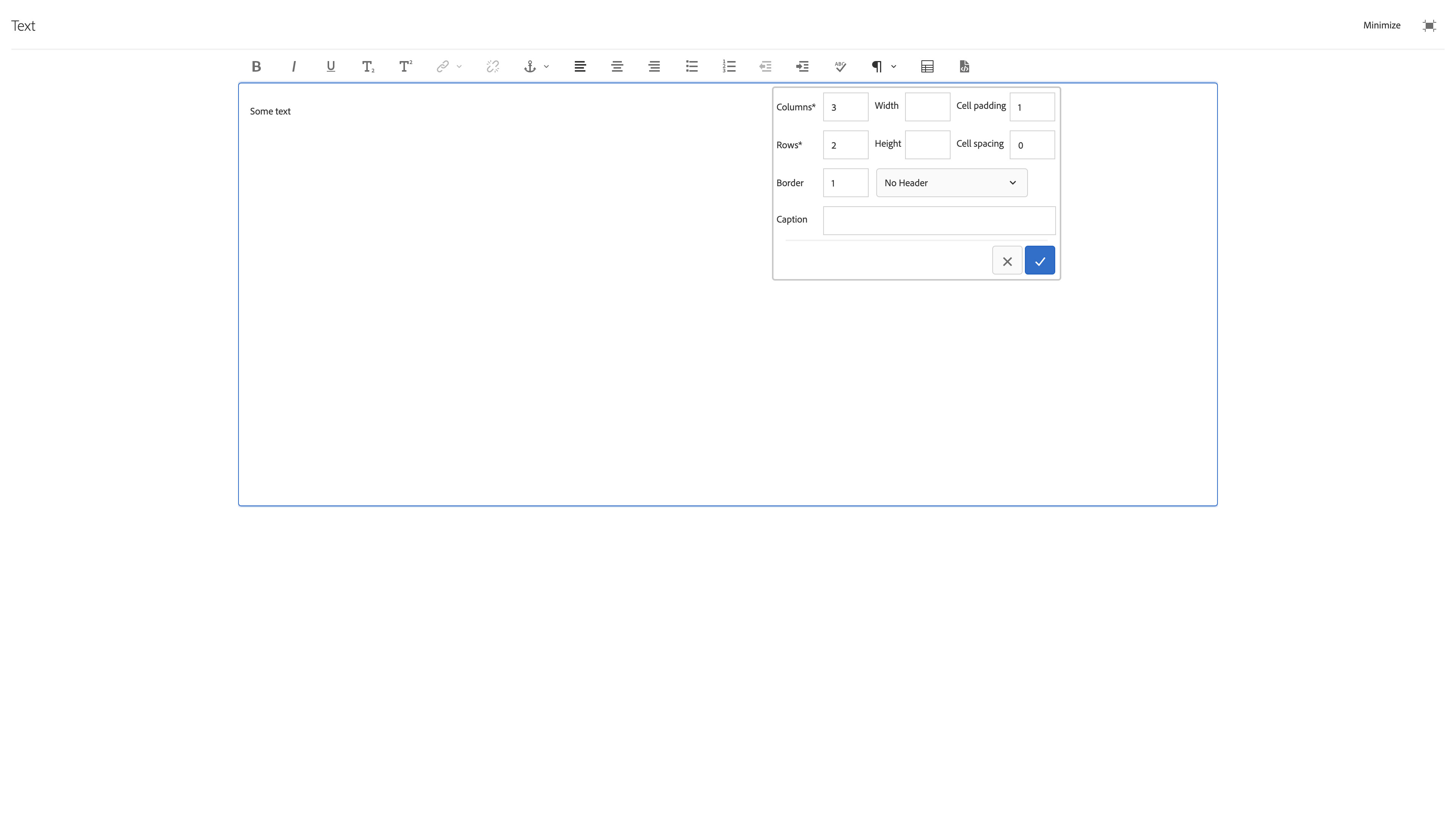
Expanded Editor Table Insertion dialog
The Expanded Editor Table Insertion dialog for the Text component contains the following options:
- Columns - text input field for number of table columns
- Width - text input field for table fixed width value in pixels
- Cell padding - text input field for table cell padding value in pixels
- Rows - text input field for number of table rows
- Height - text input field for table fixed height value in pixels
- Cell spacing - text input field for table cell spacing value in pixels
- Broder - text input field for table cell border width in pixels
- Header - select pulldown used to choose header position No Header, First row, First column, or First row and column
- Caption - text input field for required WCAG table caption, i.e., title of table
Expanded Editor Table Edit toolbar
The Expanded Editor Table Edit toolbar for the Text component contains the following tools and options. It is access by clicking the table insert icon when the text cursor is active inside a table cell.
- Insert Left - button to insert a cell to the left of the currently active cell(s)
- Insert Right - button to insert a cell to the right of the currently active cell(s)
- Delete Column - button to delete the entire column associated with the currently active cell(s)
- Insert Above - button to insert a cell above of the currently active cell(s)
- Insert Below - button to insert a cell below the currently active cell(s)
- Delete Row - button to delete the entire row associated with the currently active cell(s)
- Merge right - button to merge a cell or cells to the right of the currently active cell(s)
- Merge down - button to merge a cell or cells down from the currently active cell(s)
- Merge cells - button to merge a selected set of cells together
- Split cell horizontally - button to split a selected set of cells horizontally
- Split cell vertically - button to split a selected set of cells vertically
- Select entire row - button to select the contents of an entire row reltive to the currently active cell(s)
- Select entire column - button to select the contents of an entire column reltive to the currently active cell(s)
- Ensure Paragraph - button to insert a hard paragraph between the bottom of a table and the next bit of text
- Insert Table - button to open a table insertion diloag to embed a table inside a table cell
- Remove table - button to remove a selected table
- Exit Table Editing - button to exit the Table Editor toolbar
Creating inline anchors for internal linking
There are times when the text on a page gets quite long and you want to create internal links to sections of text on a single page to minimize scrolling. This can be achieved by creating anchors within the page and then linking to those anchors.
1. Insert Text Component on the page
2. Go to full text editor view by clicking on the fullscreen/expand icon ( )
)
3. Add text as needed, click on where you want the anchor placed
4. Click on the Anchor icon and give the anchor a name (eg., link1)
5. Select the text that you want linked to the anchor and click on the Link icon
6. For the link, type in #[anchor name] (eg., #link1)
7. Return to the in-place text editor by clicking on the exit fullscreen/shrink icon ( )
)
8. Click on the check mark icon to save the text changes
The text component features an editor tool that allows you to type content or place it from a clipboard using the copy/paste function in your browser.
Features
- Rich text editing, including text formatting, lists, hyperlinking, etc.
- Direct access to the output HTML
- Table building with UI
Text editing
The image may be edited in-line after choosing it from the dialog properties and clicking the pencil icon.
Edit Options
Text formattingBoldItalicUnderlineSubscriptSuperscript
JustifyLeftCenterRight
Lists- create a bulleted or numbered listBullet ListNumbered ListOutdentIndent
Paragraph formatsParagraphHeading 2Heading 3Heading 4Heading 5Heading 6BlockquoteQuote
Hyperlink- becomes activated after typing in the componentPath- browse for a page or copy/paste a urlAlt text- if link needs accessible textTarget- where the link opensSame TabNew TabParent FrameTop Frame
CancelConfirm
UnlinkFullscreenTable- build a table with UIColumnsWidthCell paddingRowsHeightCell spacingBorderHeader selectNo headerFirst rowFirst columnFirst row and columnCaptionCancelConfirm
Source edit- directly edit the HTML of the text component output
CancelConfirm
Dialog Properties
Properties
Component Title- Title of ComponentCSS Class- CSS class to be applied to the component
CSS Classes
- parbase
- section
- text
- vt-text