

Image component
The Image component is used to place images on a page.
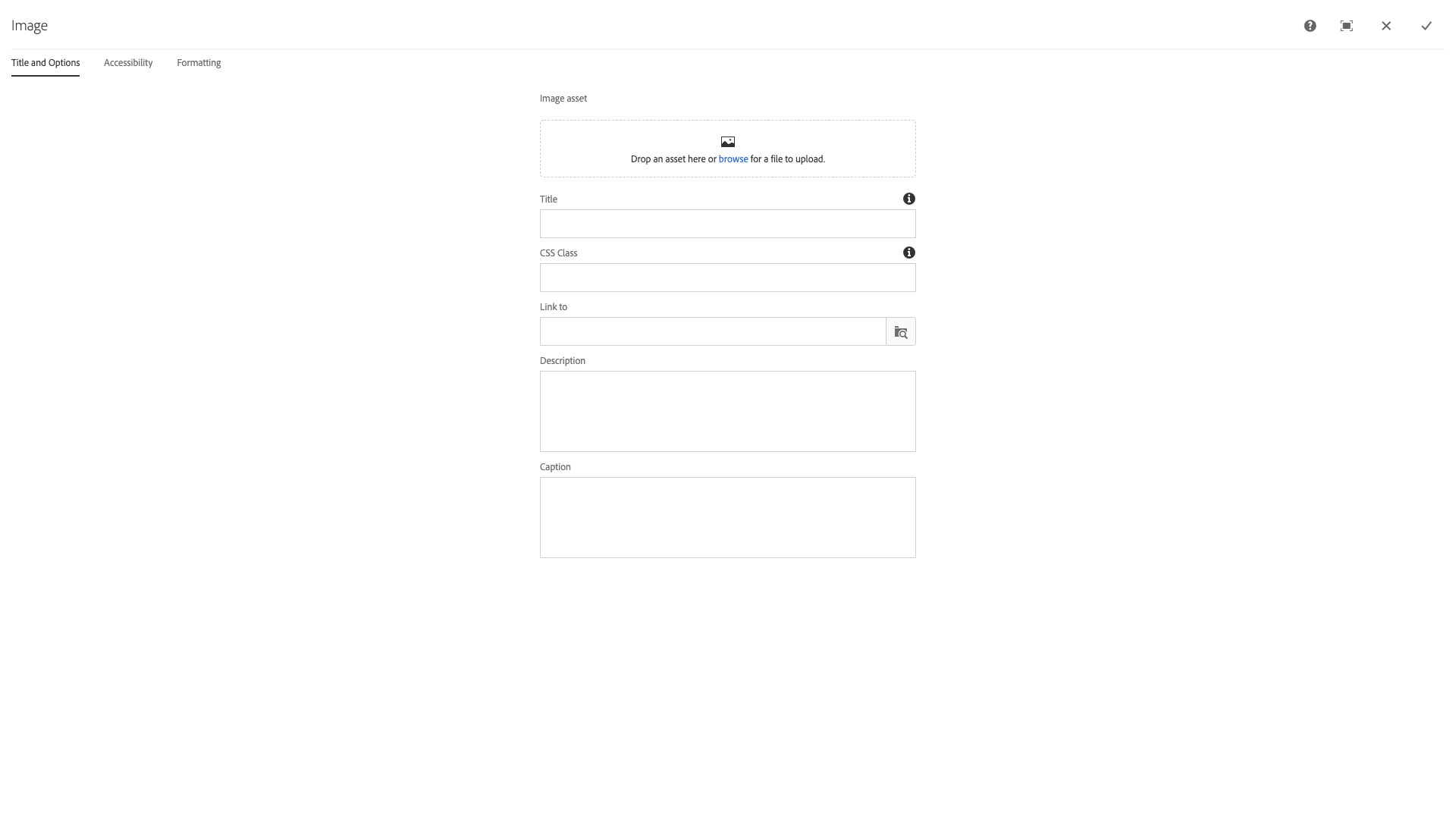
The Image configuration dialog contains the following options:
- Image asset - drop zone for drag and drop of images from the Assets sidebar
- NOTE: Do not use the browse function to upload assets directly to the component.
- Component Title - text input field that does not display for this component but useful for giving the component a title for keeping track of what it is used for on the page
- CSS Class - text input field for custom CSS and/or utility classes
- Link to - text input field to link a page to the image; link can be a /content or https:// link type
- Description - textare input field for a description of the image; this field does not display in a page
- Caption - textare input field for an image caption
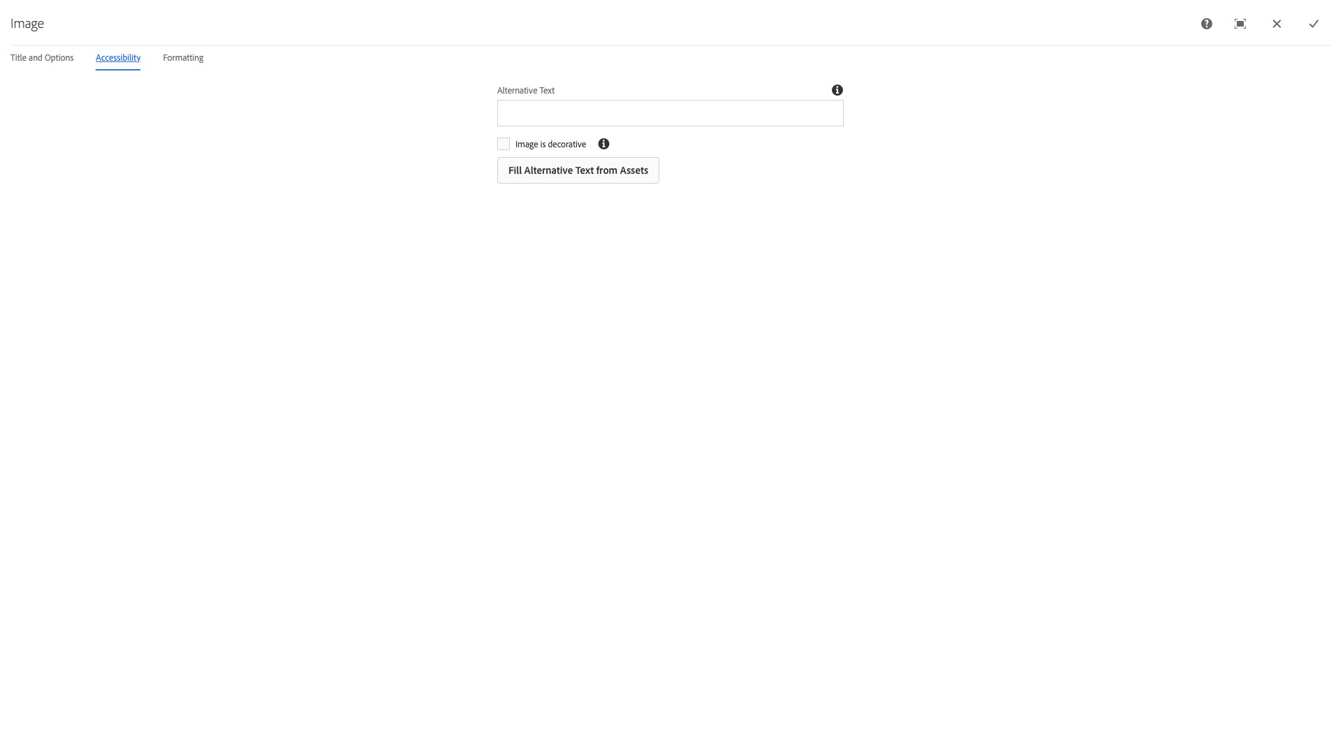
The Accessibility configuration dialog contains the following options:
- Alternative text - text input field for accessible alternative text descriptions of the image
- NOTE: Alternative text is required for non-decorative images and must be a brief description of the image contents. Avoid using text in images or images that are complex diagrams as they will require long descriptions if their content is not explained by other text on the page.
- Image is decorative - checkbox for images that do not contain information relative to the page and are purely decorative, e.g., a decorative stencil image being used to separate sections of a page
- Fill Alternative Text from Assets - button used to fill the alternative text field from the image properties
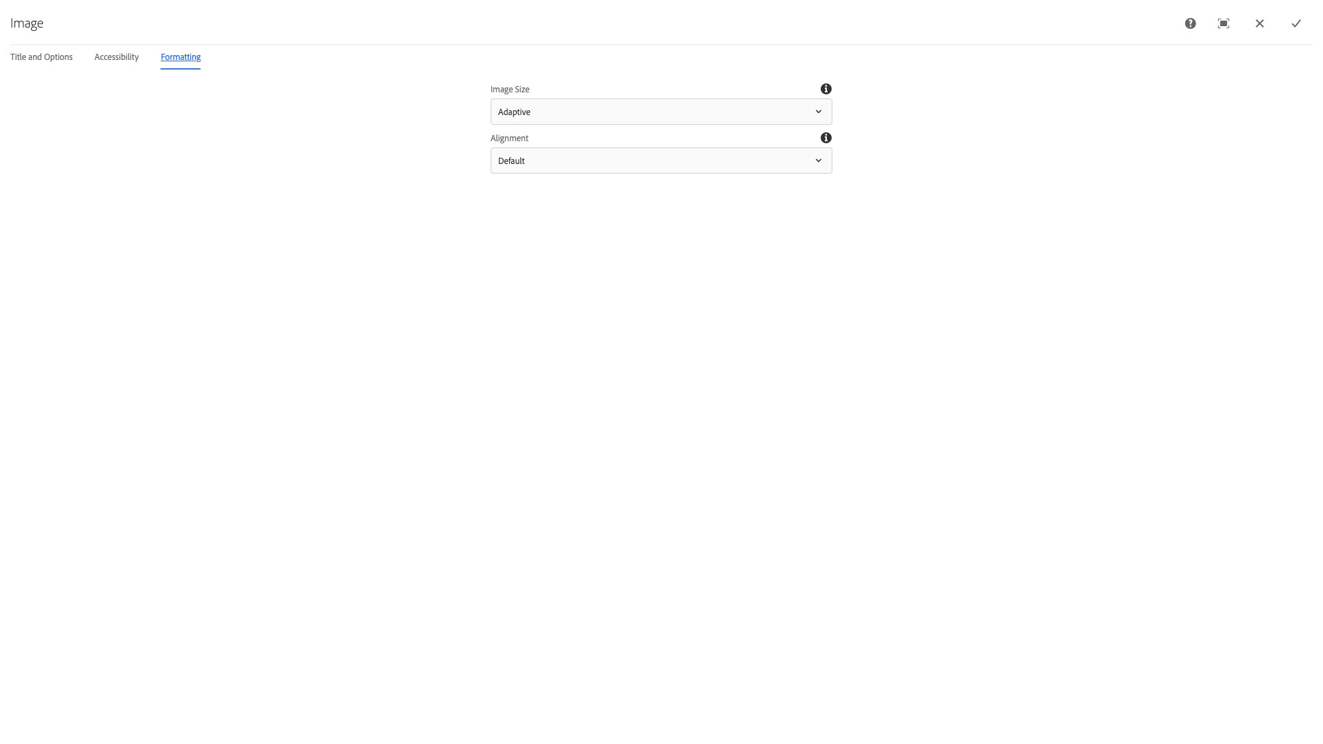
The Formatting configuration dialog contains the following options:
- Image Size - select pulldown to set the image size is used; Adaptive, Thumbnail, Small, Medium 240, Medium, Large (original size)
- NOTE: Using a size other than Adaptive will break page responsiveness. If an image needs to appear at a specific size, you can select a pre-determined size from the pull-down menu. The sizes are:
- Thumbnail: 52x52
- Small: 185 pixels wide
- Medium 240: An image that's 240 pixels wide
- Medium: 490 pixels wide
- Large (original size): The image at the size it was uploaded.
- NOTE: Using a size other than Adaptive will break page responsiveness. If an image needs to appear at a specific size, you can select a pre-determined size from the pull-down menu. The sizes are:
- Alignment - select pulldown to set the image alignment relative to the page; Center, Left, or Right
Editing an image
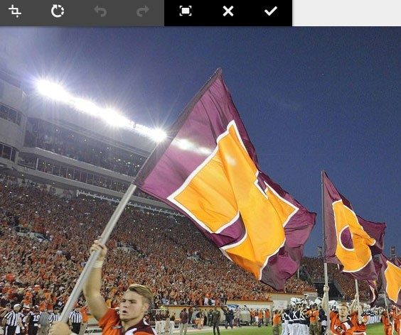
Once in place on the page, click the image to see the component toolbar.
Click the pencil icon to crop, rotate, or flip the image.
Note: Any changes made to the image will apply to this page only. Edits made on a page will not affect the original image in the Asset library.
Once edits have been made (if any), click the check mark to save changes.
This component inserts an image onto the page. It affords image editing as well as the configuration of certain properties and styles. Images can be sourced from Ensemble's asset library or from the user's computer directly.
Features
- Basic image editing
- Accessibility enforcement
- The image can be a link
- Various size and positioning configuration options
- Automatic image quality adjustments with the adaptive image option
- Custom text description and caption
Image editing
The image may be edited in-line after choosing it from the dialog properties and clicking the pencil icon.
Edit Options
CropRotate- Clockwise rotationUndo- Undo the most recent editRedo- Redo the most recent editEnable full screen- Launches a full screen editor with more options- Map functions not working at present ( 08/2020 AEM 6.4.60.6 )
Reset Zoom- If the user has zoomed into the image, reset to the default view
Zoom- Opens a slider control to zoom in or out withX- Cancel editsCheckmark- Confirm edits
Dialog Properties
Title and Options
Image asset- Browse for an image file on your computer or drag one over from the digital asset libraryComponent Title- Title of ComponentCSS Class- CSS class to be applied to the componentLink to- Renders the image as a link to another pageDescription- A short paragraph of text describing the imageCaption- A short sentence that will serve as the caption of the image
Accessibility
Alternative Text- a short sentence providing a description of the contents of the image. This will be used by screen reader software to assist visually impaired individualsImage is decorative- if an image serves no meaningful purpose (i.e. is an icon or symbol, or does not provide any real content to the user) then this option will hide it from screen reader softwareFill Alternative Text from Assets- This option will fill theAlternative Textfield with the alt text or title from the asset in the asset library
Formatting
Image Size- Choose the size of the imageAdaptive- Automatic image quality adjustments based on screen widthThumbnail- The smallest image sizeSmall- Forces the width to be a smaller sizeMedium 240- Forces the width to be 240 pixelsMedium- Forces the width to be a medium sizeLarge- The image loads in its original size
Alignment- the horizontal positioning of the imageDefault- For use with the adaptive image format. The adaptive image cannot be alignedCenterLeftRight
CSS Classes
- adaptiveimage
- caption
- center-block
- clearfix
- image
- img240
- img490
- parbase
- pull-left
- pull-right
- section
- vt-image
- vt-image-caption
- vt-image-desc
- vt_adaptive_img
- vt_img
- vt_img_center
- vt_img_left
- vt_img_right
- vt_large_img
- vt_medium_img
- vt_small_img
- vt_thumb_img