

Download component
The Download component allows digital assets within My Assets to be linked for download by site visitors. Digital assets can also be downloaded via Text component or Call To Action Link components.
The Title and Options configuration dialog contains the following options:
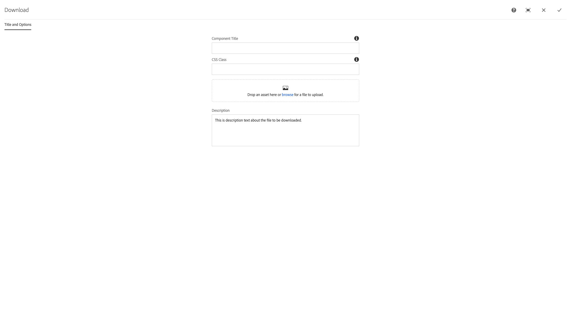
- Component Title - Replaces the component title displayed at the top of the compoent; default is pulled from asset Title property field
- CSS Class - text input field for custom CSS and/or utility classes
- A drop zone to drag and drop assets from the Assets sidebar
- NOTE: Do not upload digital assets directly to the component.
- Description - textarea input for a brief description of the linked asset
NOTE: The filename is displayed "as-is" so the user will be able to find it and make sure they have the correct file after they download. Please make your file names descriptive, but as brief as possible. Use the same filename on the web for recurring information, i.e., don't use eventName_schedule_202X.pdf for the event that ocurrs every year as this will create a search nightmare for your users. You can manage info locally that way, but the file displayed to the user should be the same every occurence, same for pages.
The Download component provides a handy link to download files, image, and other assets. This is great for posting meeting minutes, policy documents, PDFs, and any other item that may need to be distributed on an as-needed basis.
Features
- Automatic detection for certain filetypes
- A description of the file's contents may be provided
- A large, prominent button is displayed for the file
Dialog Properties
Title and Options
Component Title- Title of ComponentCSS Class- CSS class to be applied to the component- File upload area
Description- The textarea to enter the description
CSS Classes
- cat
- cq-dd-file
- csv-document
- doc-document
- docx-document
- download
- download-description
- download-filename
- download-info
- download-link
- download-title
- excel-xlsx-document
- fa
- fa-arrow-to-bottom
- icon
- parbase
- pdf-document
- section
- type_csv
- type_doc
- type_docx
- type_jpeg
- type_mp3
- type_pdf
- type_xls
- type_xlsx
- vt-download
- xls-document