

Container Component
The Container component gives site creators the ability to add <DIV> containers to the page. The container can contain one or more other components. The Container component also allows for some static CSS properties to be set for the container and some inherited styles for other components like font or text color.
The Container is also vital to developing custom widgets using custom CSS classes and local or global assets.
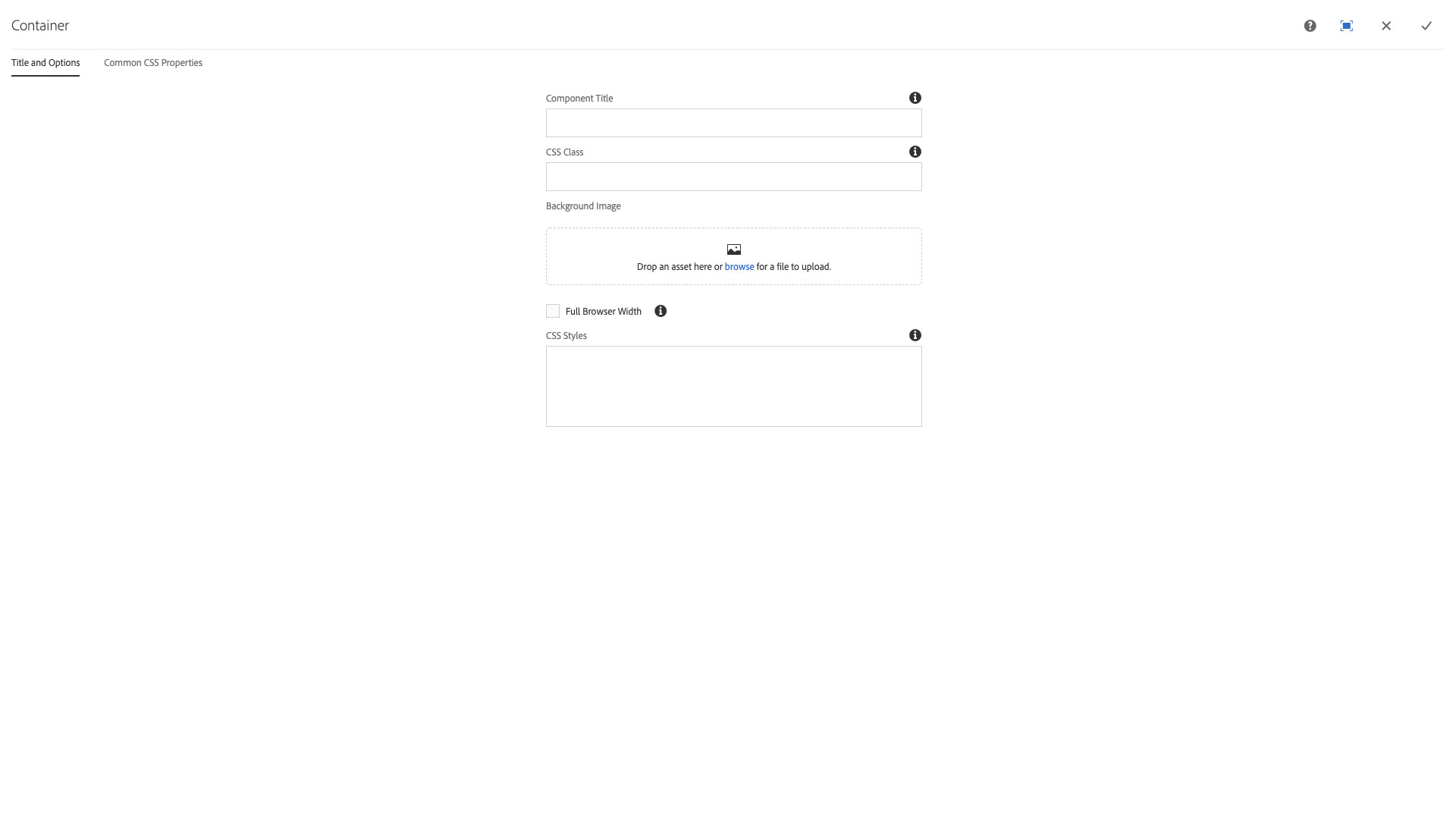
The Title and Options configuration dialog contains the following options:
- Component Title - text input field that does not display for this component but useful for giving the component a title for keeping track of what it is used for on the page
- CSS Class - text input field for custom CSS and/or utility classes
- Background Image - drop zone for images to be added to the background of a container from the Assets sidebar
- NOTE: Do not use the browse option to upload directly to the component.
- Full Browser Width - checkbox that sets the container to full browser window width, overriding any page margins or padding
- CSS Styles - textarea input for CSS properties to be applied to the container, some of which can be inherited to other components like font and other text properties using !important
- NOTE: Does not support media queries, only CSS properties for a single element.
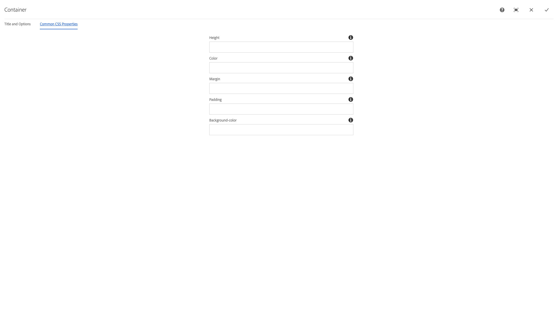
The Common CSS Properties configuration dialog contains the following options:
- Height - text input field to set a fixed height for the container
- Color - text input field to set the foreground color for the container that may override other components with !important
- Margin - text input field to set the margins of the container component, uses the combined margin syntax of top, right, bottom, left values
- Padding - text input field to set the padding of the container component, uses the combined margin syntax of top, right, bottom, left values
- Background-color - text input field used to set the background color of the component
This component affords the ability to add extra "containers" (specifically <div> elements) to a page. These containers may contain other components. Containers are customizable with CSS, and allow for the easy manipulation of common CSS properties.
Features
- Custom background images
- Can be stretched to the full width of the page
- Supports custom CSS
- Allows for easy editing of common CSS styling
Dialog Properties
Title and Options
Component Title- Title of ComponentCSS Class- CSS class to be applied to the componentBackground Image- Browse for an image to use as a background for the containerFull Browser Width- Force the container to stretch the full width of the windowCSS Styles- Any custom CSS needed for the container. This will be inserted on the page in a<style>block, and will override any values put into theCommon CSS Propertiestab
Common CSS Properties
Height- The height of the container (e.g. "100px")Color- The text color within the container (e.g. "#ffffff")Margin- The outer spacing around the container, from top, right, bottom, left in that order (e.g. "5px 5px 5px 5px")Padding- The inner spacing of the container, from top, right, bottom, left in that order (e.g. "5px 5px 5px 5px")Background-color- The background color of the container (e.g. "#ffffff")