

Authored Content List component
The Authored Content List component is used in conjunction with Article pages that have authors associated with them under the Article Info tab in their page properties. This component will list all associated articles with a particular author.
This component has similar configuration options to the standard List component, without the options for how to build the list, e.g., fixed, tags, search, etc. The Authored Content List component was specifically developed for the VTx site, but can be used to find content by author in any site in the CMS.
The List Properties configuration dialog contains the following options:
- Component Title - text input field that does not display for this component but useful for giving the component a title for keeping track of what it is used for on the page
- CSS Class - text input field for custom CSS and/or utility classes
- Order by - select pulldown used to choose what page information to use to order the pages being displayed in the list, Filename, Title, Created Date, On Time, Last Modified, and page Template are the available options
- Sort order - select pulldown used to set ascending or descneding methods to the Order by configuration
- Limit - number field used to set the maximum number of returned pages for an author
- Include Hidden Pages - checkbox to include pages in the list that have the Hide in navigation option turned on in their page properties
- Offset - number field that sets the starting point of returned page results to be listed
- Paginate after - number field used to set the number of viewable results before paginating

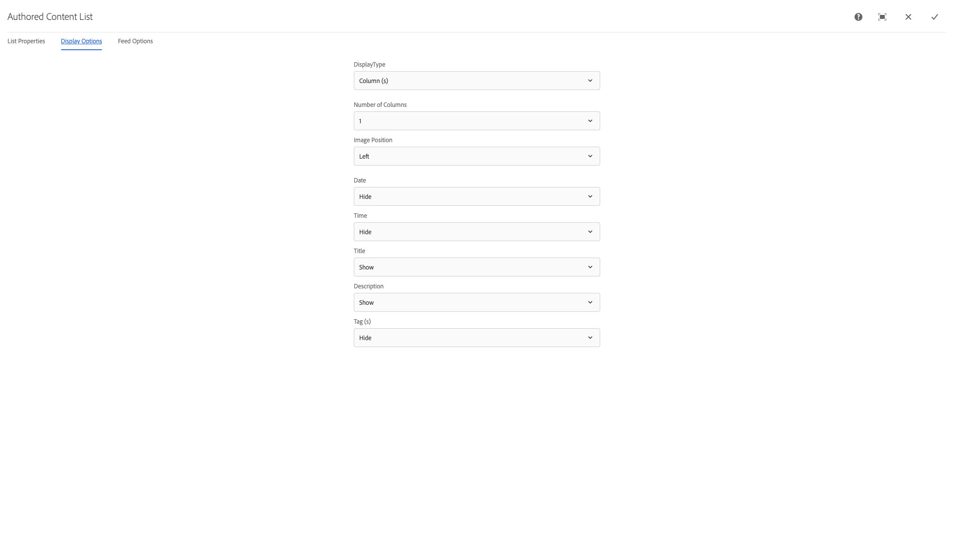
The Display Options configuration dialog contains the following options:
- Display Type - select pulldown to choose between columnar and table formatting for list items
- Number of Columns - select pulldown to choose the number of items per row; 1, 2, 3, 4, or 6
- Image Position - select pulldown that contains the placement (and size) options for image display; Top, Bottom, Left, Left (Medium), Left (Large), Right, Right (Medium), RIght (Large), or Hide
- NOTE: The Medium and Large options should be avoided as they will break the responsiveness of the display.
- Date - select pulldown to choose to display the page's last publication date or on time if set with formatting options
- Time - select pulldown to choose to display the page's last publication time or on time if set with formatting options
- Title - select pulldown to choose to display the page's title or to hide it
- Description - select pulldown to choose to display the page's page properties description or to hide it
- Tags - select pulldown to choose to display the page's tags or to hide them
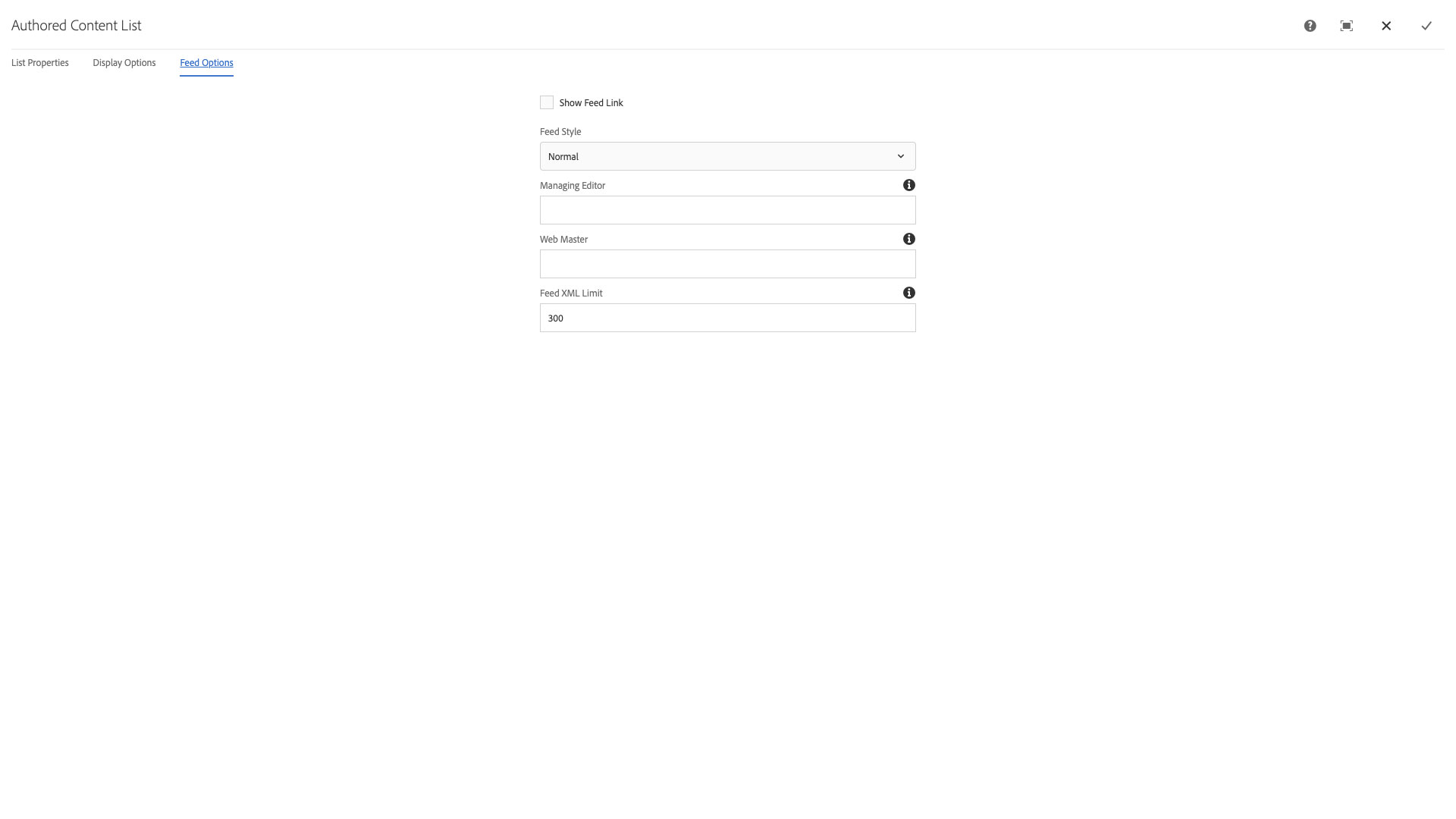
The Feed Options configuration dialog contains the following options:
- Show Feed Link - checkbox to set whether a RSS feed link is displayed at the top of the list view in the published page
- Feed Style - select pulldown to choose to display default feed options or to display only the items' title and description in the feed
- Managing Editor - text input field to set a person as the feed manager in the RSS feed results
- Web Master - text input field to set a person as the web master for a site in the RSS feed results
- Feed XML Limit - text input field to set the maximum number of items in an RSS feed
CSS Classes
- caption
- col-12
- col-lg-6
- col-sm-6
- d-flex
- embed-responsive
- embed-responsive-16by9
- fa-arrow-right
- far
- font-italic
- image-center
- light
- link-text
- maroon
- parbase
- row
- section
- text-uppercase
- vt-callToAction
- vt-callToAction-message
- vt-callToAction-message-description
- vt-callToAction-message-heading
- vt-callToAction-message-secondary
- vt-callToAction-message-secondary-container
- vt-callToAction-message-secondary-link
- vt-callToAction-message-secondary-link-description
- vt-callToAction-noMedia
- vt-callToAction-primary
- vt-callToAction-supplement
- vt-callToAction-supplement-fig
- vt-callToAction-supplement-fig-container
- vt-callToAction-textHighlight
- vt-callToAction-textLeft
- vt-callToAction-textRight
- vt-ctaLink
- vt-image
- vt-video
- vt-video-kaltura-player
- vt-vtcontainer
- vt_adaptive_img
- vt_large_img
- vtcta
- vtctalink