

Call to Action Link Component
The Call to Action Link component gives site creators the ability to add a link that looks like a button or to add a behavior to a page.
The link can be styled in various different ways based on the selected properties.
The Title and Options configuration dialog contains the following options:
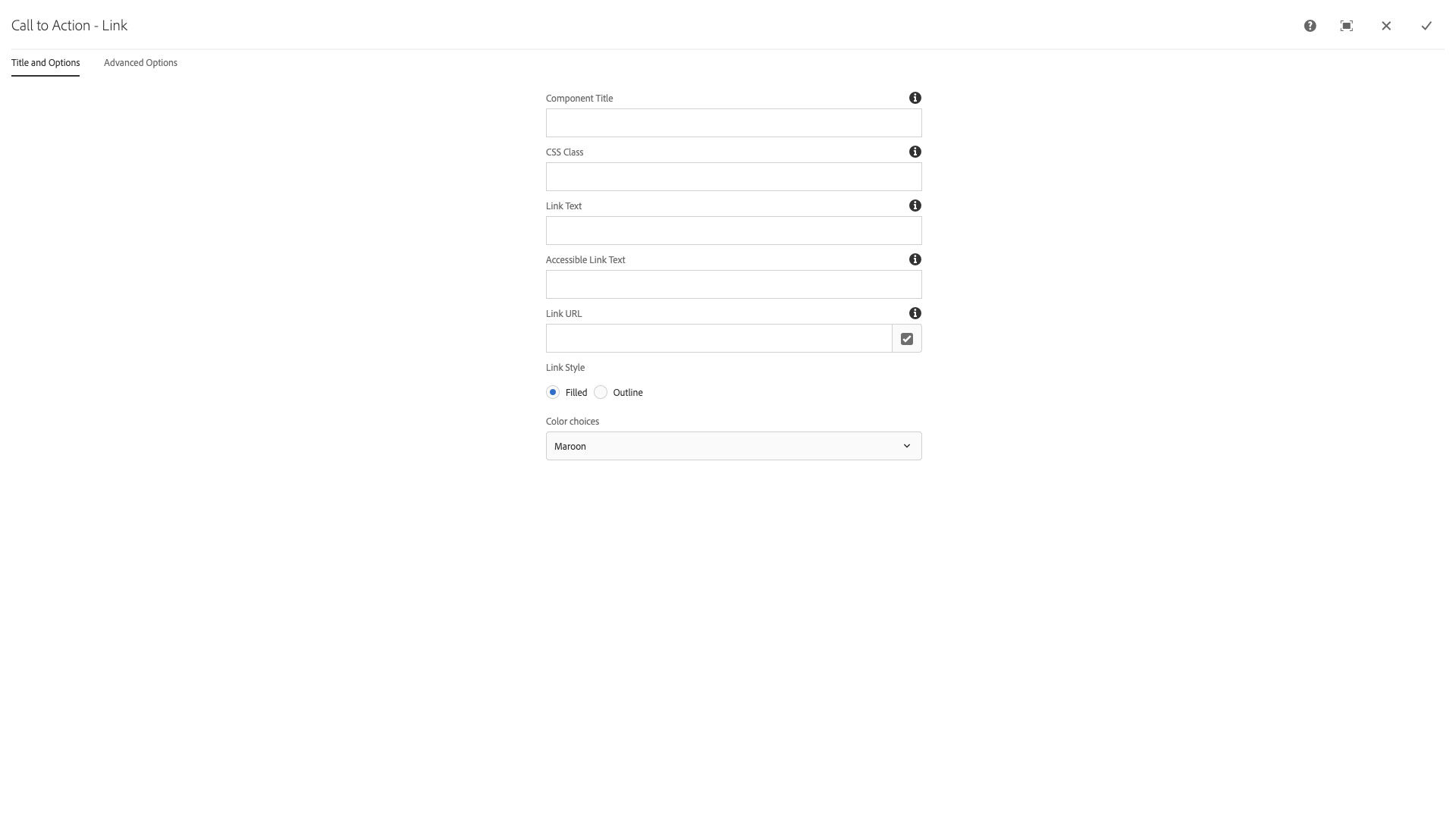
- Component Title - text input field that does not display for this component but useful for giving the component a title for keeping track of what it is used for on the page
- CSS Class - text input field for custom CSS and/or utility classes
- Link Text - text input field for setting the text that appears within the button
- NOTE: Do not type text in all uppercase as some screen readers will read that as an acronym and not words.
- Accessible Link Text - text input field for setting additional link text context to meet WCAG requirements; e.g., if the Link Text field is "Learn more", then additional accessible text may be needed to provide proper context for what the user would learn more about if they clicked the link, "Learn more about how to apply for undergarduate admissions"
- Link URL - text field that contains a /content, https:// link or a javascript function
- Link Style - radio button choices for a filled or outline based appearance
- Color choices - select pulldown to choose Maroon, Orange, Dark, or Light color options
The Advanced Options configuration dialog contains the following options:
- Alignment - select pulldown to choose Left, Center, Right, or Inline alignment options for the link
- Font Family - select pulldown to choose which brand font to use for the link text
- Opacity - select pulldown to control the opacity/ttransparency of the link; None, 60%, 70%, 80%, or 90%
- Shadow - checkbox to set a drop shadow on the link
- Text Uppercase - checkbox to set the link text display to all uppercase
- NOTE: Do not type text in all uppercase as some screen readers will read that as an acronym and not words.
- Full Width - checkbox to style the link to stretch across all available space horizontally

The Call to Action Link gives site creators the ability to add an eye-catching link to the page. These links are meant to entice users to take an action, such as applying, visiting, donating, or requesting information, among other uses.
Features
- Custom link text
- Design options including placement, color, style, font, etc.
- Custom accessible label
Dialog Properties
Title and Options
Component Title- Title of ComponentCSS Class- CSS class to be applied to the componentLink Text- The display text of the linkAccessible Link Text- Text that will only be available to a screen reader. Useful if link text needs to be something like "Learn more"Link URL- The url for the linkLink Style- The general style theme of the linkFilled- A solid fill background colorOutline- A strong, colored border and text, but no background color
Color choices- There are several color optionsMaroonOrangeDarkLight
Advanced Options
Alignment- Snaps the link to a certain positionLeft- align link to the left edge of the rowCenter- align link to the center of the rowRight- align link to the right edge of the rowInline- link will flow with other elements on the same line
Font Family- Several font choices are availableGineso Condensed- Condensed sans-serifAcherus Grotesque- Normal sans-serifCrimson Text- Normal serif
Opacity- The translucence of the link, measured in percentagesNone60%- 60% visible70%- 70% visible80%- 80% visible90%- 90% visible
CSS Classes
- acherus
- btn-shadow
- btn-transparency-60
- btn-transparency-70
- btn-transparency-80
- btn-transparency-90
- crimson
- d-flex
- dark
- gineso
- inline
- justify-content-center
- justify-content-end
- justify-content-start
- light
- maroon
- opacity-60
- opacity-70
- opacity-80
- opacity-90
- orange
- outline
- parbase
- section
- uppercase
- vt-ctaLink
- vtctalink
- w-100