

One Theme Documentation
Prologue
This documentation will change and grow over time.
Known issues
The One theme has some known issues with work arounds. This section of the document discusses those issues and how to fix them.
NOTE: The One theme uses a customized version of Bootstrap 4. You will need to work around those customizations when doing something beyond using prebuilt options.
Problem:
There are pages showing up in breadcrumbs and the Explore menu that have not been published and are not linked.
Why:
This happens when a sub page is published, but the parent page is not.
Solution:
The solution is to publish the parent page with hide in nav selected on the parent page.
The One theme processes tables of information created in the Text component so they will appear better on mobile devices and have better attributes for screen readers. Tables being used for layout purposes will experience issues. It is not recommended to use tables for layout purposes as this practice is not good for people that use assistive technologies to view web pages. If you are unsure how to format information on a page in the CMS without using a table, please file a JIRA ticket using the "Request CMS Support" button in the bottom right-hand corner of the browser window on this web site and someone will contact you to help with your layout issue.
There is an issue with FontAwesome icons in Text components that will make the component uneditable via the Expanded text editing interface inside the author interface after they have been inserted. You should not use FontAwesome icons in the Text component. If you need to use them please use the HTML component for the icons and any associated text.
UPDATE (09/19/2018): A fix for this was merged to the production server that will deactivate FontAwesome icons in the Edit mode within Ensemble. They will appear in Preview and in published pages and you will still be able to add them within a Text component via the HTML view. Please note that we are using FontAwesome 5 Pro, so you will need to use the classes for that version of FontAwesome, e.g., class="fab fa-facebook".
Bio pages in the One theme have been updated to accommodate square (1:1) and portrait (1:>1) aspect images due to their predominant use. If you have landscape (>1:1) images in your site's Bio pages you will need to recrop those images to either square or portrait aspects for them to display properly in this theme.
Due to significant differences in the features of the home page templates between Moss and the One theme these pages will need to be redone during the transition from Moss to One. This isn't just "index" home pages, but any page using the Generic Home Page template. We apologize for the inconvenience.
Switching site design theme
The process for switching the site design to the One theme is manual and is detailed below. If you encounter any issues you can easily change the site back to the Moss theme before publishing the site level page using the instructions below and substituting Moss for One. The site will not switch until you have published the site level page, but all pages will gain the One theme in the authoring environment instantly. Make sure your content contributors know you are doing this change and that it will not affect live pages, or pages that need to be changed before the site level is published. That means, until the site level is published all pages under it that are published will still have the old theme.
As noted above under Known Issues, Generic Home Page template pages will need to be redone when switching to the One theme.
1. Click the checkbox next to the site name in the My Sites view
2. Click the View Properties button
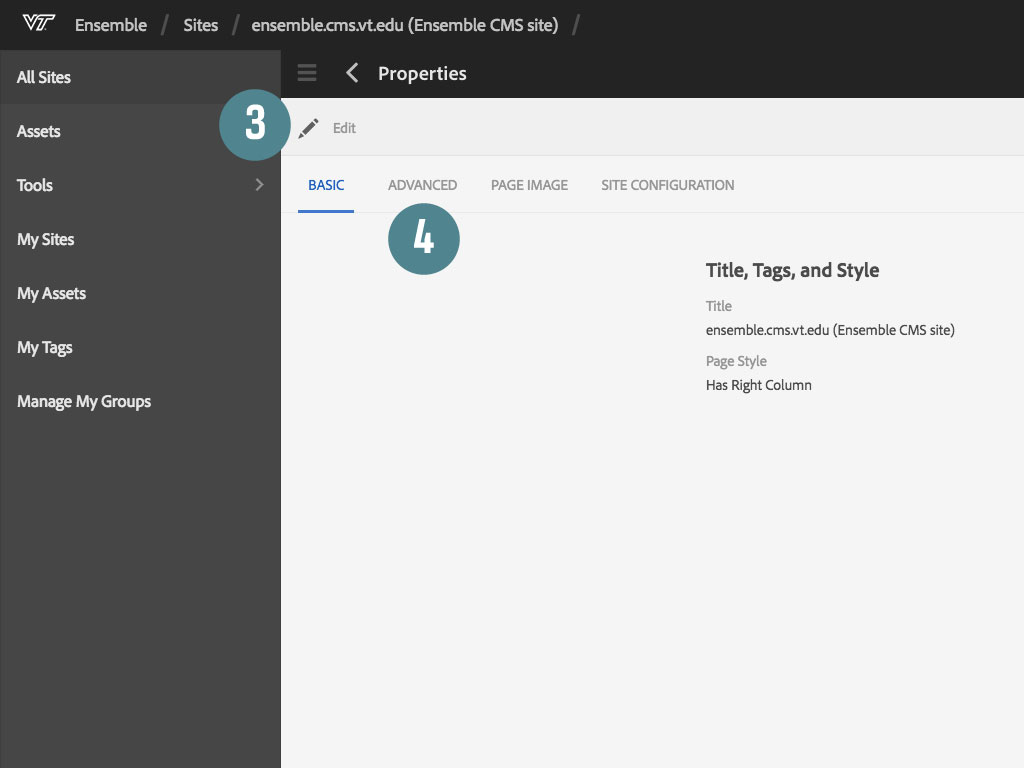
3. Click the Edit button
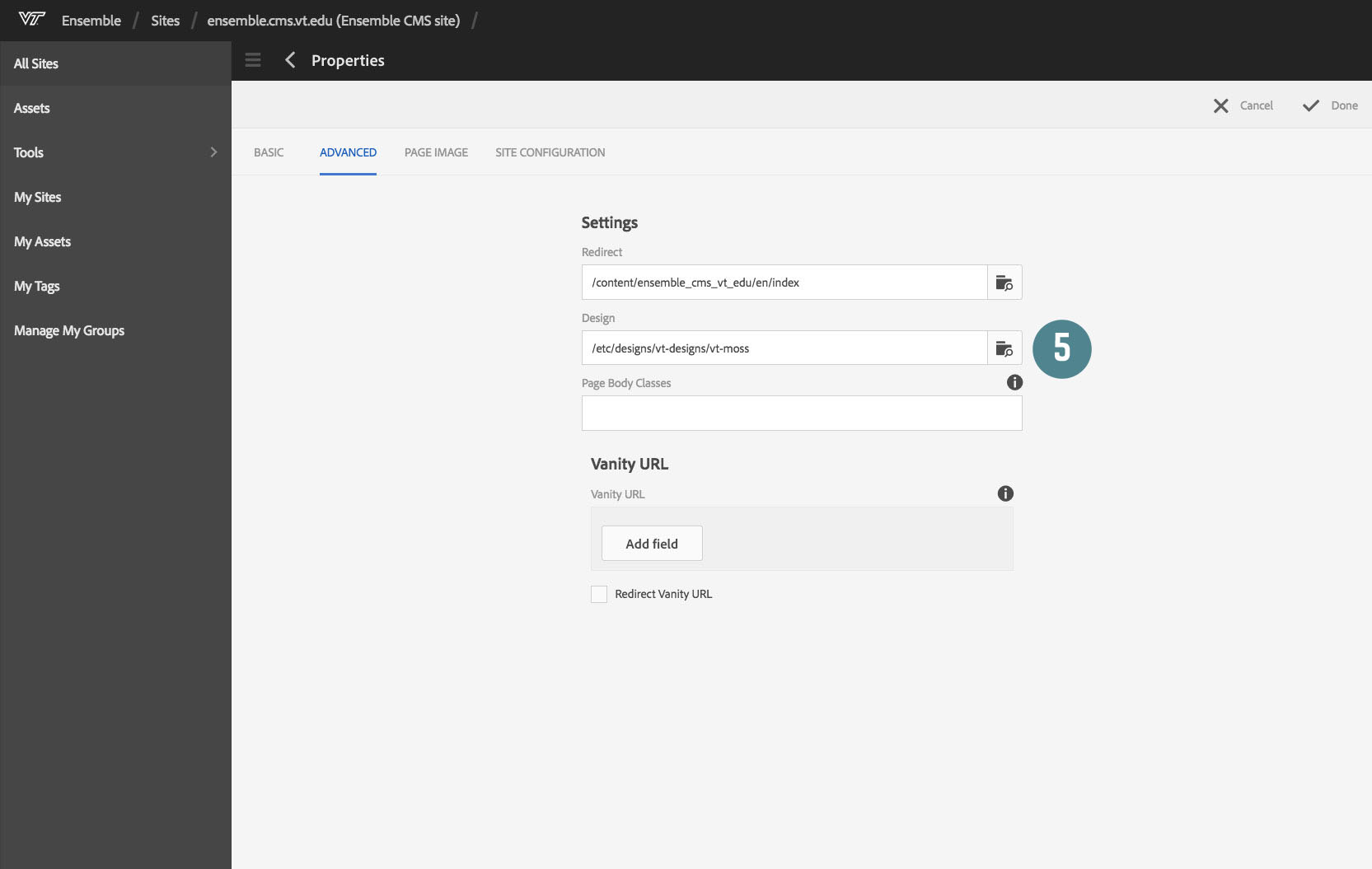
4. Click the Advanced tab (if you cannot see the Advanced tab then your user does not have web_admin level permission and you cannot switch the site theme)
5. Click the icon at the far-right of the Design input field
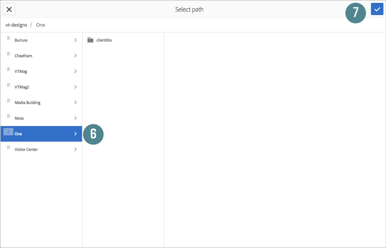
6. Click on the One title in the left column of the design selection dialog
7. Click the blue checkmark in the top-right corner of the dialog
8. Click the Done button in the top-right of the properties dialog
The theme is now active in the authoring environment. In order to publish the theme:
9. Go back to the My Sites page
10. Click the checkbox next to the site you just changed
11. Click the Publish button in top toolbar and then choose Publish
The change may take a few minutes to propagate across pages, and you may need to publish the home page in order to speed things along.

Note: The following areas of the template are not to be modified for any reason without prior consent from Advancement | University Relations. Modifying these areas will violate the 80/20 rule that has been established for Virginia Tech branding as well as the consistent user experience the CMS is supposed to provide all users.
- The header - the black bar and main white header area
- The main navigation and search drawers
- The default footer
Modifying is defined as anything that changes styles, behaviors, or content within these areas beyond what the theme and CMS provide by default.
Parent organizations
Websites in Ensemble are able to list an organization as its “parent”. This informs the user that a website is affiliated with another group on campus. For example, a research institute or department may fall under one or more colleges. To set a parent organization on your site, follow the steps listed in the documentation:
Home page design
If you’re moving from Moss to One, you will notice some differences about the home page type. There is no longer a default gallery component embedded at the top of the page. Instead, there is an optional call to action (CTA) component. Underneath the call to action component is a space for any component, should you decide not to use the CTA.
The home page content type no longer includes an embedded gallery component. The CTA component is now embedded at the top of the page by default. However, a gallery component may still be the first thing on the page if you wish. Follow these steps to place a gallery component at the beginning of your home page content:
- From My Sites, select your home page.
- Click Open.
- Leave the call to action component unconfigured. Find the drop zone directly underneath it.
- Note: The default call to action component will NOT display on the published page if left unconfigured, but will STILL SHOW UP in edit mode.
- Drag a gallery component out of the left-panel, and into the drop-zone below the call to action.
- Click the gallery component to reveal its toolbar.
- Click the wrench icon to open the gallery’s properties window.
- Select Carousel from the Gallery Type select box.
- Select Hidden from the Controls Style select box.
- Click the Items tab.
- Click Add Field.
- Drag an image from the assets library onto the gallery component.
- Click the checkmark icon to save the gallery component.


The featured component is a drop-zone just beneath the embedded call to action component on home pages. You may put any component you like in it, but pay attention to the space around the component in the published page. You may need to create some left and right margins. To do this, use the following steps:
- From My Sites, select your home page.
- Click Open.
- Leave the call to action component unconfigured. Find the drop zone directly underneath it.
- Note: The default call to action component will NOT display on the published page if left unconfigured, but will STILL SHOW UP in edit mode.
- Drag a container component out of the left-panel, and into the drop-zone below the call to action.
- Click the container component to reveal its toolbar.
- Click the wrench icon to open the container’s properties window.
- Locate the CSS Styles textarea.
- Copy and paste this code into it:
- padding: 0 5%;margin-top: 2em;
- Click the checkmark icon to save the container.
- The container is now ready to receive any component.


The call to action link component is meant to encourage the user to take a specific action, such as: donating, applying, visiting, etc. It may be placed anywhere you need an attractive link, and is embedded inside the call to action component. It comes pre-configured with different color and font variations. Please refer to the official documentation for the call to action link component, listed here:
The call to action component (CTA) is meant to draw the user’s attention to a brief, but important, message, and entice the user to take an action. It is now included at the top of the home page type by default, but its use is not mandatory. Simply leave a CTA unconfigured, and it will not display on the published page. Note – it will still display on the page in edit mode. Please refer to the official documentation on the call to action component, listed here:
Widgets are combinations of components, classes, and content that yield a specific look within the theme. The vt.edu home page contains examples of all the widgets documented below. The documentation includes step-by-step instructions and screen shots of component configurations to help you build the widgets within your own site.
NOTE: Widgets have specific usages and is why they are called widgets and not components. If and when we can we will convert some of these to components in the future. Most of the widgets can be made and maintained by the novice user with base experience with Enseble. The Featured Item Grid widget is the only exception and is for advanced users only until a component can be built to supply the functionality to everyone.
NOTE 2: Just to clarify, the widgets are not components and are offered pretty much as-is to the larger community, with the caveat that those with HTML/CSS/JS experience could adapt and use them elsewhere. We do make improvements to the widgets based on user feedback and have plans to convert some into components, but they do not get the same level of support as the components as they are basically things we are offering up that we made for specific projects, and specific content needs, knowing others may also want to use them.
- List Stripe widget
- List Stripe Alternate with color schemes
- Upcoming Events widget
- Featured Media widget
- Our Vision widget
- In The News Widget
- Featured Item Grid widget (advanced users only)
- Pull quotes and side bars
- Video page headers
- Ut Prosim Stripe
- Timeline
FontAwesome changes to 5.x Pro
The One theme is using FontAwesome 5 Pro and does not use the actual font any longer. This is due to accessibility concerns that we switched the implementation from the font to the SVG method. You can still insert elements into Text components via the HTML view in the Expanded editing mode. There are new classes that need to be used and they are described on the FontAwesome site.
Note: There is a known issue at the moment with adding FontAwesome icons to Text components and not being able to edit the text in the Expanded view after doing so. We are actively working on this issue and should have a fix soon. If you need assistance editing content in a Text component with FontAwesome icons in it, please file a ticket or send an email to: askvt@vt.edu
UPDATE (09/19/2018): A fix for this was merged to the production server that will deactivate FontAwesome icons in the Edit mode within Ensemble. They will appear in Preview and in published pages and you will still be able to add them within a Text component via the HTML view. Please note that we are using FontAwesome 5 Pro, so you will need to use the classes for that version of FontAwesome, e.g., class="fab fa-facebook".
Utility classes
The One theme uses and extends existing utility classes while also adding new classes specifically for the One theme. The utility class page has a section that covers the utility classes enhancements and the new ones that are specfic to the One theme.
As of August 21, 2019 there are CSS color variables included in the base One theme that can be used to reference all brand colors, tints, and shades. These variables are displayed in the web developer tools of any browser when an item on a web page in the CMS is inspected. There are 249 total variables. Please go to the Brand Color Tool to select colors for your palette and view all CSS variables.
These variables can be used within an HTML component <style> tag, or within local assets to reference any of the brand colors, tints, and shades. See the following example:
CSS variable:
--vt-maroon
Example style implementation:
.vt-class-name {
color: var(--vt-maroon);
}
The "var(--variable-name)" is how CSS accesses the color info for that variable, and will output:
.vt-class-name {
color: #861f41;
}
Accessibility
A major feature of the One theme is its orientation to accessible best practices. There are new tools at your disposal to help you create accessible web sites in ensemble. Using One will improve your page’s accessibility in many ways under the hood, by providing good, semantic HTML, and adhering to accessible user interface paradigms.
Alternative text for images
Images generally need alternative text for assistive technology. The alternative text is read by screen readers to describe images to users, and displays in place of the image should it fail to load. It is also indexed by search engines that are crawling the page. Writing good alt text takes some effort; pay attention to the context of the image as that will determine the level of detail needed to describe it. Here are some guidelines:
If you’re using a caption on an image, avoid any redundancy between the alt text and the image caption. The alt text can be less descriptive in this case because it has the supporting caption text.
If the image falls within a paragraph, think about the context of the image. The more thoroughly the surrounding text describes the image, the more brief your alt text can be.
Never use a phrase like “image of…” because it is unnecessary. The user already knows you are describing an image in this case.
Alt text should be brief enough to convey the visual information not contained elsewhere in the text.
If the image also serves as a link, do not include a phrase like, “link to…” because the screen reader will identify the link before reading the alt text.
Page headings
Use page heading elements (h1 - h6) for meaningful sections of content within the page, and never use them for styling purposes. Using page headings incorrectly will alter the document outline, which screen readers use to help users navigate the page.

The call to action component and the call to action link component work together, but can create accessibility issues under certain circumstances. For example, it is possible to choose a maroon background for the CTA, while also choosing a maroon background for the CTA link. This is inaccessible and does not meet our legal obligations for accessibility.


The One theme has improved keyboard navigation built-in. Focus states are consistently visible throughout the theme.
A major new feature to the One theme is the universal access menu. The universal access menu is an accessibility focused modal dialog, which contains tools to help consume information on the page. Over time, as more tools become available, they will be located in this menu. The universal access menu is also where users go to report accessibility issues. To open the universal access menu, tab to or click the universal access icon in the topmost menu bar of the page.

Local assets and customization
You may still customize your site using local assets. However we ask that you please consider the main menu and other navigational elements such as breadcrumbs and the explore menu, the header, and the footer as special entities. They must have a consistent look-and-feel throughout the site so that users do not find themselves lost or learning new interface patterns between sites. The header, main menu, and footer are known as the C-clamp, since it forms a backwards letter-c-like shape around the main body of content. While content such as menu items within the C-clamp may change from site to site, these items always look the same, have the same behavior, and are always in the same locations.
While we ask that no changes be made to the functionality and design of the header, we realize that some organizations have situations like industry partnerships which may require changing the logo. This is acceptable but will be done on a case-by-case basis, with permission from University Relations.


