

List Stripe Alternate with color schemes
This widget is very simple to use. You have a Container component with a class. Inside there is a text component (also with a class), a list component, and a Call To Action - Link component. The class controls the color scheme and adjusts break points for all uses of the widget in a body column in the One theme. Beliow is a list of color schemes and how to construct the components and add the needed classes.
List Stripe Alternate container classes
Light:
vt-listStripe-white
vt-listStripe-pink
vt-listStripe-yellow
vt-listStripe-turquoise
vt-listStripe-sand
vt-listStripe-smoke
Dark:
vt-listStripe-maroon
vt-listStripe-burntOrangeWeb
vt-listStripe-hokieStone
vt-listStripe-purple
vt-listStripe-teal
vt-listStripe-blue
vt-listStripe-black
1. Drag and drop a Container component onto the page
2. Drag and drop one Text, List, and Call To Action - Link component into the Container from step 1

3. Click the Container component to open its toolbar
4. Click the wrench icon to open the configuration dialog
5. In the CSS Class field, add one of the list stripe theme color classes
NOTE: If you want the stripe to go across the browser window check the Full Browser Width checkbox.
6. Click the checkmark top-right to save the settings

7. Click the Text component to open its toolbar
8. Click the wrench icon to open the configuration dialog
9. In the CSS Class field, type vt-listStripe-heading

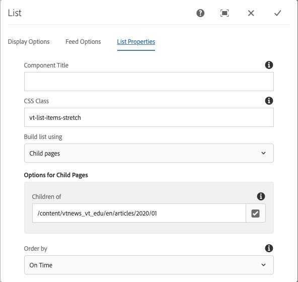
You may also want to add the vt-list-items-stretch class to the list component so multiple items are all the same size.
11. Click the Call To Action - Link component to open its toolbar
12. Add your link text and link info
13. Change the Color choices to either Dark or Light depending on the background of the color scheme (light buttons on dark backgrounds and vice versa)
14. Click the Advanced Options tab


15. In the Advanced Options, set the Alignment to Inline and then set any other options you prefer, but the alignment must be set to inline.
16. Click the checkmark in the top-right corner to save the settings
17. The List component can be set to what ever column display you want, from two to six columns and whatever content you want to include.
