

List Stripe Widget
The following component structure and classes applied to components will create the same type of appearance as the Virginia Tech Daily section of the vt.edu home page. Although the classes are specific in name, they can be applied to the same structure and set of classes with different content.
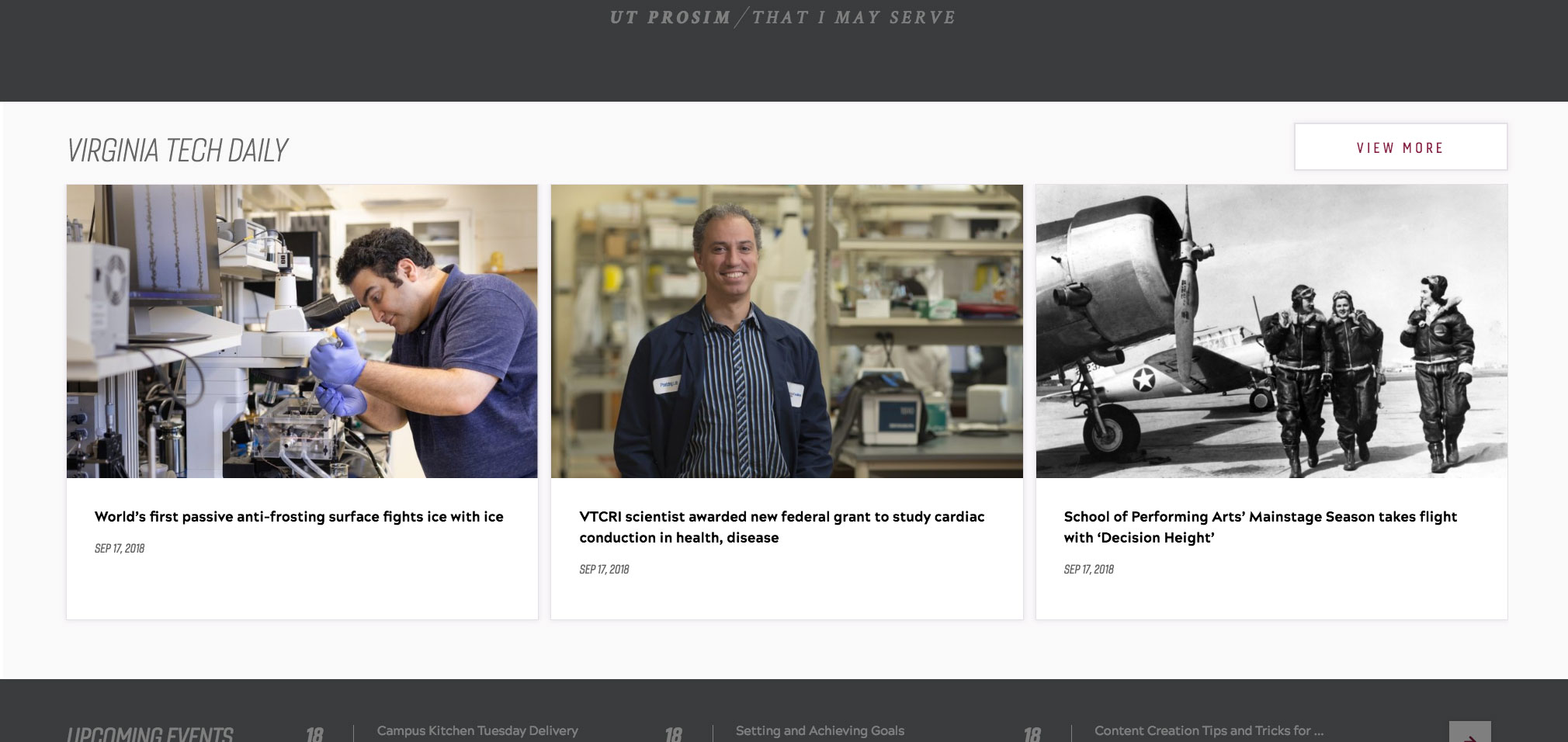
The example shows the header, list, and "View more" call to action.
User level: Basic
1. Drag and drop a Container component into place on a Homepage template page without right column
2. Click the Container component to show the component toolbar
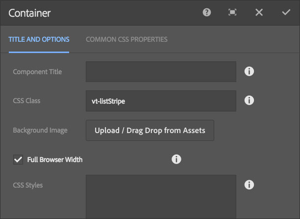
3. Click the wrench icon to display the configuration dialog
4. Type or copy-paste the vt-listStripe class into the CSS Class field
5. Check the Full Browser Width checkbox
6. Click the checkmark in the top-right of the dialog to save changes
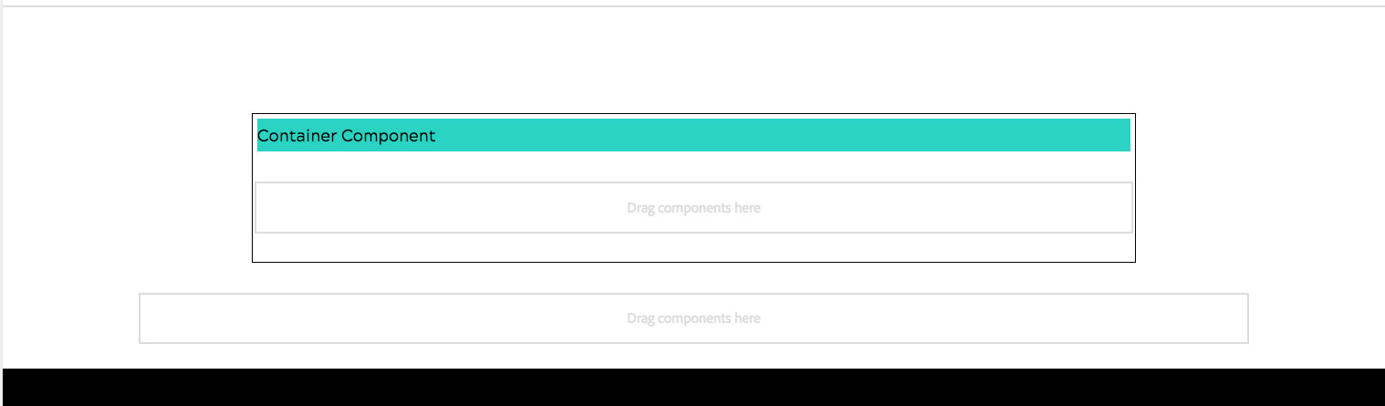
7. Drag and drop a Text component into the Container you just created
8. Click the Text component to show the component toolbar
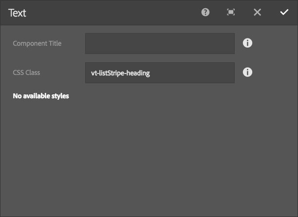
9. Click the wrench icon to display the configuration dialog
10. Type or copy-paste the vt-listStripe-heading class into the CSS Class field
11. Click the checkmark in the top-right of the dialog to save changes
12. Click the Text component to show the component toolbar
13. Click the pencil icon to edit text
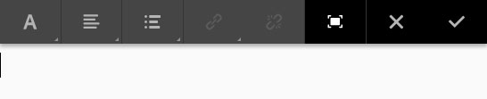
14. Click the Expand icon, third icon from the far right
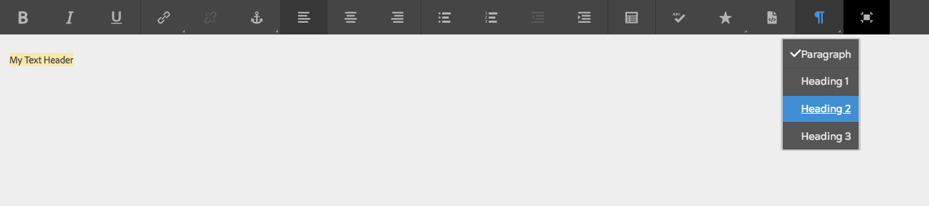
15. Type the heading text you want
16. Select the text by dragging the cursor over the text
17. Click on the text formatting icon, second from far right in the toolbar and select Heading 2
18. Click the Collapse icon, far right icon in the toolbar
19. Click the checkmark to save the text changes
20. Drag and drop a List component under the Text component you just created
21. Click the List component to show the component toolbar
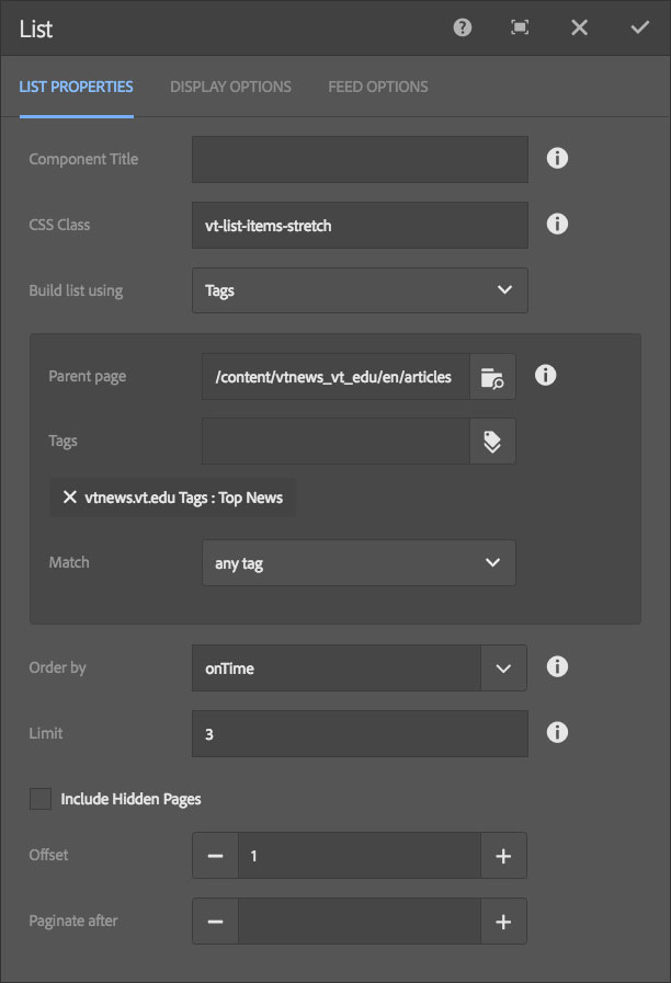
22. Click the wrench icon to display the configuration dialog
23. Type or copy-paste the vt-list-items-stretch class into the CSS Class field
24. Configure the List component to display the content you wish
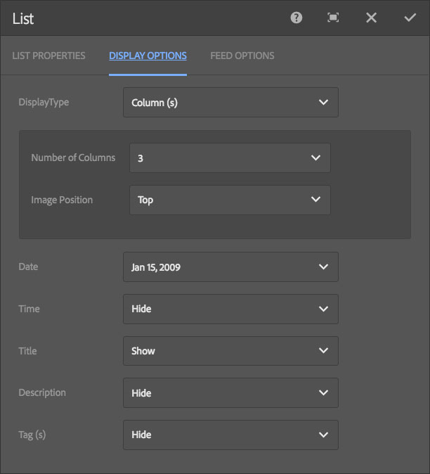
25. Click the Display Options tab and select DisplayType -> Columns with the number of columns you desire to display (example is three (3)), set other options as desired
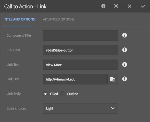
26. Click the checkmark in the top-right of the dialog to save changes
27. Drag and drop a Call to Action - Link (CTA-Link) component under the List component you just created
28. Click the CTA-Link component to show the component toolbar
29. Click the wrench icon to display the configuration dialog
30. Type or copy-paste the vt-listStripe-button class into the CSS Class field
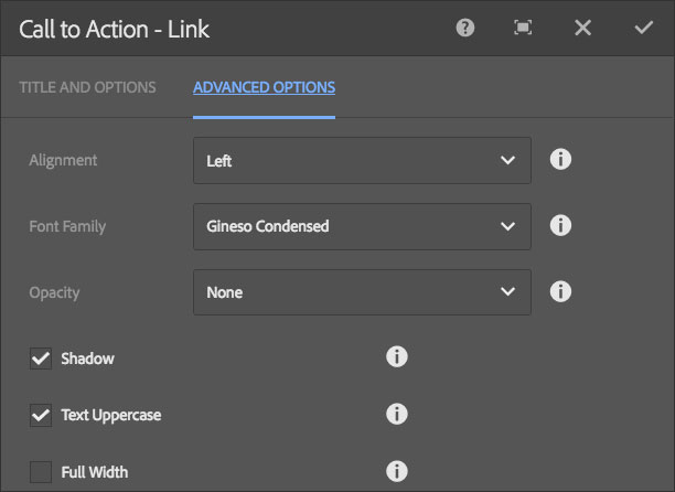
31. Configure the CTA-Link component as desired
32. Click the checkmark in the top-right of the dialog to save changes
You should now Preview your List Stripe to make sure it appears as desired before publishing the page.