

Featured Media Widget
The following component structure and classes applied to components will create the same type of appearance as the Featured Media section of the vt.edu home page. Although the classes are specific in name, they can be applied to the same structure and set of classes with different content.
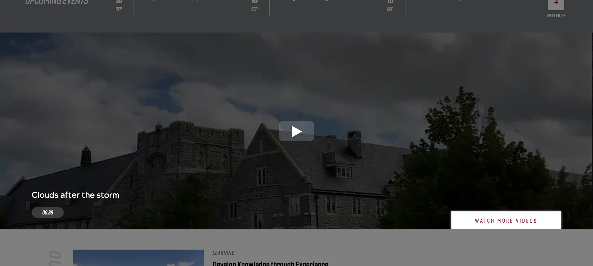
The example shows the poster image, play button, video title, duration, and "Watch more videos" call to action.
NOTE: This widget uses a different poster framing method and there is no need to add a poster frame to the Media - External component, rather it uses an Image component as a poster frame for the video.
User level: Basic
1. Drag and drop a Container component into place on a Homepage template page without right column
2. Click the Container component to show the component toolbar
3. Click the wrench icon to display the configuration dialog
4. Type or copy-paste the vt-featured-media class into the CSS Class field
5. Check the Full Browser Width checkbox
6. Click the checkmark in the top-right of the dialog to save changes

7. Drag and drop a Container component into the Container you just created
8. Click the Container component to show the component toolbar
9. Click the wrench icon to display the configuration dialog
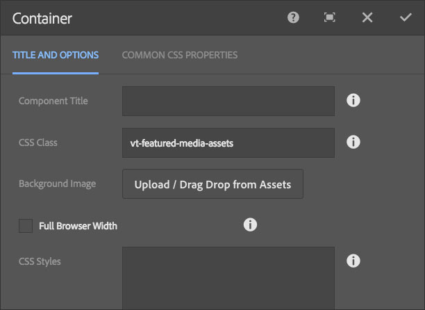
10. Type or copy-paste the vt-featured-media-assets class into the CSS Class field
11. Click the checkmark in the top-right of the dialog to save changes
12. Drag and drop a Container component into the Container you just created below the first inner container
13. Click the Container component to show the component toolbar
14. Click the wrench icon to display the configuration dialog
15. Type or copy-paste the vt-featured-media-controls class into the CSS Class field
16. Click the checkmark in the top-right of the dialog to save changes

17. Drag and drop a Media - External component into the top, inner Container
18. Click the Media - External component to show the component toolbar
19. Click the wrench icon to display the configuration dialog
20. Type the title of the video into the Component Title field
21. Type or copy-paste the vt-featured-media-video class into the CSS Class field
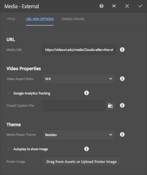
22. Click the URL and Options tab
23. Copy and paste the share URL for the video you wish to play, either from Kaltura or YouTube into the Media URL field
24. Click the checkmark in the top-right of the dialog to save changes

25. Drag and drop an Image component into the top, inner Container below the Media component
26. Click the Image component to show the component toolbar
27. Click the wrench icon to display the configuration dialog
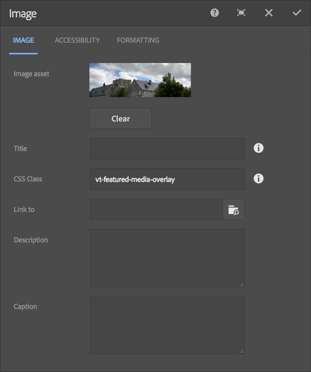
28. Type or copy-paste the vt-featured-media-overlay class into the CSS Class field
29. Click on the Assets tab in the Edit mode side panel, at left
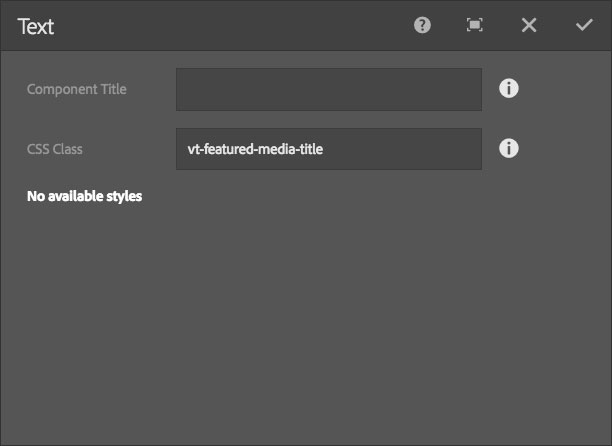
30. Drag and drop the image you wish to use for the poster image into the Image Asset area of the open Image component configuration dialog
NOTE: The ideal image will be cropped to a 3:1 aspect ratio
31. Click the checkmark in the top-right of the dialog to save changes
32. Drag and drop a Text component into the top, inner Container below the Image component
33. Click the Text
component to show the component toolbar
34. Click the wrench icon to display the configuration dialog
35. Type or copy-paste the vt-featured-media-title class into the CSS Class field
36. Click the checkmark in the top-right of the dialog to save changes
37. Click the Text component to show the component toolbar
38. Click the pencil icon to edit text
39. Type the title of the video
40. Click the checkmark to save the text changes
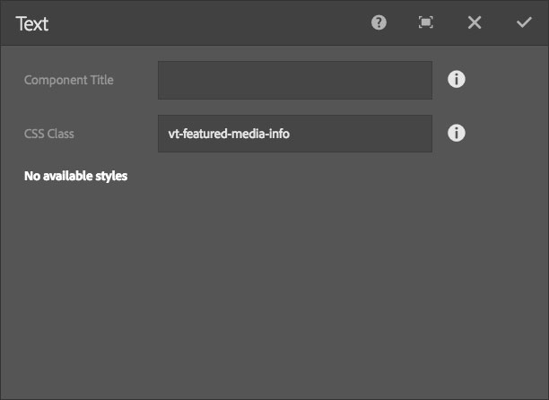
41. Drag and drop a Text component into the top, inner Container below the first Text component
42. Click the Text
component to show the component toolbar
43. Click the wrench icon to display the configuration dialog
44. Type or copy-paste the vt-featured-media-info class into the CSS Class field
45. Click the checkmark in the top-right of the dialog to save changes
46. Click the Text component to show the component toolbar
47. Click the pencil icon to edit text
48. Type the duration of the video in HH:MM:SS format, e.g., 01:35 or 01:12:23
49. Click the checkmark to save the text changes
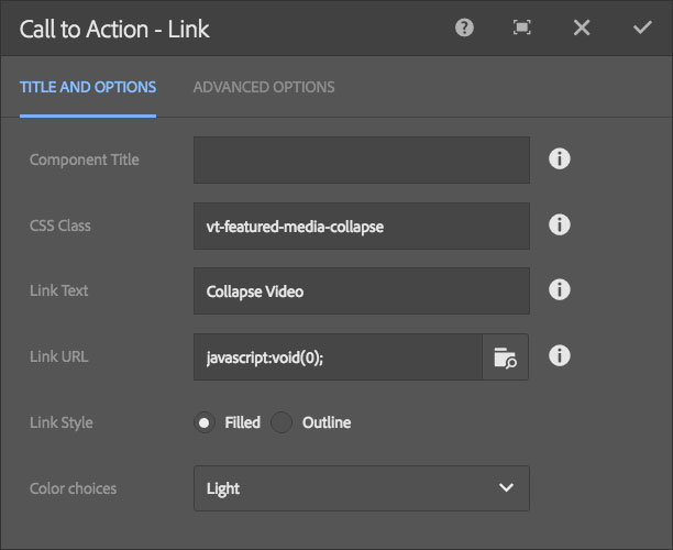
50. Drag and drop a Call to Action - Link component into the bottom, inner Container
51. Click the Call to Action - Link component to show the component toolbar
52. Click the wrench icon to display the configuration dialog
53. Type or copy-paste the vt-featured-media-collapse class into the CSS Class field
54. Type Close Video into the Link Text field
55. Type or copy-paste javascript:void(0); into the Link URL field
56. Select the Filled Link Style
57. Select Light from the Color Choices selection menu
58. Click the Advanced Options tab
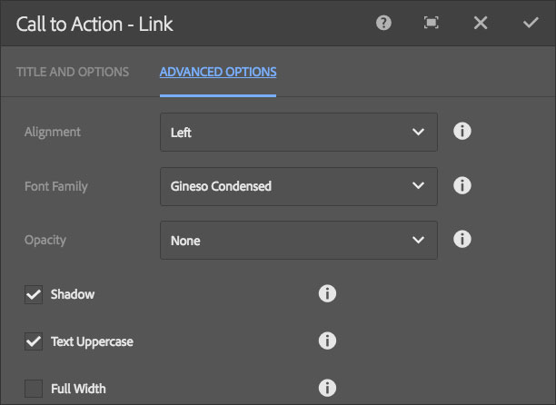
59. Select Left from the Alignment selection menu
60. Select Gineso Condensed from the Font Family selection menu
61. Select None from the Opacity selection menu
62. Check the Shadow checkbox
63. Check the Uppercase checkbox
64. Click the checkmark in the top-right of the dialog to save changes
65. Drag and drop a Call to Action - Link component into the bottom, inner Container below the first Call to Action - Link component
66. Click the Call to Action - Link component to show the component toolbar
67. Click the wrench icon to display the configuration dialog
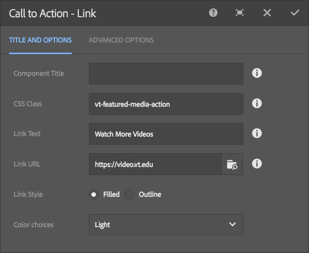
68. Type or copy-paste the vt-featured-media-action class into the CSS Class field
69. Type Watch More Videos into the Link Text field
70. Type or copy-paste https://video.vt.edu into the Link URL field
71. Select the Filled Link Style
72. Select Light from the Color Choices selection menu
73. Click the Advanced Options tab
74. Select Left from the Alignment selection menu
75. Select Gineso Condensed from the Font Family selection menu
76. Select None from the Opacity selection menu
77. Check the Shadow checkbox
78. Check the Uppercase checkbox
79. Click the checkmark in the top-right of the dialog to save changes
You should now Preview your Featured Media to make sure it appears as desired before publishing the page.