

Timeline widget
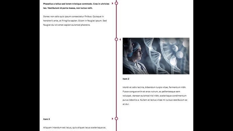
The following component structure and classes applied to components will create the same type of appearance of a vertical Timeline like the image above.
User level: Basic
1. For accessibility purposes, create a text heading in a Text component above the timeline to identify it, e.g., [Subject] Timeline
2. Drag and drop a Container component into place in the body of a page below the identifying text heading
3. Click the Container component to show the component toolbar
4. Click the wrench icon to display the configuration dialog
5. Type or copy-paste the vt-timeline class into the CSS Class field
6. Click the checkmark in the top-right of the dialog to save changes
7. Drag and drop Container components for each item in the timeline
8. Add content components to each container and construct your timeline items
9. Publish the page


Selectors and attributes needed to change colors of timeline elements
You can use these in local assets or within a <style></style> tag inside a HTML component.
.vt-timeline > .vt-vtcontainer-content::after
background-color for timeline vertical bar
#vt_no_rb .vt-timeline .vtcontainer::after,
#vt_with_rb .vt-timeline .vtcontainer::after
border-color is ring
background-color is center of pip
#vt_no_rb .vt-timeline .vtcontainer::before,
#vt_with_rb .vt-timeline .vtcontainer::before
border-color for item arrows