

Dual CTA widget


This widget can be used within the One theme to replace the single, embedded Call To Action on home pages by adding it to the Featured Content drop zone at the top of the page, or in the body of any other page type.
Drag and drop a Container component into the desired drop zone
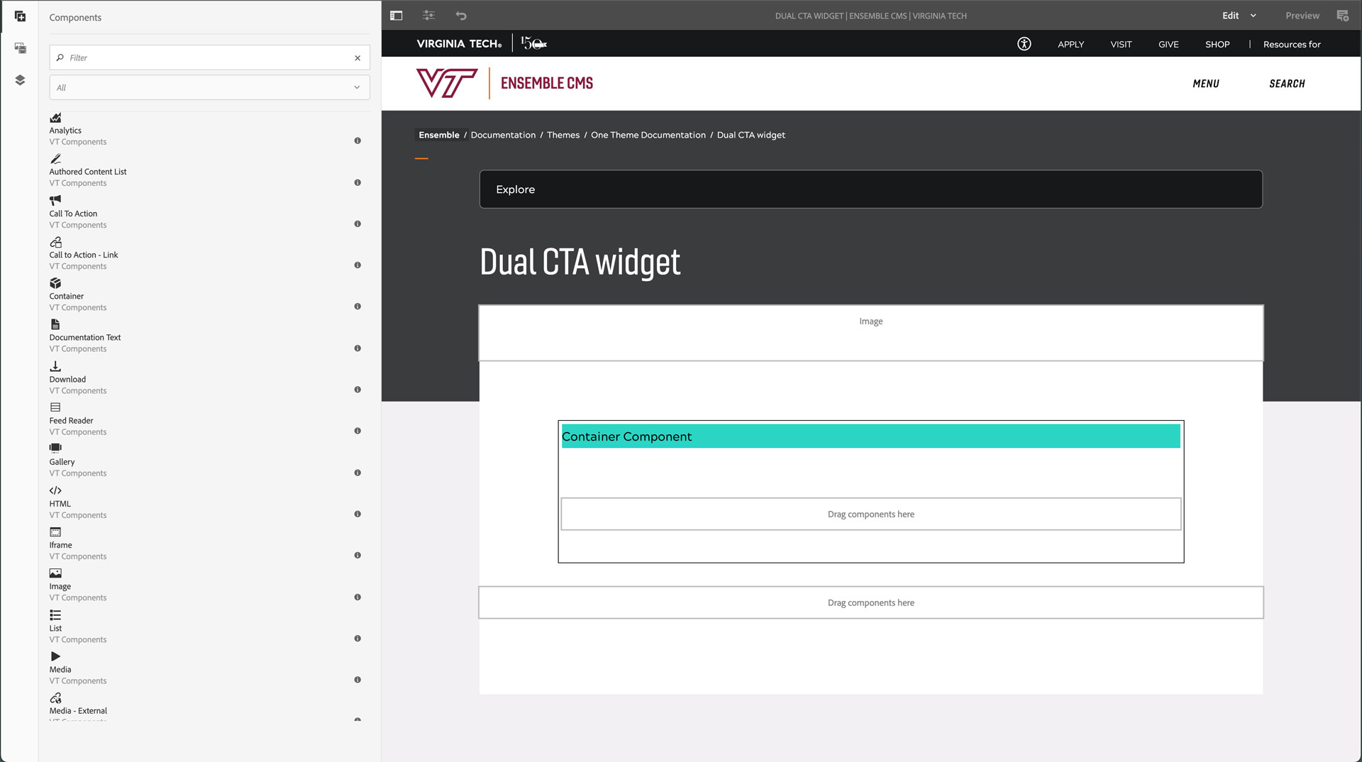
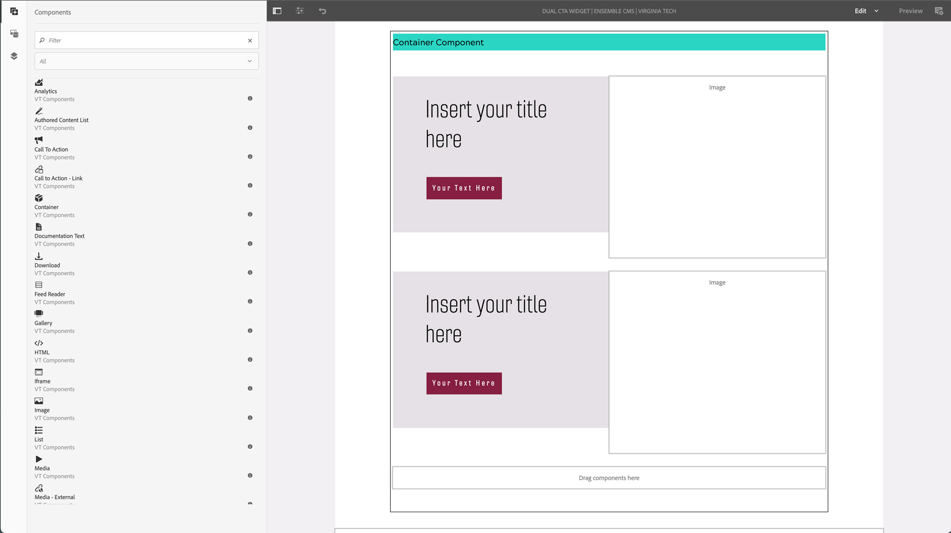
Drag and drop two Call To Action components into the container
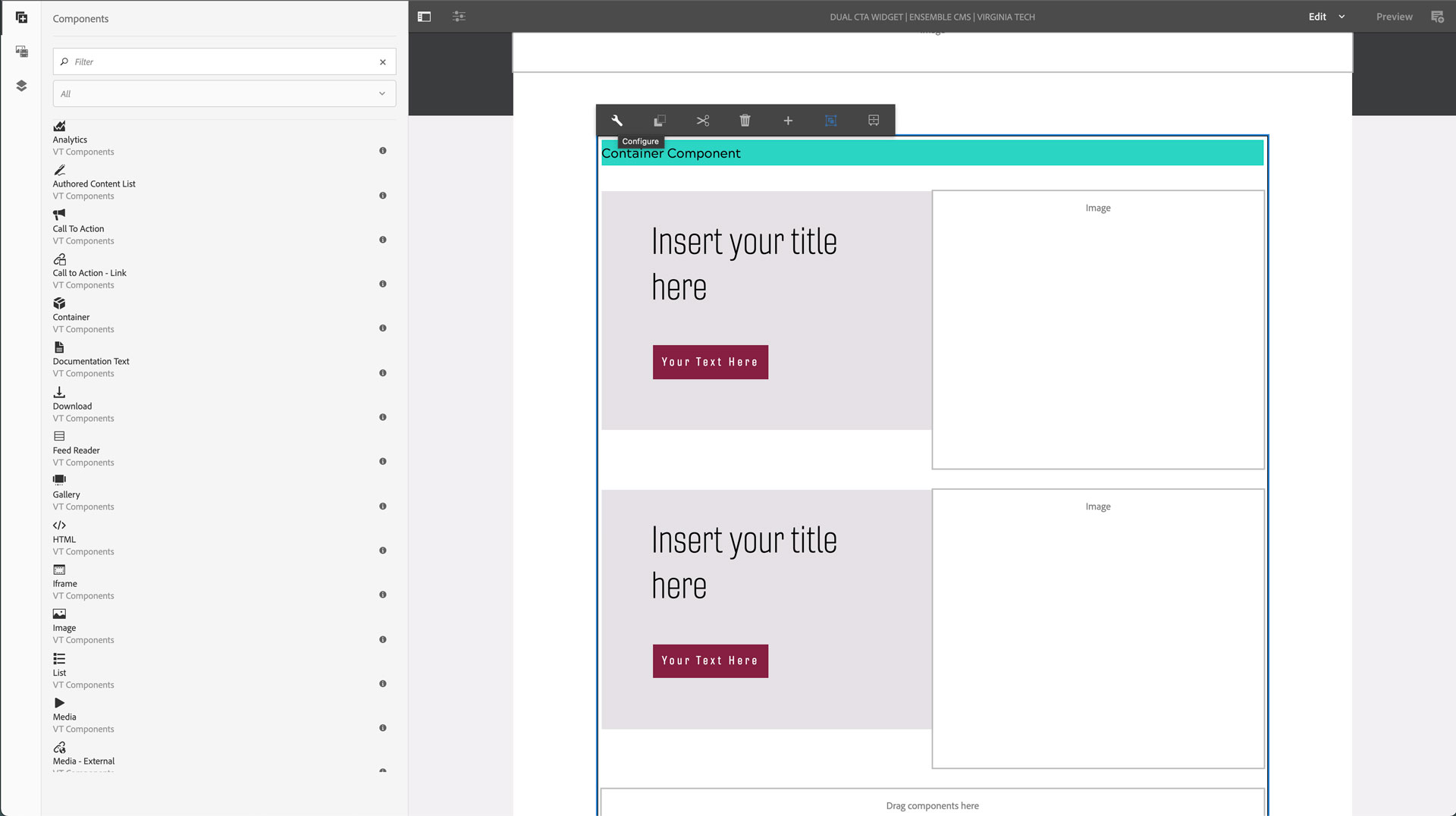
Click the Container component to view toolbar
Click the wrench (configure) icon
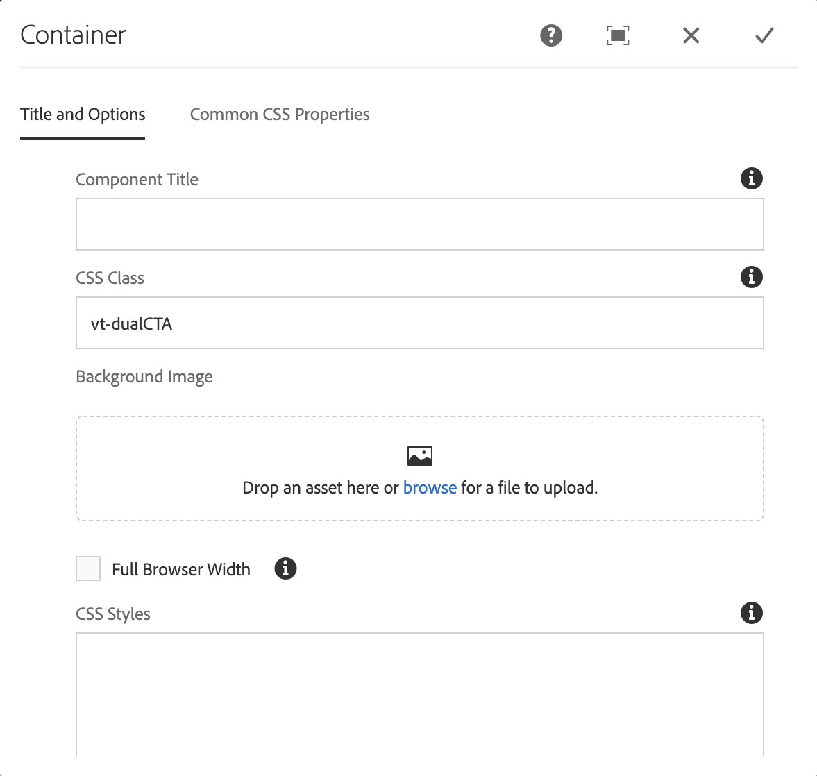
Copy the CSS class for the type of dual CTA you want into the CSS class field
- There are two versions of the dual CTA, one with a separating gutter, one without
- vt-dualCTA
- vt-dualCTA-fullWidth
Click the checkmark in the top-right corner to save changes
Click on the first Call To Action component and then click the wrench (configure) icon
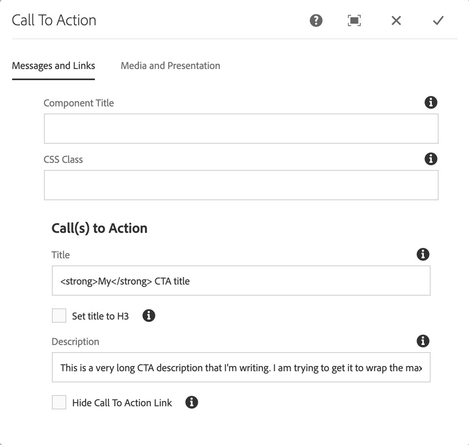
In the Messages and Links tab:
- Enter a title in the Title field; this can include limited HTML for formatting
- <strong>, <em>, <i>, <b>, <br />
- Enter a description in the Description field; this can include limited HTML for formatting
- <strong>, <em>, <i>, <b>, <br />
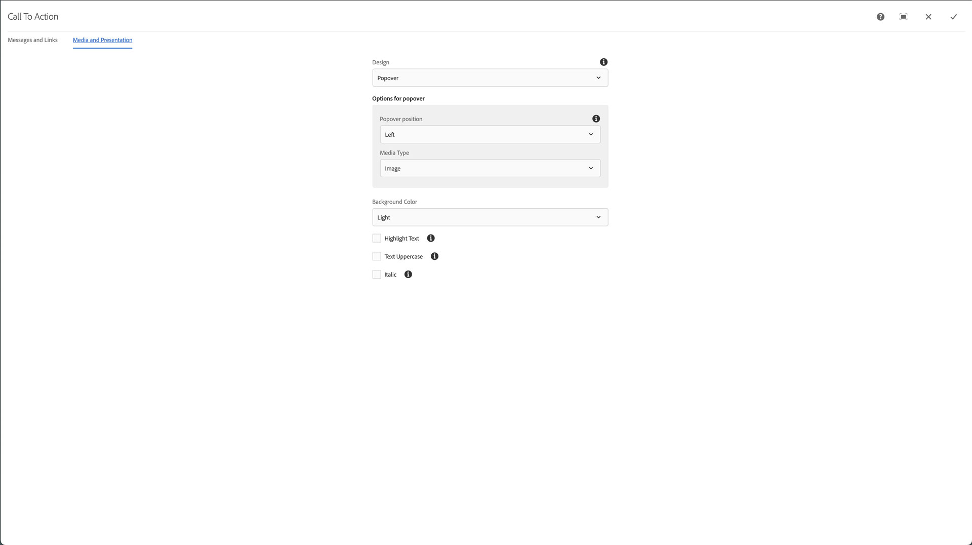
In the Media and Presentation tab:
- Set the Design pulldown to Popover
Click the checkmark in the top-right to save the changes
Click on the second Call To Action component and then click the wrench (configure) icon
In the Messages and Links tab:
- Enter a title in the Title field; this can include limited HTML for formatting
- <strong>, <em>, <i>, <b>, <br />
NOTE: The second Call To Action component does NOT have a description. If you add one the design will not work properly for all devices.
In the Media and Presentation tab:
- Set the Design pulldown to Popover
Click the checkmark in the top-right to save the changes
