

Ut Prosim Stripe

The Ut Prosim stripe widget is a brief, supplemental information area. It is designed to be used directly underneath an embedded Call to Action component on a home page.
User level: basic
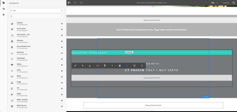
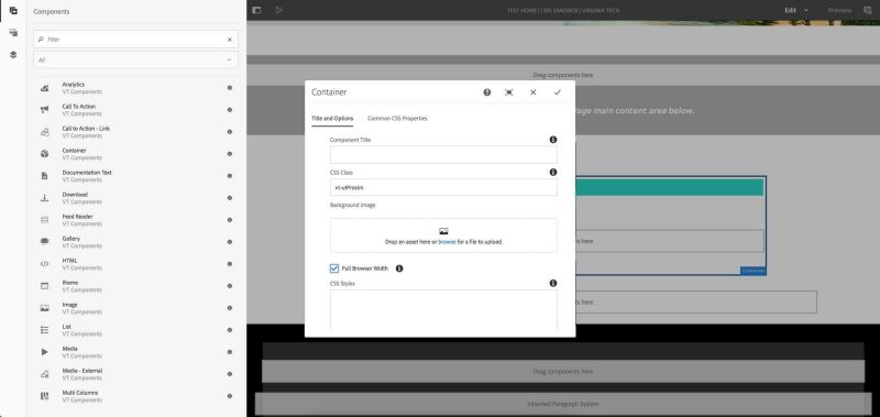
2. Under the featured component area, place a container component.
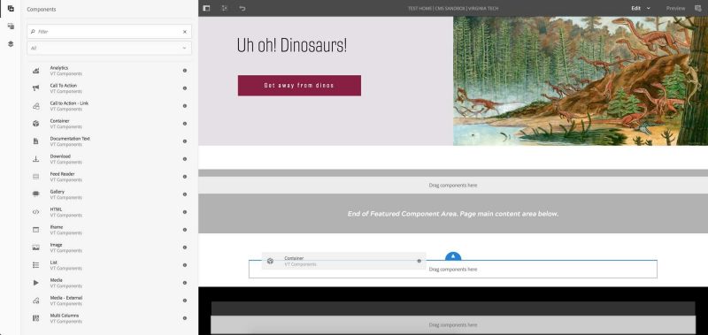
3. Open the container component’s properties by clicking the wrench icon.
4. In the CSS Class field, enter “vt-utProsim.”
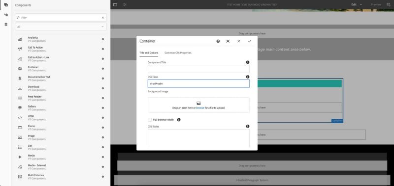
5. Click the Full Browser Width checkbox.
6. Click the Common CSS Properties tab.
7. Enter these properties in these fields:
- Color: white
- Padding: 5em 2em 5em 2em
- Background-color: #75787B
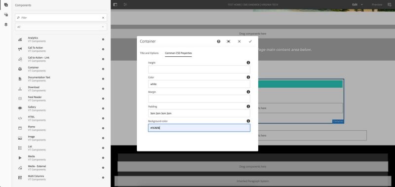
8. Click the checkmark icon to save the properties.
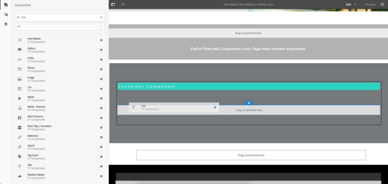
9. Place a text component inside the container.
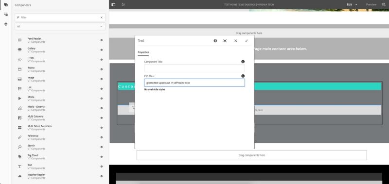
10. Open the text component’s properties by clicking the wrench icon.
11. In the CSS Class field, enter “gineso text-uppercase vt-utProsim-intro.”
12. Click the pencil icon to edit the text component’s content.
13. Type the text.
14. Highlight and center the text by using the alignment controls.
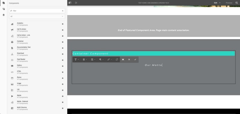
15. Click the checkmark icon to save the text.
16. Place a text component inside the container, underneath the first one.
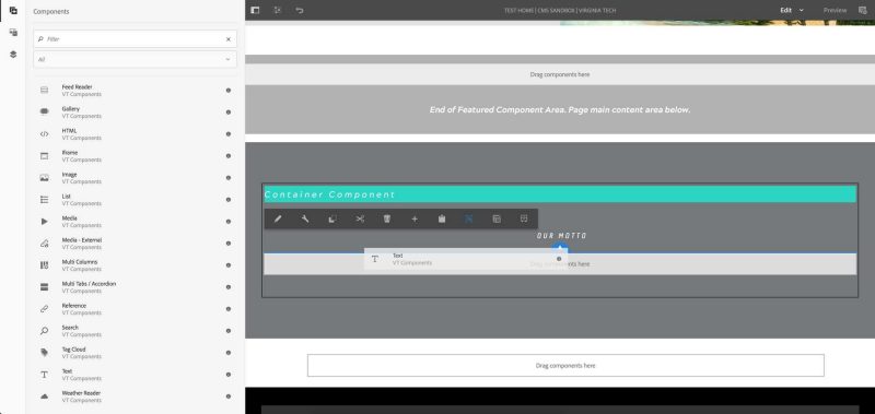
17. Open the text component’s properties by clicking the wrench icon.
18. In the CSS Class field, enter “text-uppercase suppress-margin crimson vt-utProsim-motto.”
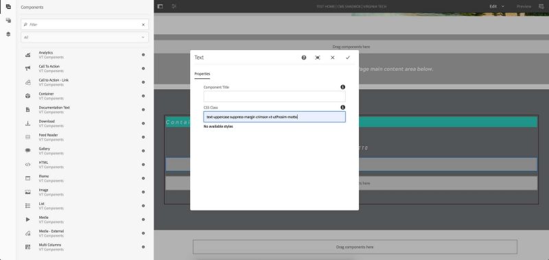
19. Click the checkmark icon to save the properties.
20. Click the pencil icon to edit the text component’s content.
21. Type the text.
22. Highlight and center the text by using the alignment controls.
(optional) Format the text as you choose by using the formatting controls.
23. Click the checkmark icon to save the text.