Pull quotes and side bars
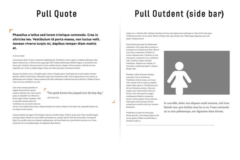
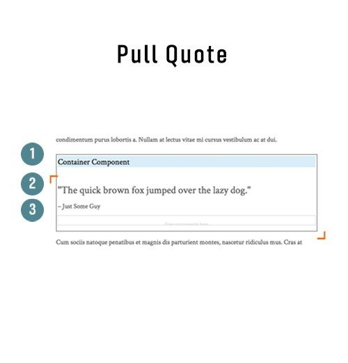
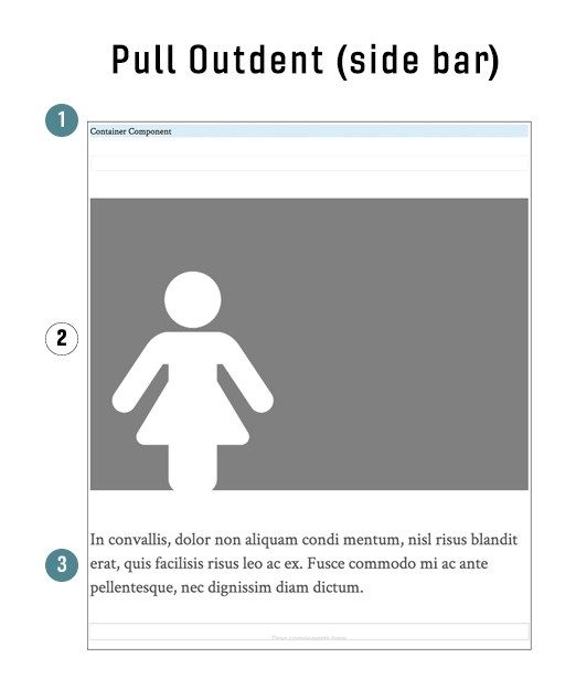
Pulled items have two different style types. There’s the vt-pullQuote class that will add the corner decorations to the container and a vt-pullOutdent class that does not have decorations. In order to style the quote or general text in the pulled item, that component will need two classes, vt-quote-text, if it is a quote with attribution a second text component with the classes vt-quote-attribution assigned to it is needed. If creating a side bar using the vt-pullOutdent class on the container you can place any other components into the container to be pulled left or right. To use the same text treatment, simply add the vt-quote-text classes to the text component you want styled similarly.
The position and size of the pulled item is determined by Bootstrap classes:
- pull-right OR pull-left -- position of pulled item
- col-lg-7 -- width of pulled item at mobile and desktop sizes, respectively
To start a pulled item:
- Drag and drop a "Container" component on the page where desired
- Click on the container component to open its toolbar
- Click the wrench icon in the toolbar
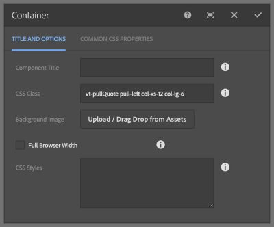
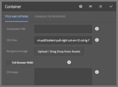
- Click in the "CSS Class" field and type: vt-pullQuote OR vt-pullOutdent
- Type the position and size classes into the Container CSS Class field, e.g., pull-right col-lg-7
- Click the checkmark in the top-right of the dialog to accept the changes
If creating a decorated pull quote:
- Drag and drop two "Text" components into the Container component
- Click on the first text component to open its toolbar
- Click the wrench icon in the toolbar
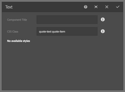
- Click in the "CSS Class" field and type: vt-quote-text
- Click the checkmark in the top-right of the dialog to accept the changes
- Click on the first text component to open its toolbar
- Click on the pencil icon in the component toolbar to enter edit mode
- Type the quote text
- Click the checkmark far right in the toolbar
- Click on the second text component to open its toolbar
- Click the wrench icon in the toolbar
- Click in the "CSS Class" field and type: vt-quote-attribution
- Click the checkmark in the top-right of the dialog to accept the changes
- Click on the first text component to open its toolbar
- Click on the pencil icon in the component toolbar to enter edit mode
- Type the attribution text
- Click the checkmark far right in the toolbar


