

Building a landing page list stripe drawer
A list stripe disclosure drawer is essentially three Container components (two inside an outer wrapping one) with classes applied to them. The inner drawers for the list stripes in VTX are configured with two text components and a list component in the "visible" drawer and a single list component in the "hidden" drawer. A "View more" button is added to the visible container in published view that can be customized to say what you want via a class on the outer drawer container. There are multiple choices for list stripe color combinations and heading styles that are available. The following information will describe how to use all these features.
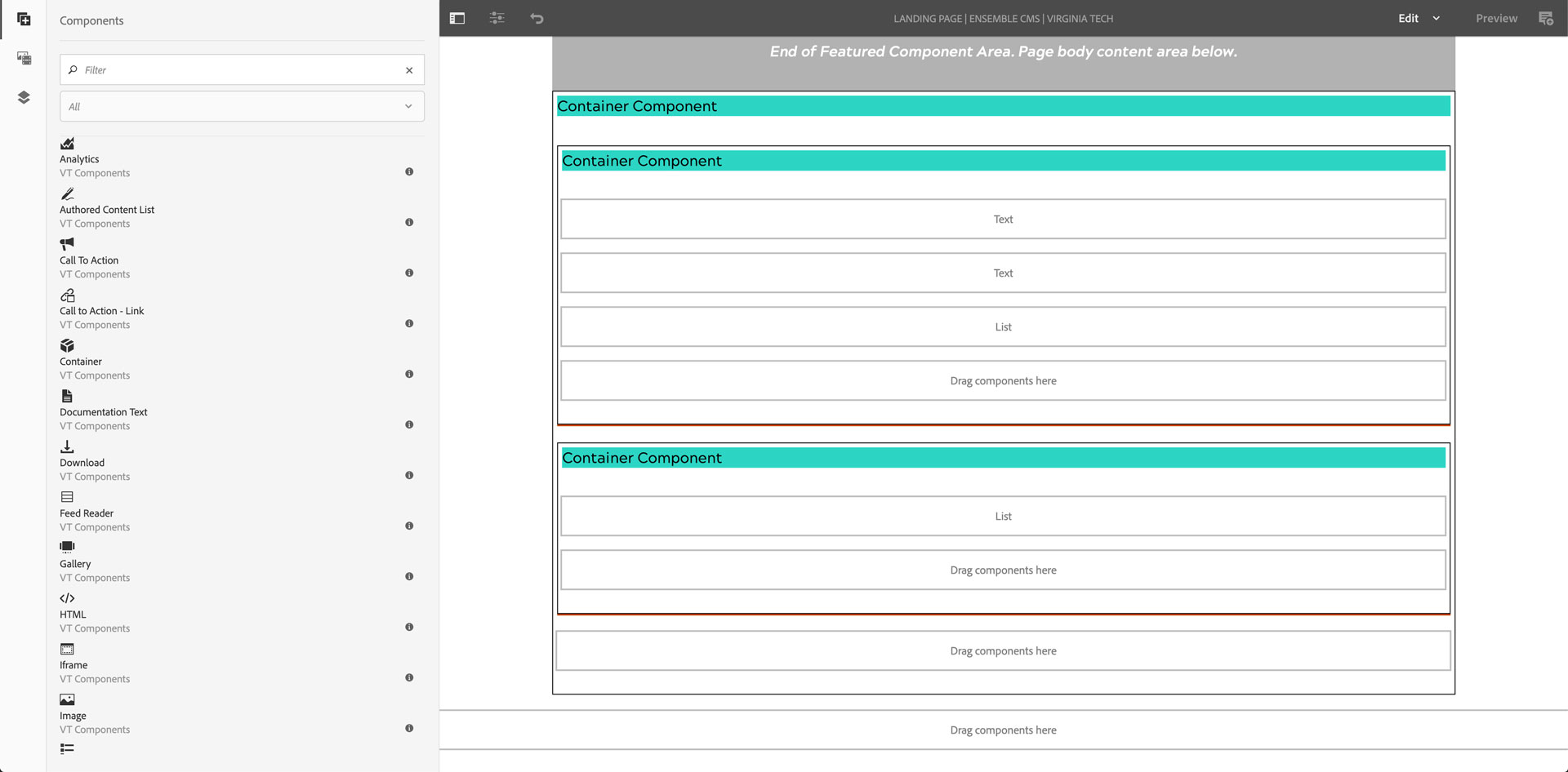
Drag and drop a Container component into the Featured Content, Body, Related Content (VTx theme), or Footer drop zone
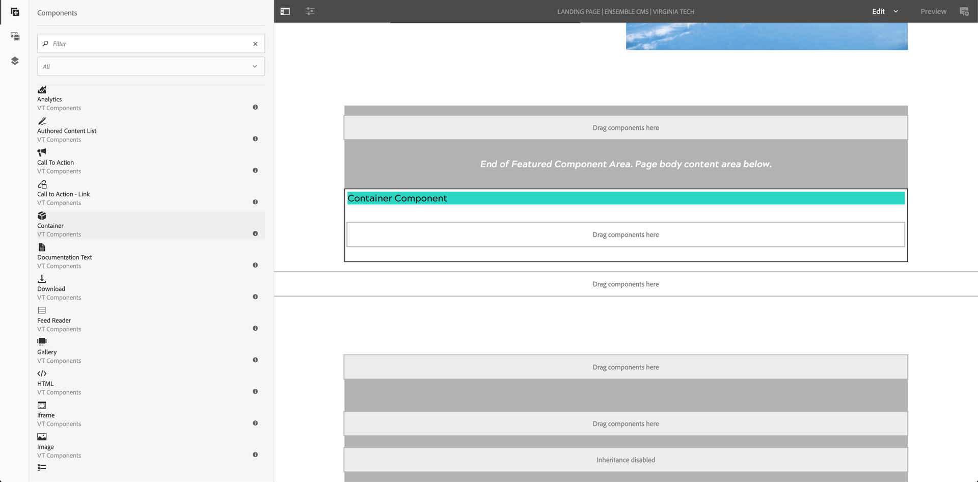
Drag two more Containers into the first, so there are two containers one over the other wrapped by the first one
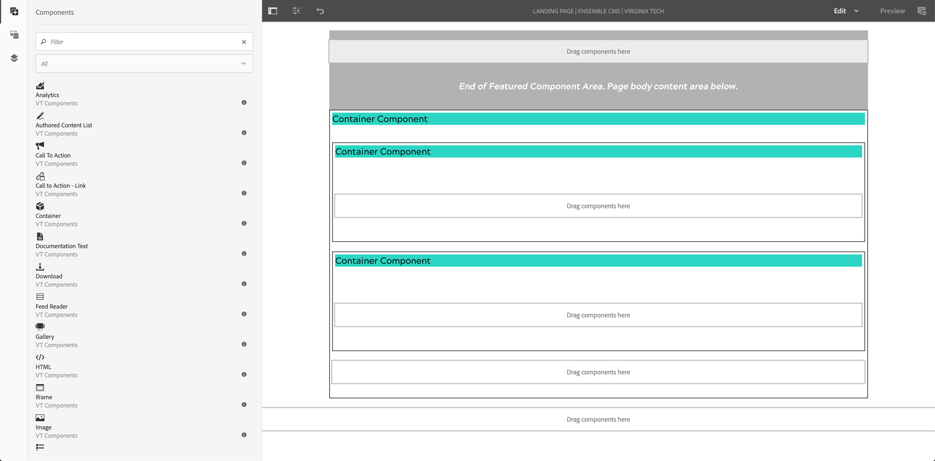
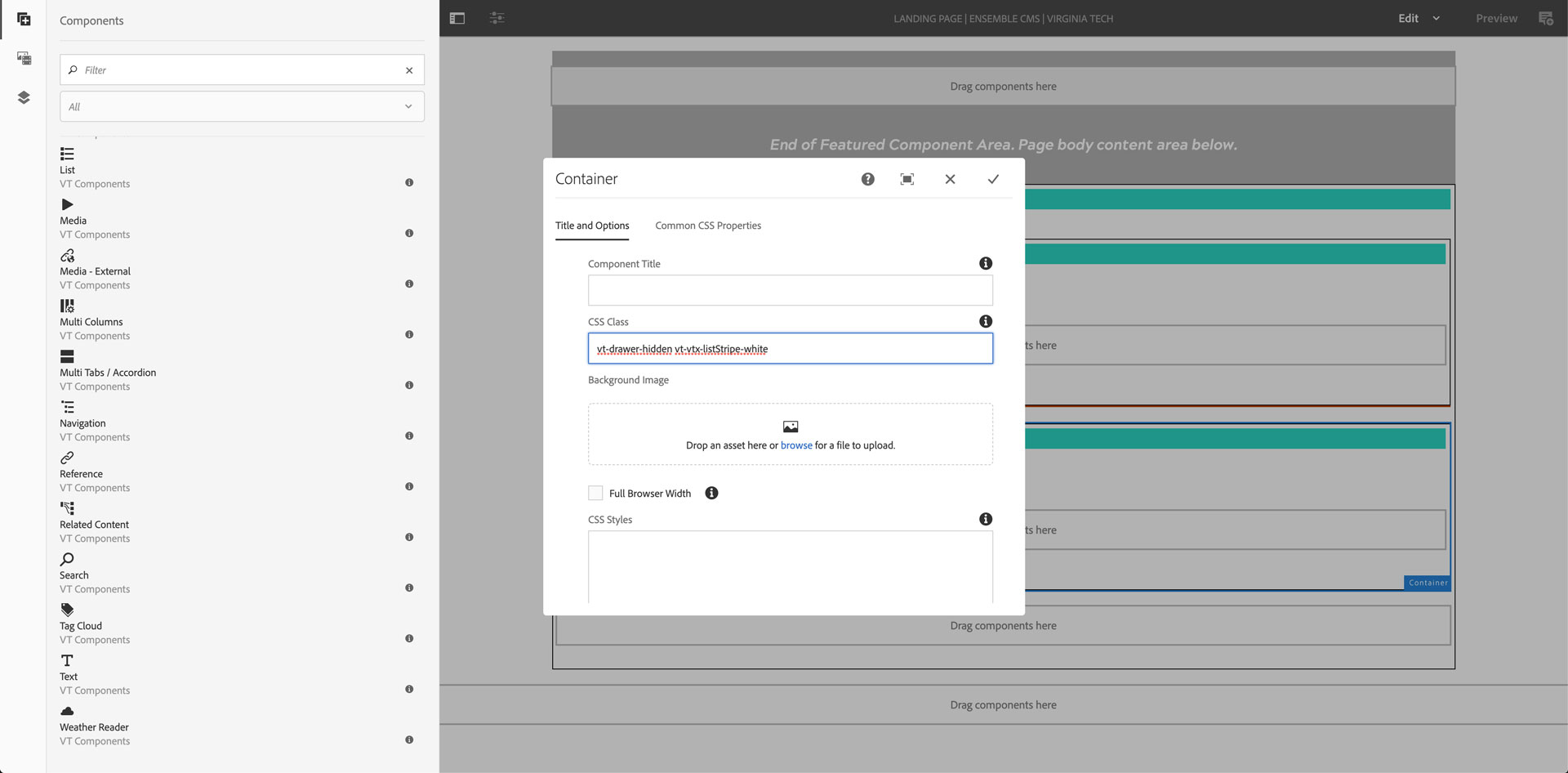
Click on the lower container inside the outer container and choose Config (wrench icon)
Add vt-drawer-hidden to the CSS Class field
Click the checkmark in the top-right corner of the configuration dialog
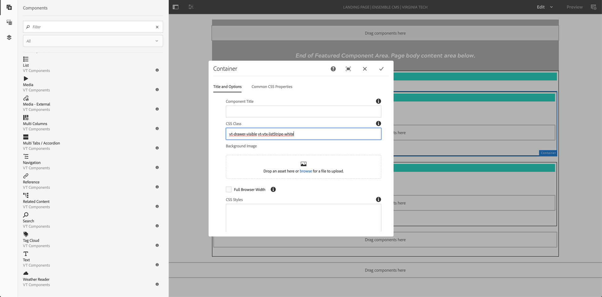
Click on the upper container inside the outer container and choose Config (wrench icon)
Add vt-drawer-visible to the CSS Class field
Click the checkmark in the top-right corner of the configuration dialog
Drag and drop two text components and a list component into the upper "vt-drawer-visible" container.
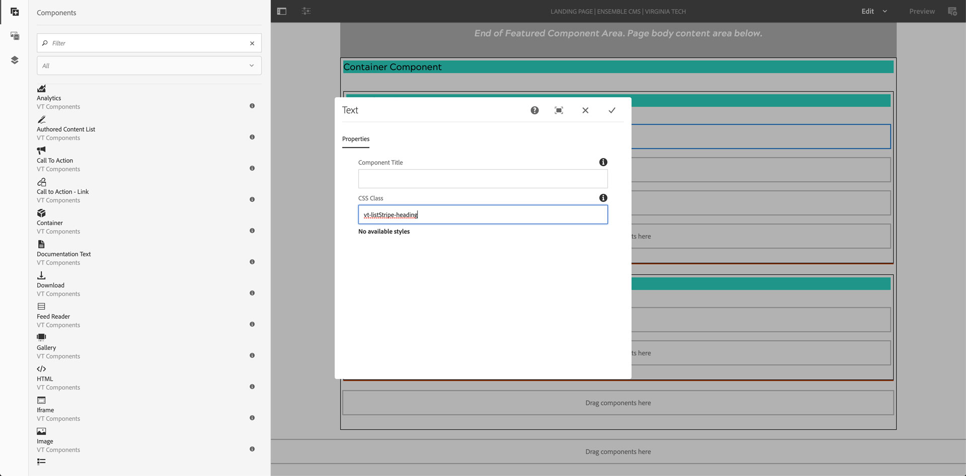
Click on the first text component and choose Config (wrench icon)
Add vt-listStripe-heading to the CSS Class field
Click the checkmark in the top-right corner of the configuration dialog
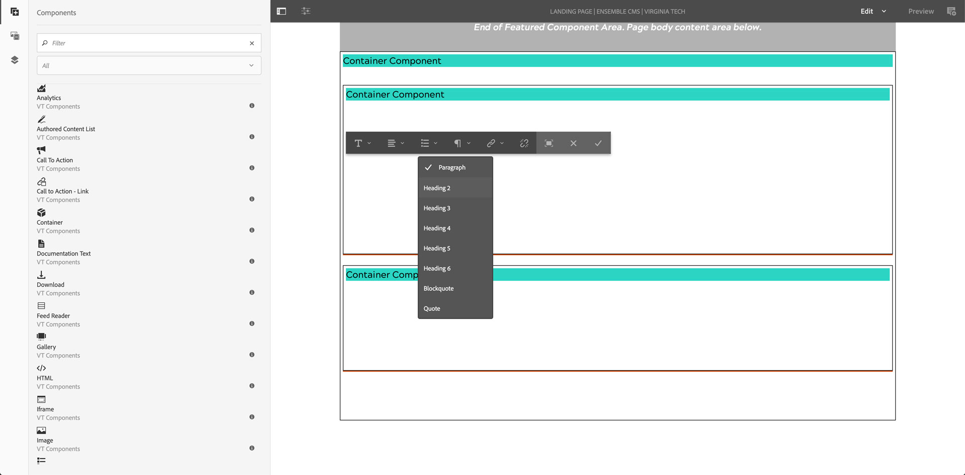
Click on the first text component and choose Edit (pencil icon)
Click on the text style tool and choose "Heading 2"
Type your heading text for the stripe
Click the checkmark in the far-right of the toolbar
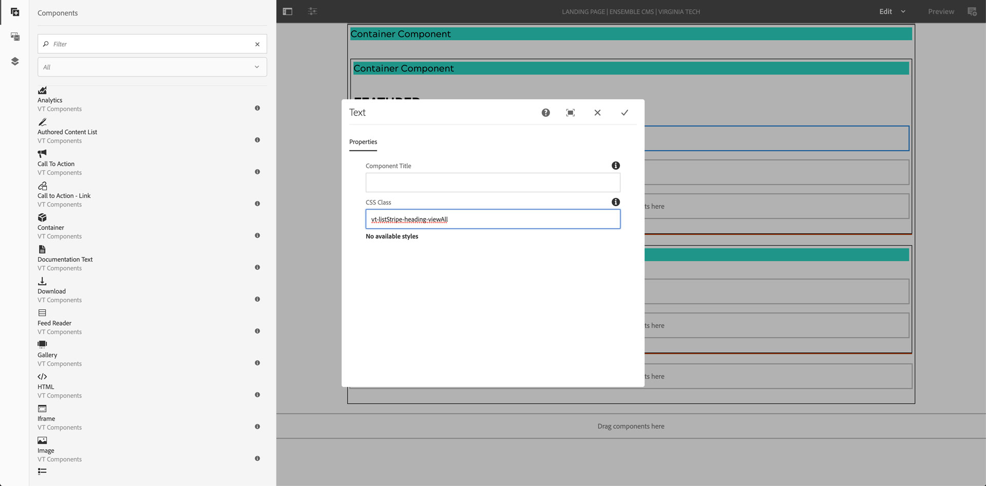
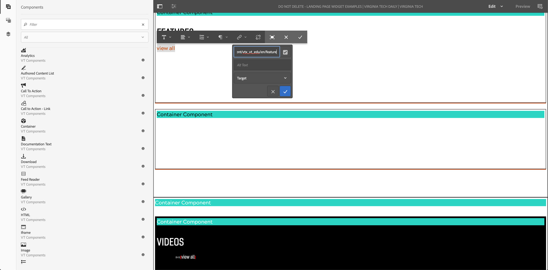
Click on the second text component and choose Config (wrench icon)
Add vt-listStripe-heading-viewAll to the CSS Class field
Click the checkmark in the top-right corner of the configuration dialog
Click on the second text component and choose Edit (pencil icon)
Type "view all"
Select all the text
Add a link to the landing page to view all similar items
Click the blue and white checkmark in the link tool
Click the checkmark in the far-right of the toolbar
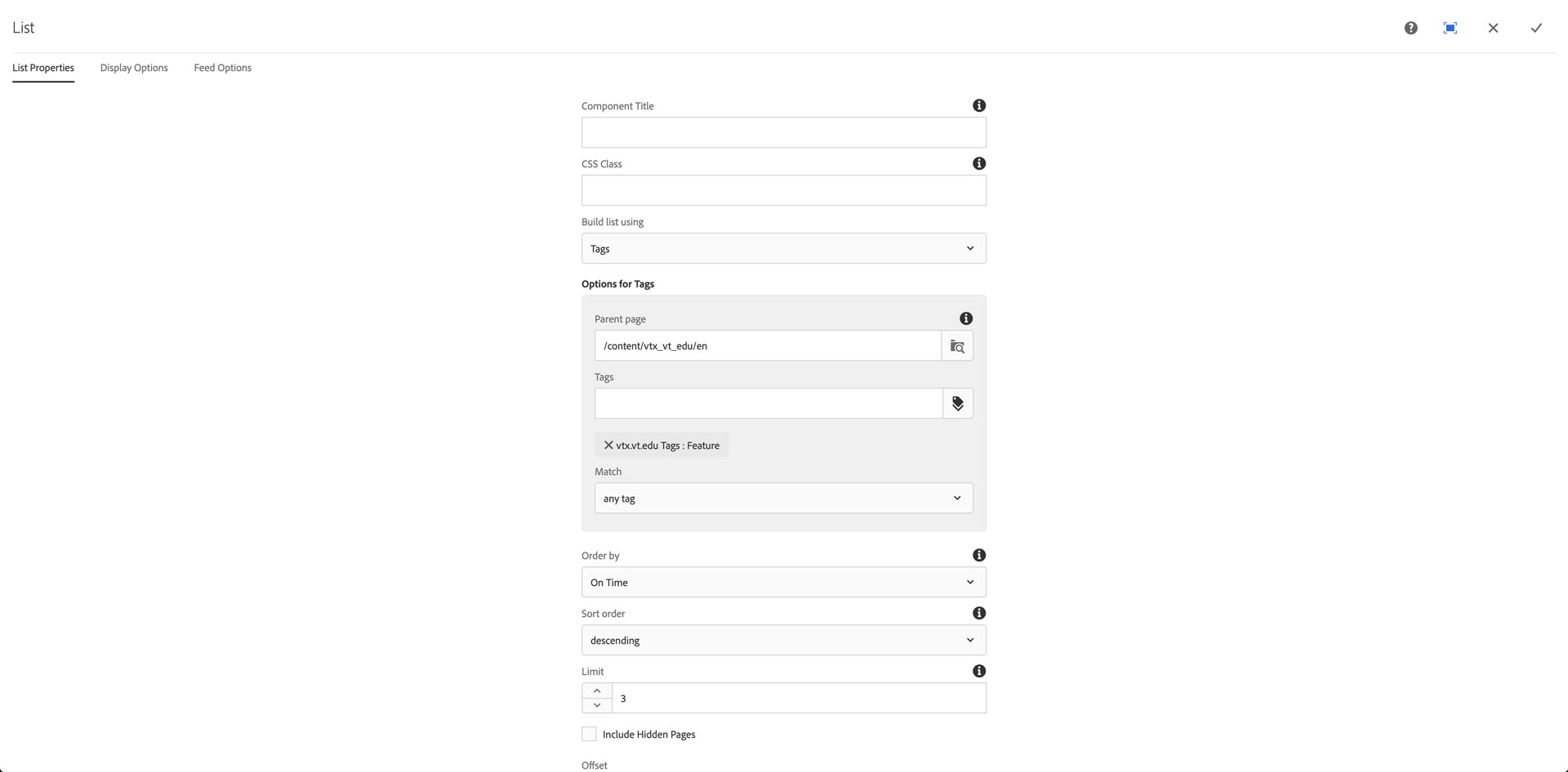
Click on the list component in the "vt-drawer-visible" container and choose Config (wrench icon)
In the List properties
Set the type of list and any tag or fixed items
Set the "Order by" to onTime, descending
Configure the limit to 3 or 4 items
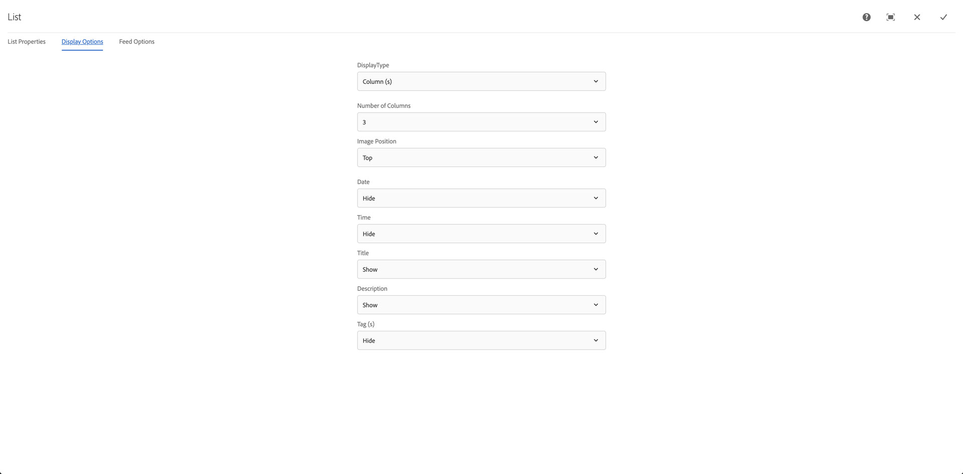
In the Display options
Set the Number of Columns to 3 or 4
Set the image position to Top or Left
Set the Description to Show or Hide
Click the checkmark in the top-right corner of the configuration dialog
Click the list component in the "vt-drawer-visible" container
Click the Copy icon (two squares offset, one filled, one outline)
Click the Drop components here box in the "vt-drawer-hidden" container component
Click the Paste icon (clipboard)
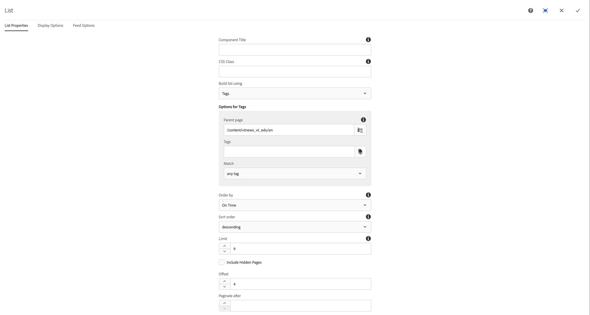
Click on the list component you just pasted and choose Config (wrench icon)
Adjust the Limit to 2x or 3x the first 3 or 4 items
Set the Offset to 4 if you are display 3 items in the visible list, to 5 if you are displaying 4 items in the visible list
Click the checkmark in the top-right corner of the configuration dialog
NOTE: Limits with offsets have to include the first set, if you want 6 items to show in the hidden list, 3 at a time the offset is 4 and the limit is 9.
Add classes to outer container
Click on the outer-most container wrapping the visible and hidden containers and choose Config (wrench icon)
Add vt-drawer-container and any drawer toggle customization classes from below to the CSS Class field
Click the checkmark in the top-right corner of the configuration dialog
List stripe options in VTx
There are various list stripe configuraiton options for color schemes and heading styles.
VTx color scheme classes to add to vt-drawer-visible and vt-drawer-hidden container components:
- vt-vtx-listStripe-white
- vt-vtx-listStripe-black
- vt-vtx-listStripe-lightgray
- vt-vtx-listStripe-darkgray
- vt-vtx-listStripe-smoke
- vt-vtx-listStripe-lightsmoke
VTx list stripe heading classes to add to the text component containing the H2 heading:
- vt-listStripe-heading (for use with any color scheme)
- vt-listStripe-heading-italic (for use with any color scheme)
- vt-listStripe-heading-category (for use with light color schemes only)
- vt-listStripe-heading-category-white (for use with dark color schemes only)
Transpose stripes to columns
If you want to transpose the list stripes from rows to colums, this can be done with a container component to wrap the two, three, or four stripes you want to turn to columns, and an class on that outer container.
Drag and drop a Container component above the stripes you'd like to turn into columns
Click on the empty container and then click the Config (wrench) icon
In the CSS Class field paste one of the following classes depending on how many columns
- vt-listStripe-transpose-2col
- vt-listStripe-transpose-3col
- vt-listStripe-transpose-4col
Click on the vt-drawer-container container component of the first stripe and click the Group icon to the right of the paste icon
Click on the outer vt-drawer-containers ONLY for the additional stripes you want to move and click the Group icon until you reach the last one and on that one the Cut (scissors) icon
Click on the Drop components here box in the empty container and then the Paste icon
NOTE: The cut components will take a little time to fill into the new location; be patient. You should be able to view the page as published and see the transposed stripes. If not, try to cut the components again after reloading the edit page.
Customizing the disclosure drawer
The outer wrapping container (vt-drawer-container) can have a custom background color by adding it to the "Common CSS Properties" tab, under the Config dialog for the component where the class was added. Please try to use Virginia Tech brand colors from the brand color utility ( https://brand.vt.edu/identity/color/color-util.html ) making sure to have proper contrast with either white or black text and button colors within the drawer.
Changing the button and text colors to white from the default black
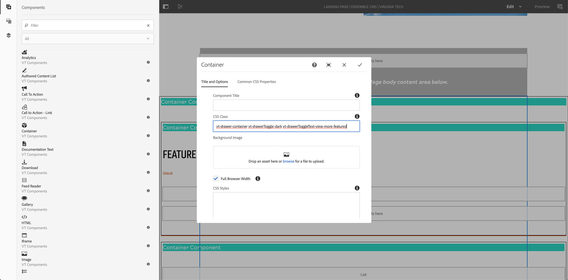
Click on the outer container (vt-drawer-container) and choose Config (wrench icon)
Add a space and vt-drawerToggle-light or vt-drawerToggle-dark to the CSS Class field
- CSS classes need to be space separated
Click the checkmark in the top-right corner of the configuration dialog
Changing the button text to say something other than "View more"
Click on the outer container and choose Config (wrench icon)
Add a space and vt-drawerToggleText-your-text-dash-separated-here to the CSS Class field
- The button text you want just needs to be lowercase and dash ("-") separated
Click the checkmark in the top-right corner of the configuration dialog
NOTE: Don't use too many characters as the button will wrap and possibly display oddly on varying devices. Test the button in "View as published" and make the browser window smaller and see how the button wraps. Adjust the length of the button text as needed.
Click on the Page Information icon (three stacked sliders) top-left of the open page and choose "View as published" to see what the drawer will look like when the page is published. Test the disclosure drawer and make sure your content looks correctly through the various device widths and adjust as needed.