

How to configure the dual CTA components on landing pages
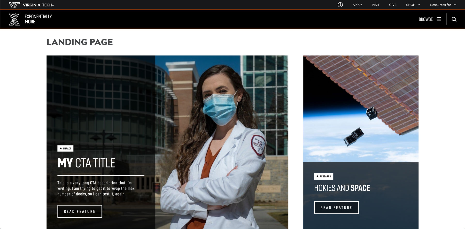
In the VTx theme, there are two embedded CTA components in Generic Home Page template pages. Each one has different maximum widths, and different prescribed usages based on its design. They are automatically scaled to fill the full view height in the browser when the page loads. They are both designed to clip the image that appears in the background as center weighted. They both use classes for some display item options and the popover media and presentation design option, but are otherwise default.
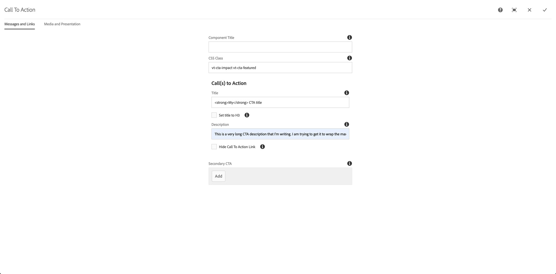
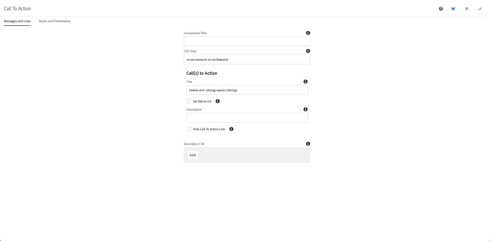
Configure Messages and Links properties
The first CTA is designed to be the most prominent item on the landing page. It's two-thirds the width of the browser and contains an image, display item classes, title, description, and CTA Link component.
The second CTA is designed to be the second most prominent item on the landing page. It's one-third the width of the browser and contains an image, display item classes, title, and CTA Link component; no description.
The component allows for HTML in the Title field, e.g., <strong></strong>, <em></em>.
Add category tag class:
- vt-cta-academics
- vt-cta-campus-experience
- vt-cta-culture
- vt-cta-impact
- vt-cta-research
Add Feature tag to featured item:
Add a space between the category and the Feature class that adds the star to the category tag display: vt-cta-featured
Click the checkmark, top-right of Config dialog
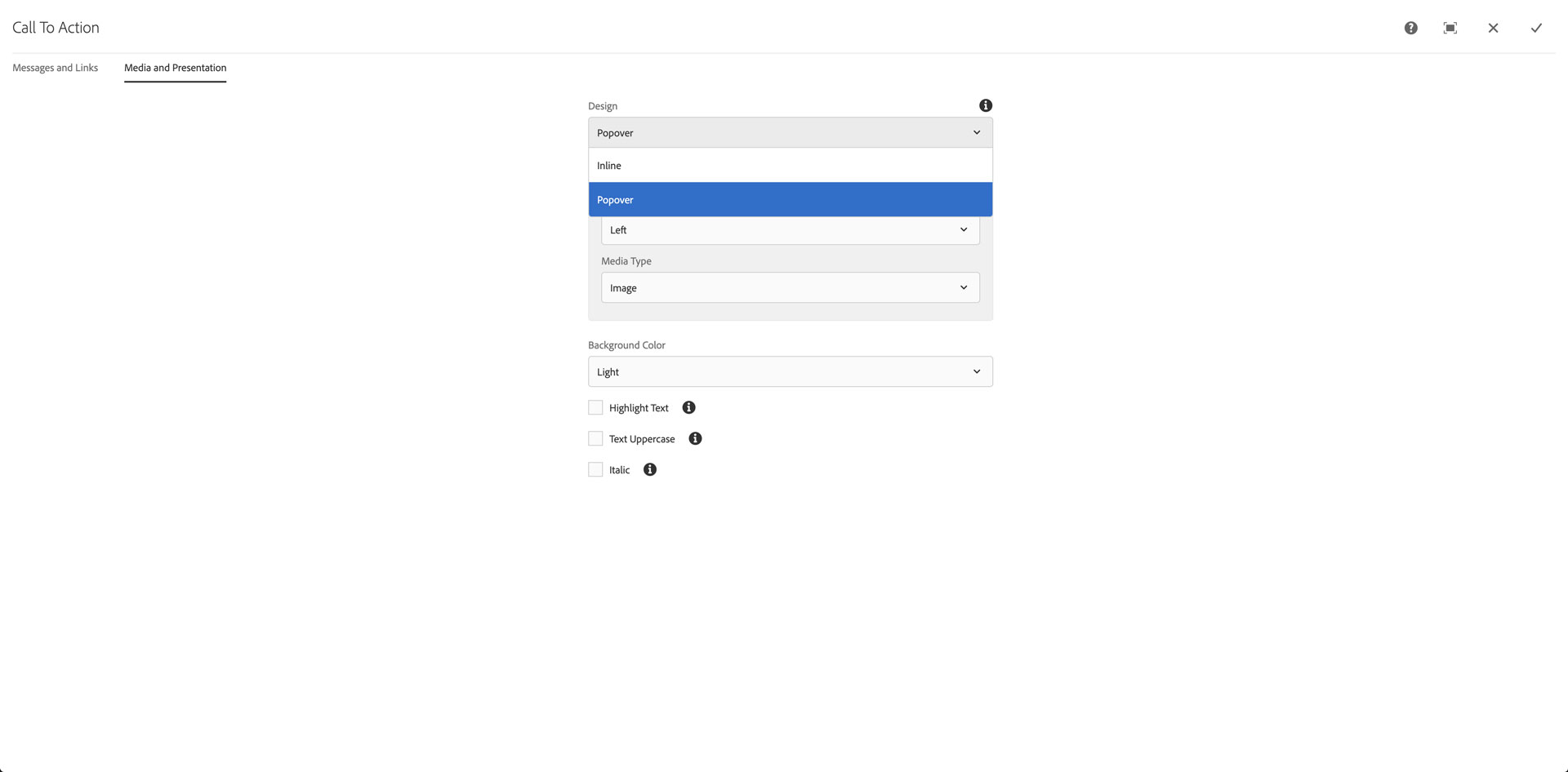
Configure Media and Presentation properties
Click the CTA component
Click the Config (wrench) icon
Click the Media and Presentation tab
Click on the Design pulldown, and choose Popover
Click the checkmark, top-right of Config dialog

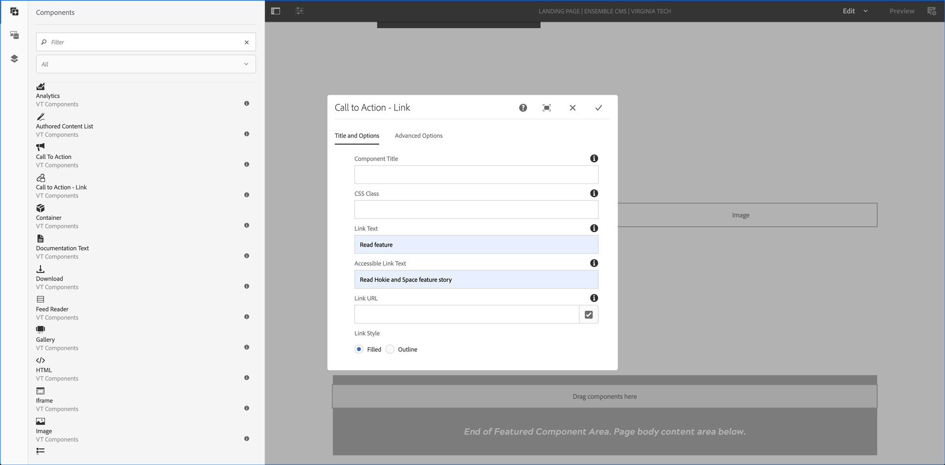
Configure CTA-Link properties
Click on the CTA-Link component
Click the Config (wrench) icon
Set the Link Text to: Read Feature
Set the Accessible Link Text to: Read [TITLE] featured story
- Where TITLE is the story, video, event, or notice title
Set the Link URL to the story, video, event, or notice
Click the checkmark, top-right of Config dialog