

Create and edit a page
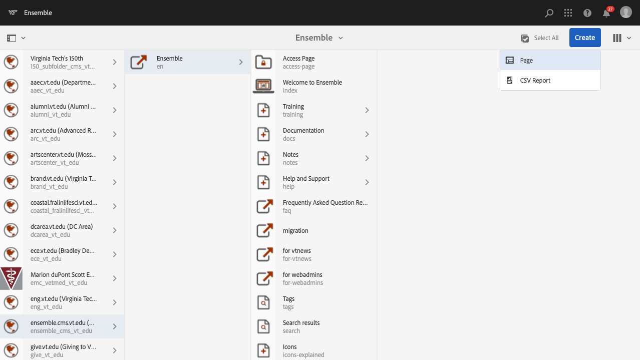
Create a page in My Sites interface
When creating a new page, select its desired location by clicking on the page titles in the My Sites view until you are at the place in the path.
Do not create pages as children of the main home page (index). You will break the site.
Click the create button and choose the page option.
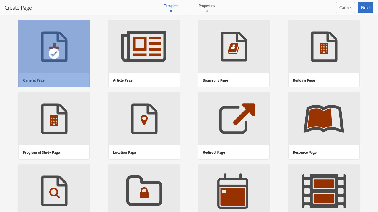
Selecting a page template is the first option after choosing a page location and clicking the create page option. There are several different page templates to choose from. Some content type specific page templates have more options and varied layouts than the simpler general types.
The basic page properties are shown next. The only required fields are the name and title of the page. Names are what appear in the URL for a page or asset. Please try to keep these lowercase letters, numbers, dashes, and underscores only, where possible. Mixed case letters are evil for making shareable URLs, other characters may add escape sequences to the URL.
The title field can be any case or character and becomes the main heading for the page as well as its browser page title.
The page can be assigned tags, whether or not to have a right column, whether it appears in navigation or lists, related content tags for refined related content associations, alternate navigation title in breadcrumbs, subtitle, description, on and off times for publishing and unpublishing a page.
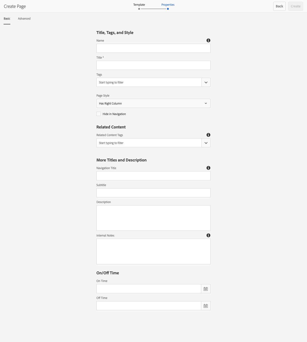
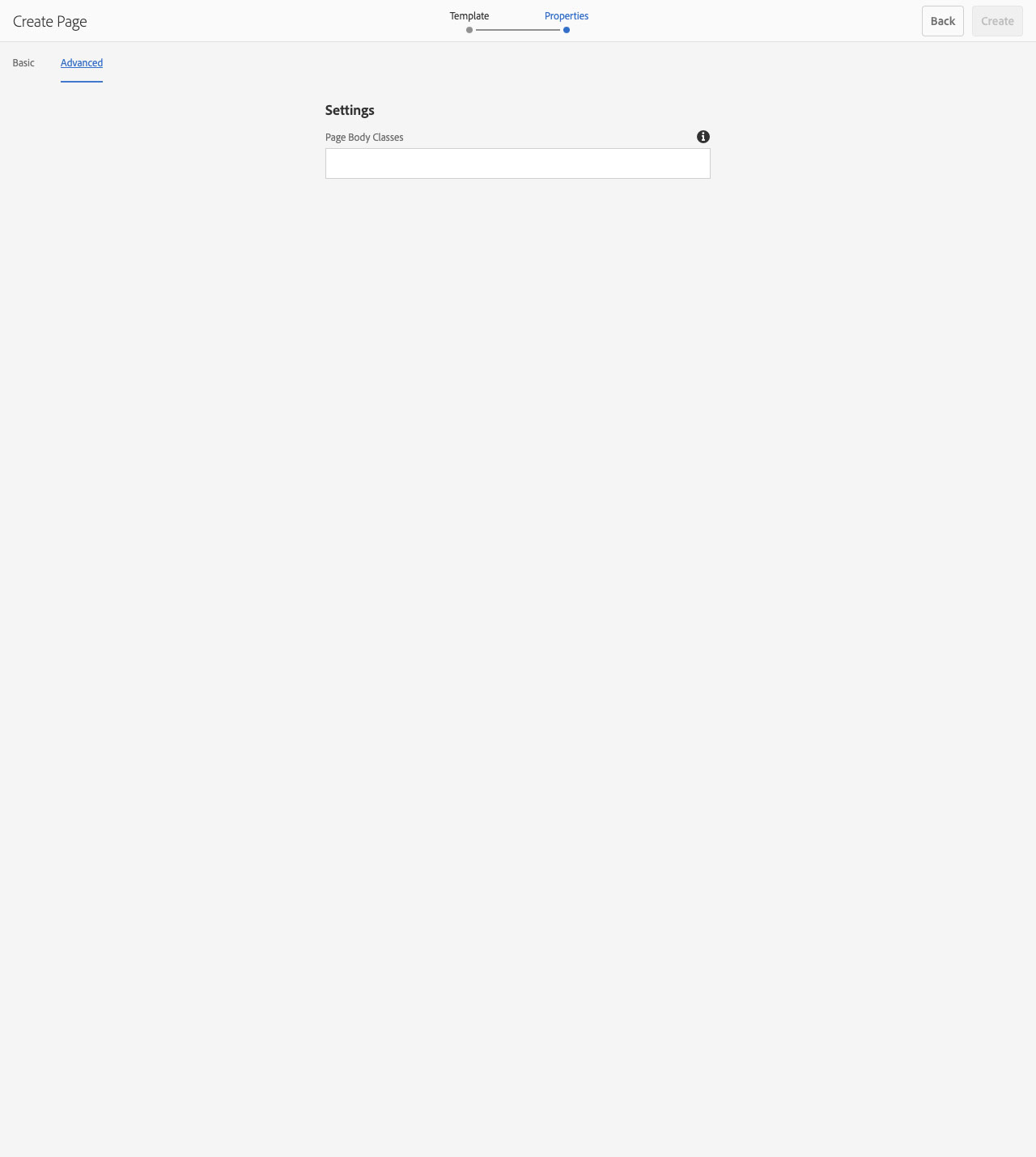
An advanced tab will also appear in the page properties during creation. This may not be all the options available to a page template. Some are only available after the page has been created. Be sure to check the page properties again after page creation success to access all the page properties that may be needed to make the page work the way it's supposed to.
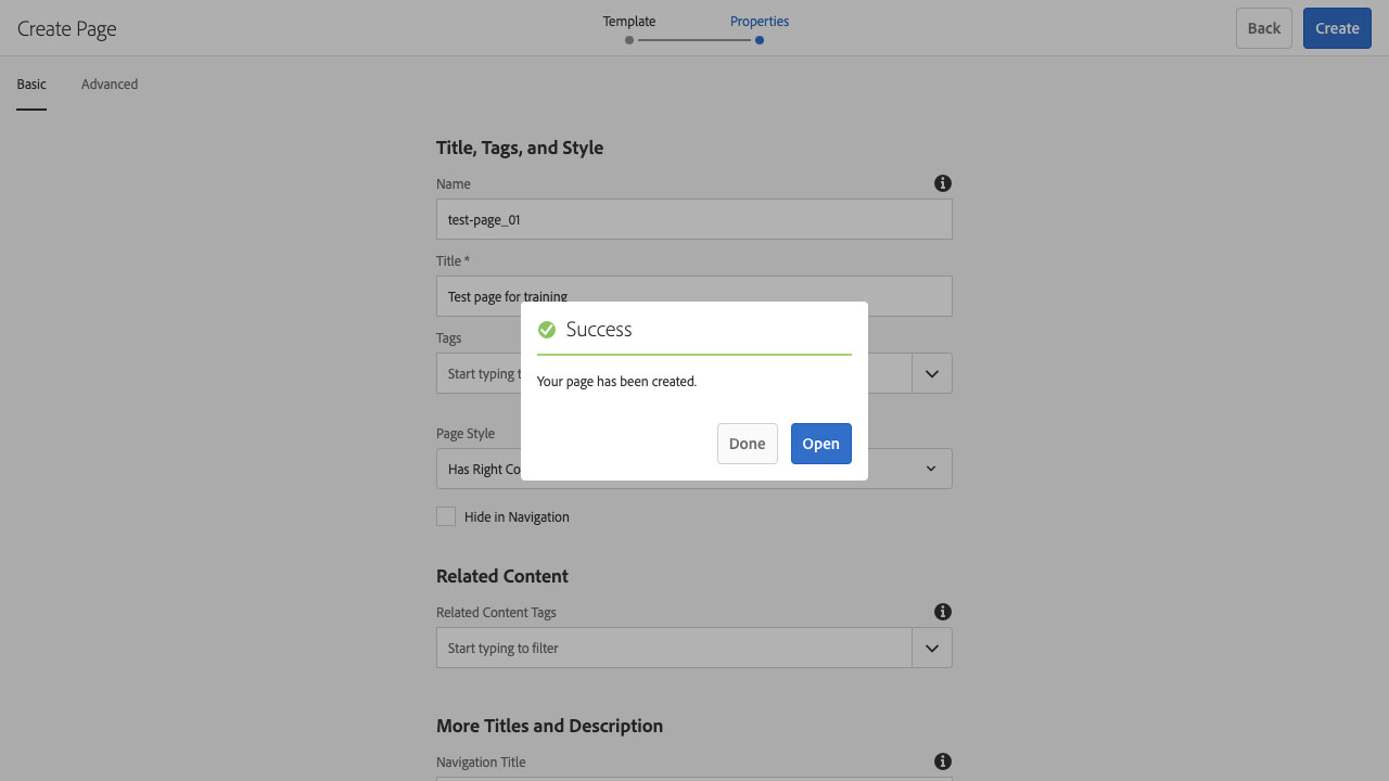
Once the page is created you can choose to open it in edit mode or close the dialog and go back to the My Sites interface to add additional pages before editing.
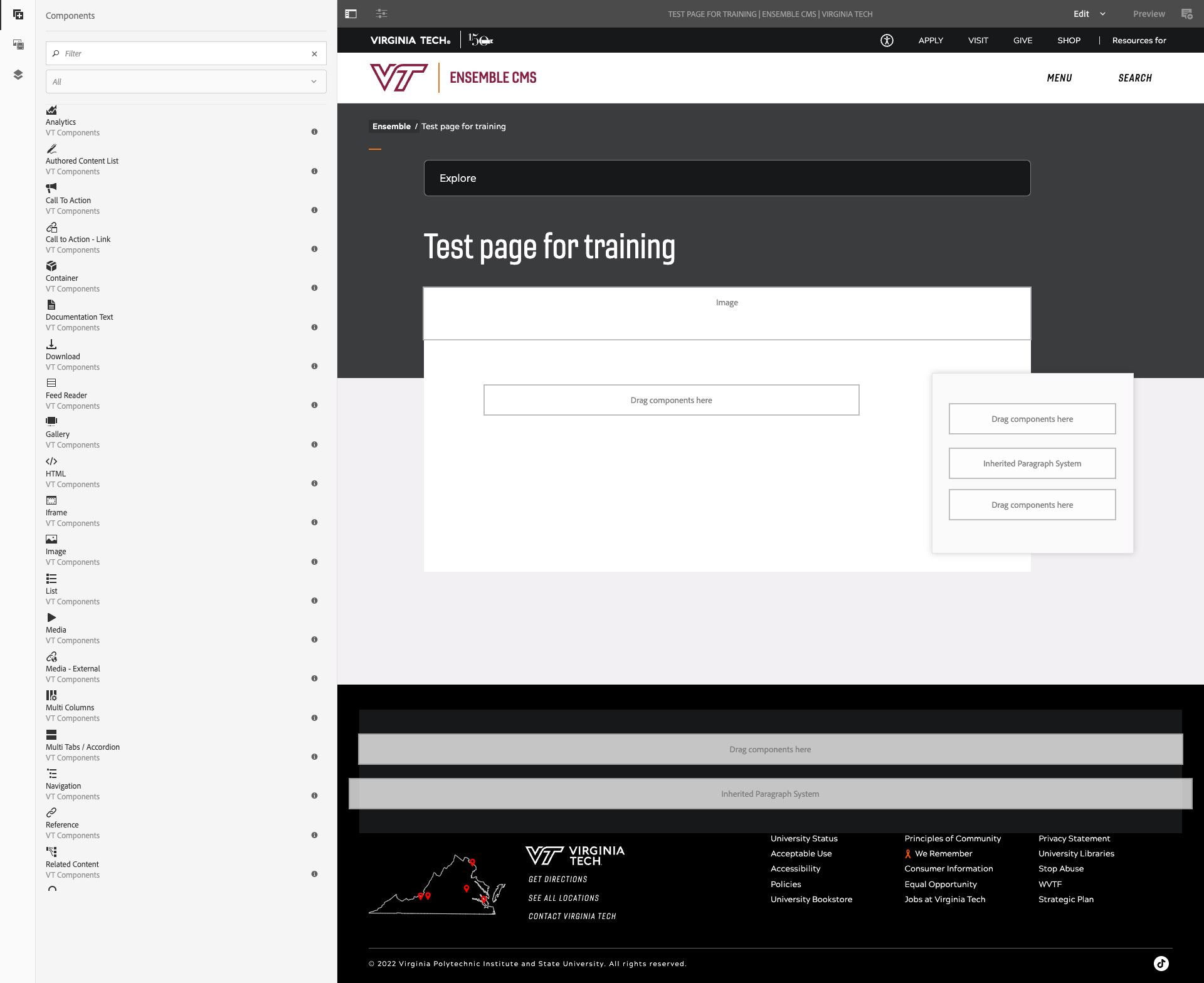
The edit page interface will open once you create a page and click the open button in the success dialog, or if you select a page in My Sites and click the edit button in the actions toolbar.
Different page templates will vary slightly with their default components, but will follow a consistent page structure for the majority of options.
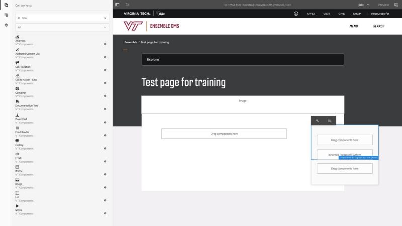
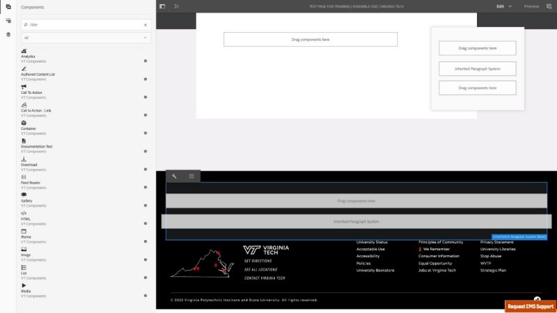
There are many component drop zones on the various page templates, most will have an embedded component above the main body, a body drop zone, a right column drop zone, and a footer component drop zone. The zones vary based on design theme, but the One theme is used for these examples and most sites in Ensemble.
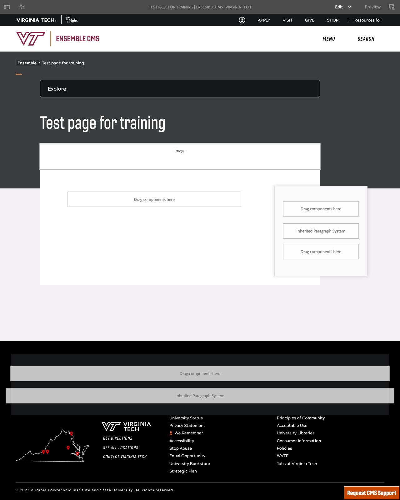
The edit page toolbar is used to access components, assets, page prperties, view a page as it would appear when published, and publish a page when ready.

The side panel toggle is in the top-left corner of the edit interface. It will open the side panel to make drag and drop page construction tools available. It looks like a rotated L on top of a white outlined box.
Components side panel gives drag and drop access to all page components. Use them to construct page layouts and rich user experiences.
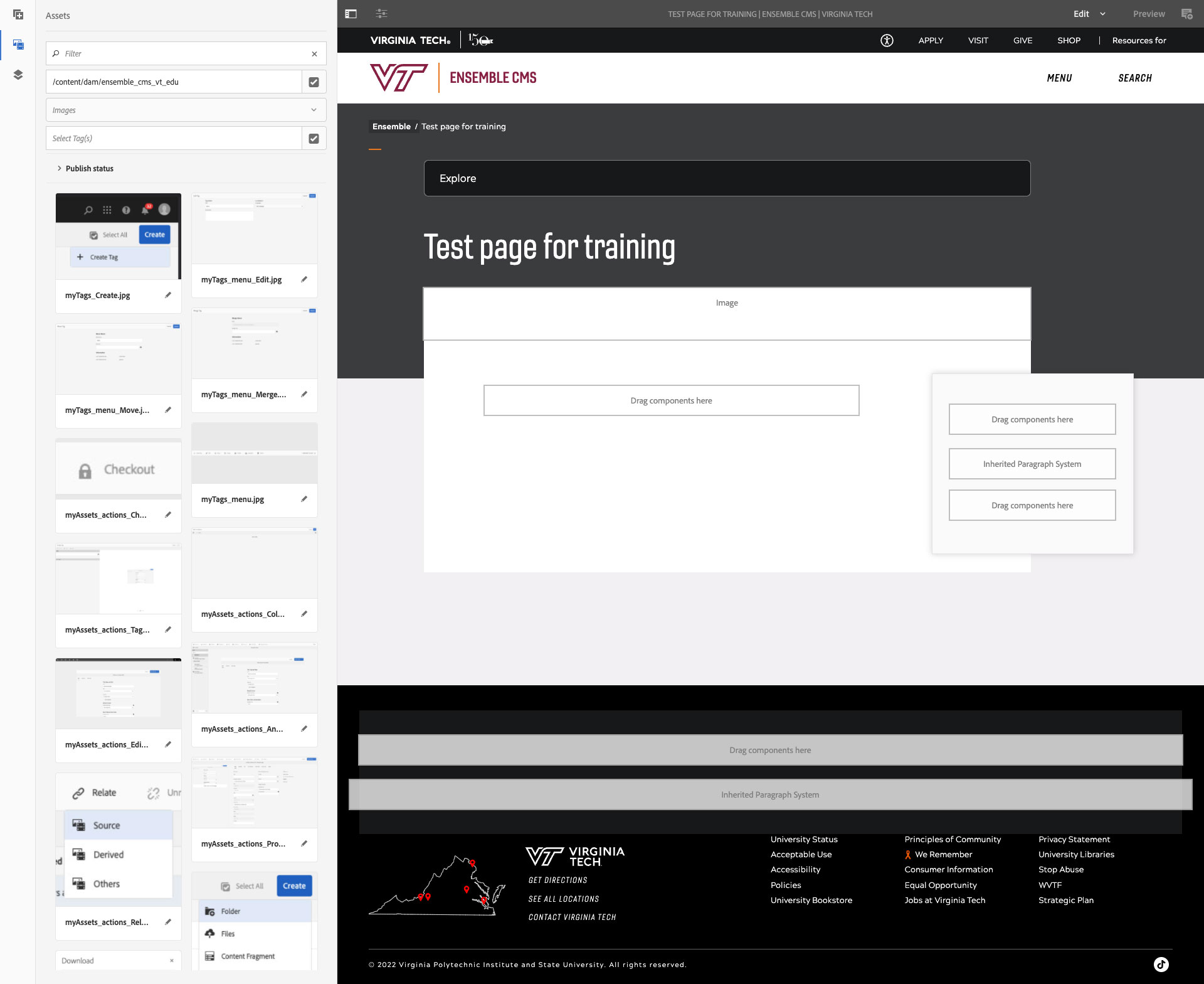
Assets side panel allows drag and drop access to content that needs to be added to page components. Includes path and asset type filters along with search.
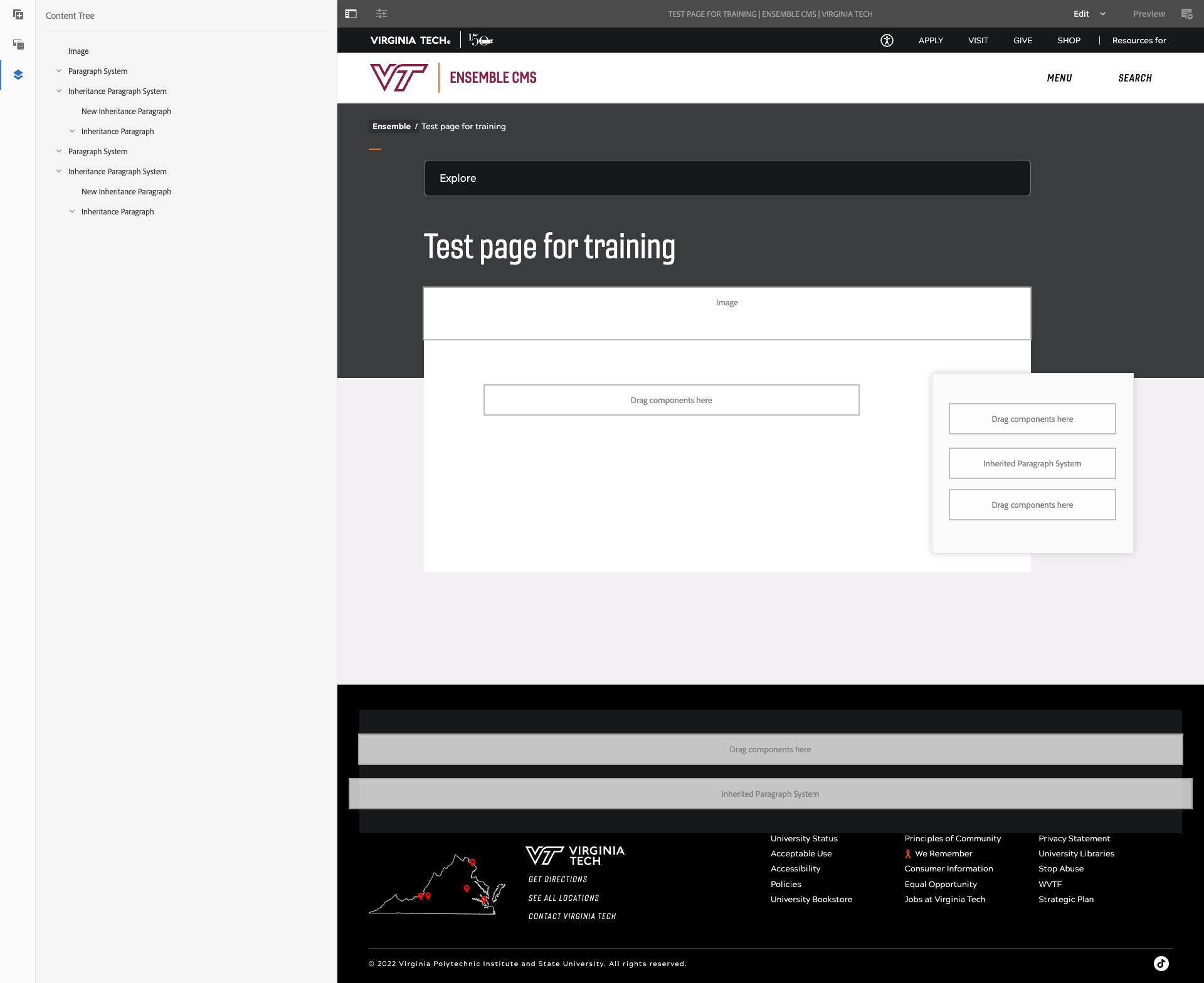
Content tree side panel allows for node level access to content on a page. Not for novice users.
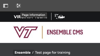
The page information toggle looks like three horizontal sliders. It's a menu of useful tools while in the edit interface.
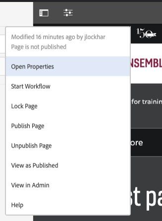
There are as many as eight options that will appear in the page information menu.
Open Properties: opens the current page's properties dialog.
Start Workflow: opens the workflow dialog.
Lock Page: will lock the current page and prevent any other user from editing the page until it is unlocked.
Publish Page: publishes the current page.
Unpublish Page: unpublishes the current page.
View as Published: opens the page in a new tab with a special URL that displays the page as if it were published.
View in Admin: opens a new tab with the My Sites interface on the parent to the current page.
Help: activates Adobe internal help.
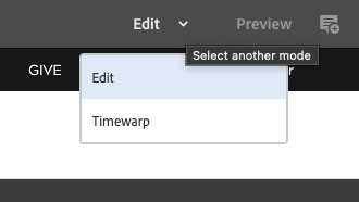
The Edit selector allows the user to switch from preview mode back to edit mode, or to activate the timewarp feature.
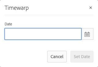
The timewarp feature will allow quick access to versions of a published page within its timeline. If the desired publish date occurred before the date entered no results will be displayed.
If this method fails, please file a ticket via the Request CMS Support button at this website.
The preview of a page is displayed within the editing interface. This is not the preferred way to view what a page would look like when live. There are many theme features that are not active in the native preview mode.
NOTE: Please use the View as published option from the page information pulldown at the top-left of the edit interface to view the published version of a page before publishing and making the page changes live.

The Add Notes feature within Adobe Experience Manager has been disabled. Do not use.

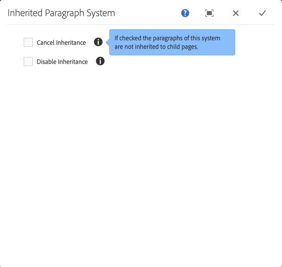
Right column area inherited paragraph system. Note, the drop components here block that inherits to descendant pages is above the inherited paragraph system box for this area.
Commonly used for custom messages, custom navigation for a set of pages, and highlighting related content. Has a light gray background.
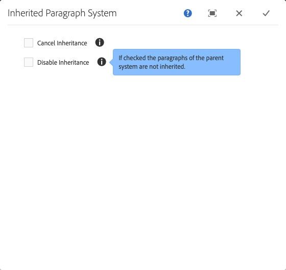
Footer area inherited paragraph system.
Commonly used for custom site or sub-site footer information. Has a dark gray background and defaults to white text.
Inherited paragraph system configuration options are: