

Multi-Tabs and Accordion component
The Multi Tabs / Accordion component is used to create content panels that are hidden by a tab or fold disclosure pattern.
WARNING: There is a known issue with the Multi-Tabs/Accordion component where changing the order of the tab/fold headings does not migrate the content associated with that tab/fold and content will get out of order from the headings. Before you start populating the Multi-Tabs/Accordion component make sure you know exactly what's going in it and the order. You can drag and drop the content to move it after the change, but this can be tedious for large amounts of pre-populated content.
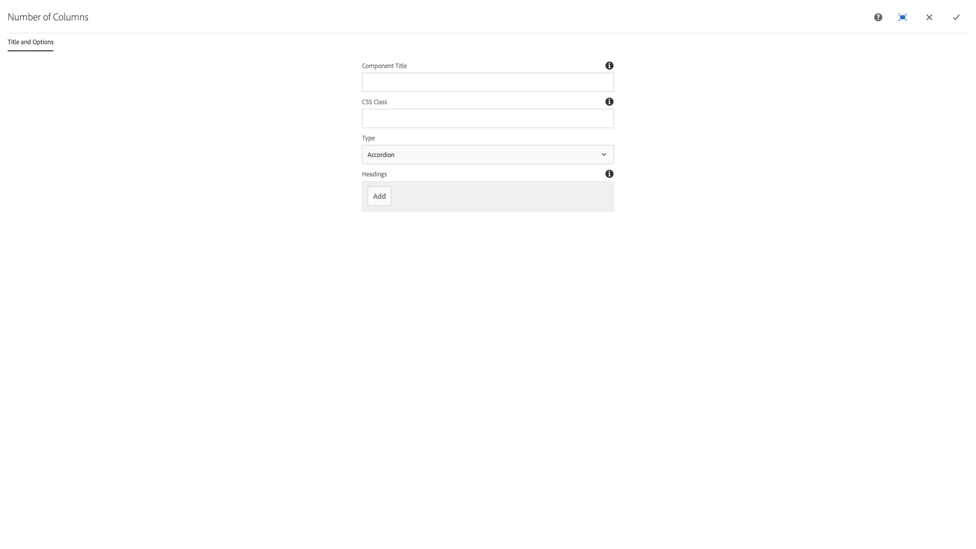
The Title and Options configuration dialog contains the following options:
- Component Title - text input field that does not display for this component but useful for giving the component a title for keeping track of what it is used for on the page
- CSS Class - text input field for custom CSS and/or utility classes
- Type - select pulldown used to choose between Accordion or Tab disclosure pattern
- Headings
- Add - button used to add heading fields and content panel drop zones to the component
The multi-tab and accordion component displays content using a tabular or accordion style. This component presents two alternatives to using multi-columns to display content.
Features
- The user may switch between two different designs
- Tabs or accordion headings may contain any component (including the multi tab / accordion component)
- Tabs and headings can be reordered or deleted
Dialog Properties
Title and Options
Component Title- Title of ComponentCSS Class- CSS class to be applied to the componentType- Choose the desired display typeAccordion- (Default) A vertical list of headings which uses a sliding animation to disclose the contentTab- A tabbed interface that switches between panels of information when the tab is clicked
Headings- add headings to the multi tab / accordion group. They may be deleted and reordered.
CSS Classes
- active
- collapse
- fade
- in
- nav
- nav-item
- nav-link
- nav-tabs
- panel
- panel-body
- panel-collapse
- panel-default
- panel-group
- panel-heading
- panel-title
- parbase
- responsive
- section
- show
- tab-content
- tab-list
- tab-pane
- text
- vt-item
- vt-item-0
- vt-item-1
- vt-item-2
- vt-multicolumn
- vt-text
- vtAccordion
- vtAccordion_closed
- vtTab
- vt_multibrief_content
- vtmultitab