

Tag cloud component
The Tag cloud component displays a list of tags on the page being viewed, similar to the default tag display within Article pages.
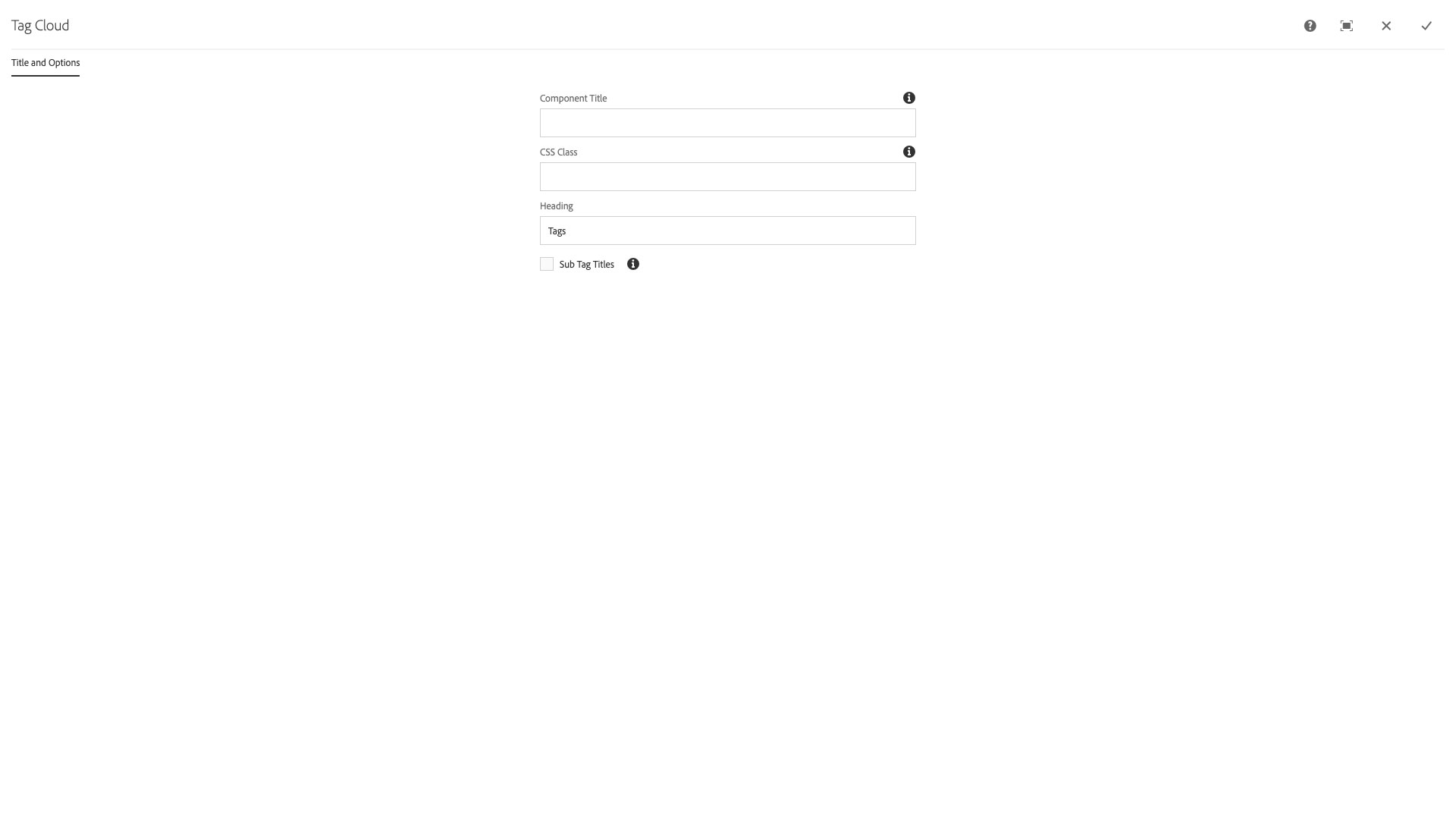
The Title and Options configuration dialog contains the following options:
- Component Title - text input field that does not display for this component but useful for giving the component a title for keeping track of what it is used for on the page
- CSS Class - text input field for custom CSS and/or utility classes
- Heading - text input field that becomes the H@ heading for the component, default is Tags
- Sub Tag Titles - checkbox to display a heirarchical list of tags and subtags
Features
- Automatically includes the tags on the page
- Groups tags together based on parent tags
- Custom heading text
Dialog Properties
Title and Options
Component Title- Title of ComponentCSS Class- CSS class to be applied to the componentHeading- Custom heading textSub Tag Titles- Includes child tags by grouping them under the parent
CSS Classes
- main-heading
- no-subtitles
- parbase
- section
- subtitles
- tagcloud
- vt-tag-d-0
- vt-tag-d-0-tags
- vt-tag-d-1
- vt-tag-d-1-tags
- vt-tag-d-2
- vt-tag-d-2-component
- vt-tag-d-2-theme
- vt-tag-item-component
- vt-tag-item-how-to
- vt-tag-item-new-feature
- vt-tag-item-one-theme
- vt-tag-item-tagcloud
- vt-tag-item-theme
- vt-tag-li-component
- vt-tag-li-tags
- vt-tag-li-theme
- vt-tag-link
- vt-tagcloud
- vt-tagcloud-heading