

Gallery component
The Gallery component is used to display collections of images in either a Featured Image, Carousel, or Light Box option.
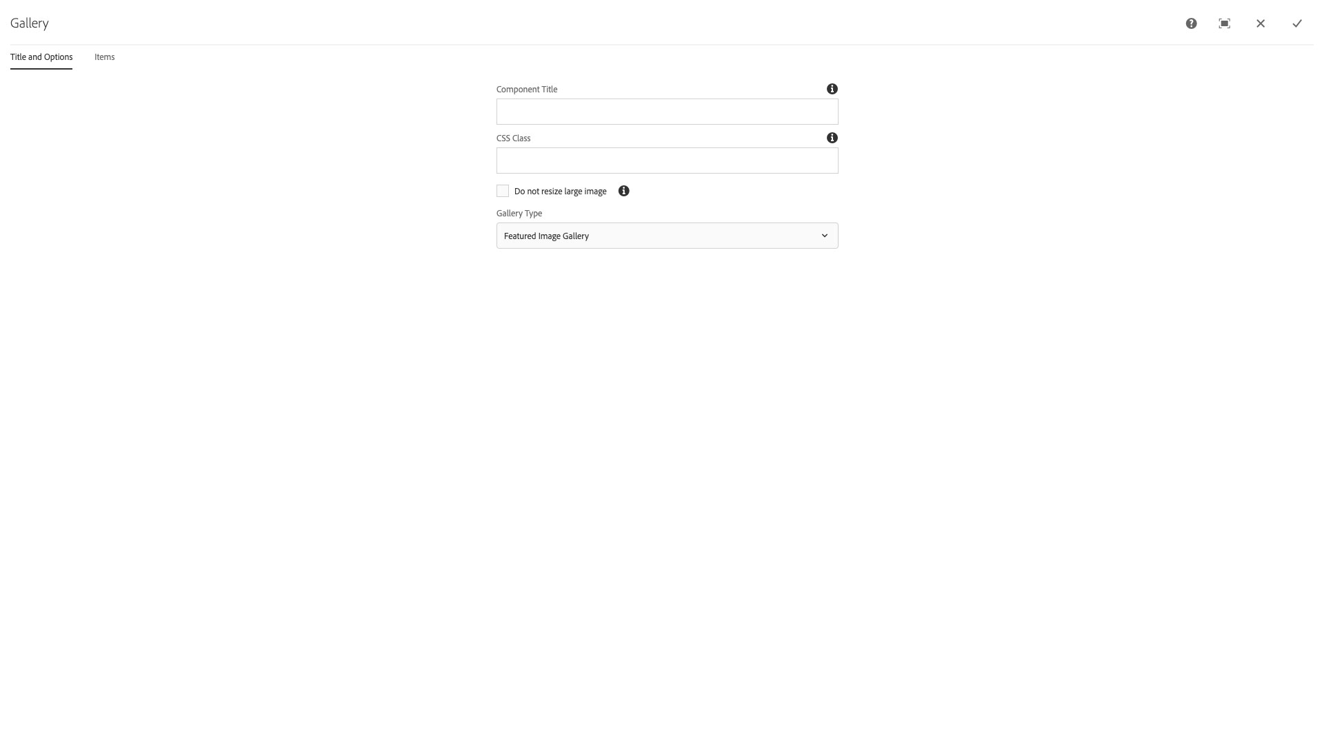
The Title and Options configuration dialog for a Featured Image gallery contains the following options:
- Component Title - text input field that does not display for this component but useful for giving the component a title for keeping track of what it is used for on the page
- CSS Class - text input field for custom CSS and/or utility classes
- Do not resize large images - checkbox for overriding the automated image scaling for images over 2500 pixels in width
- Gallery Type - select pulldown containg the options for gallery type; Carousel, Featured Image, or Light Box
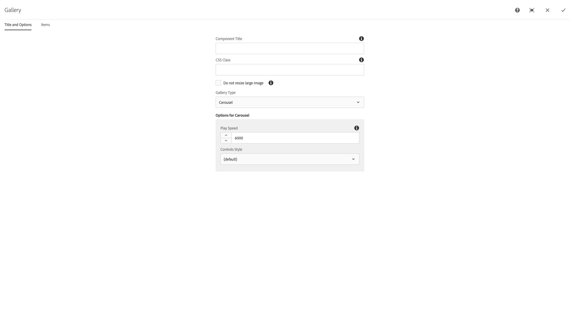
The Title and Options configuration dialog for a Carousel gallery contains the following options:
- Component Title - text input field that does not display for this component but useful for giving the component a title for keeping track of what it is used for on the page
- CSS Class - text input field for custom CSS and/or utility classes
- Do not resize large images - checkbox for overriding the automated image scaling for images over 2500 pixels in width
- Gallery Type - select pulldown containg the options for gallery type; Carousel, Featured Image, or Light Box
- Play Speed - number field that sets the time interval that images will appear before a new one is transitioned, in thousandths of a second, e.g., 6000 is six seconds
- Controls Style - select pulldown that sets the appearance of the carousel image controls; default (overlayed over image), Below Image, or Hidden
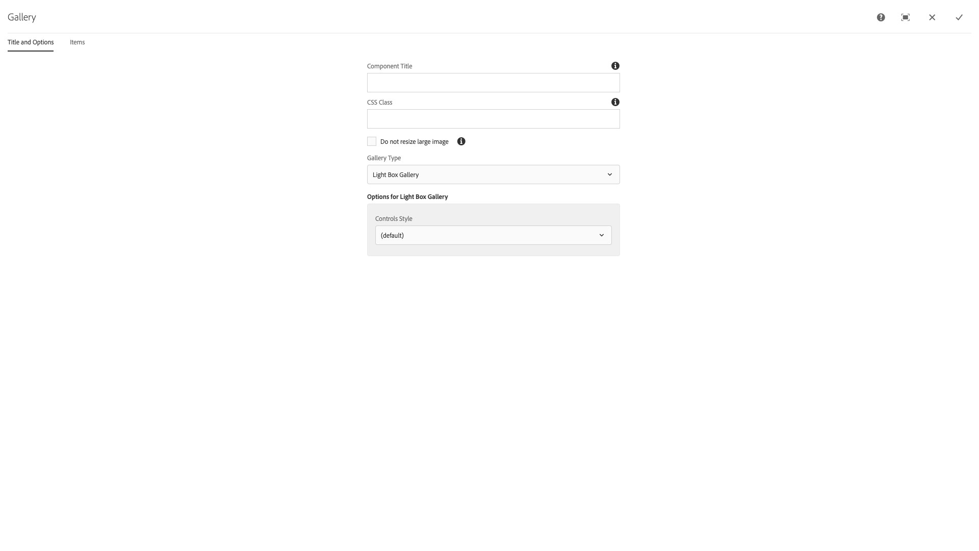
The Title and Options configuration dialog for a Light Box gallery contains the following options:
- Component Title - text input field that does not display for this component but useful for giving the component a title for keeping track of what it is used for on the page
- CSS Class - text input field for custom CSS and/or utility classes
- Do not resize large images - checkbox for overriding the automated image scaling for images over 2500 pixels in width
- Gallery Type - select pulldown containg the options for gallery type; Carousel, Featured Image, or Light Box
- Controls Style - select pulldown that sets the appearance of the light box image controls; default (inside the modal for each image)
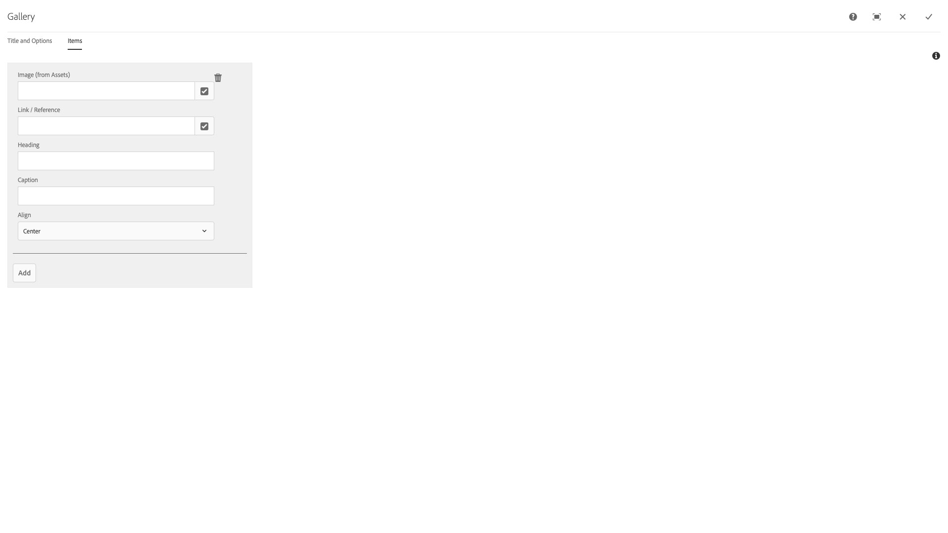
The Items configuration dialog contains the following options:
- Add - button to add images from My Assets to the gallery
- Image (from Assets) - autocomplete text input field with browse button for selecting images
- Link / Reference - autocomplete text input field for linking to an external or internal page that supports /content and https:// link types
- Heading - text input field for a heading (Title) for the image
- Caption - text input field for a caption (Description) for the image
- Align - select pulldown to align the Heading and Caption fields relative to the image; Center, Left, or Right
The Gallery component allows users to feature images for a photo gallery or in a carousel on their pages. It can feature images, titles, captions and linked text.
Features
- Multiple images in gallery
- Image is sourced from the asset library
- Various positioning options
- Various style options
Dialog Properties
Title and Options
Component Title- Title of ComponentCSS Class- CSS class to be applied to the componentDo not resize large image- when using the large image display option, will use the full-size image instead of a scaled versionGallery Type- There are major presentational differences between typesCarousel- A series of slides that can be scrolled through, with controls to scroll to the desired slidePlay speed- The number of milliseconds to wait before auto-advancing the slideControls Style(default)Below Image- controls are placed below the image slideHidden
Featured Image Gallery- A selected image is displayed while also showing thumbnails of all images in the setLight Box Gallery- A grid of thumbnails is displayed, and the selected image opens in a modal dialog box
Items
Create, delete, and reorder gallery items
Note - you may no longer drag-and-drop images from the asset library tab
Add items
Image- Choose the image from the asset libraryLink/Reference- Choose a page to link to or input a URLHeadingCaptionAlignCenterLeftRight
CSS Classes
- active
- carousel
- carousel-caption
- carousel-control
- carousel-control-next
- carousel-control-prev
- carousel-indicators
- carousel-inner
- carousel-item
- center
- clearfix
- container
- gallery
- gallery-featured-item
- gallery-thumbnails
- glyphicon
- glyphicon-triangle-left
- glyphicon-triangle-right
- item
- item-image
- left
- list
- parbase
- right
- row
- section
- slide
- sr-only
- thumbnail
- vt-carousel
- vt-carousel-control-belowImage
- vt-carousel-control-default
- vt-carousel-control-hidden
- vt-carousel-indicator-belowImage
- vt-carousel-indicator-default
- vt-control-type-belowImage
- vt-control-type-default
- vt-control-type-hidden
- vt-gallery-type-carousel
- vt-gallery-type-featured-lbgallery
- vt-gallery-type-lbgallery
- vt-image